Tab
Use a Tab widget to hold a collection of widgets on a form. You can use multiple tabs to display groups of related widgets. A user views one tab at a time.
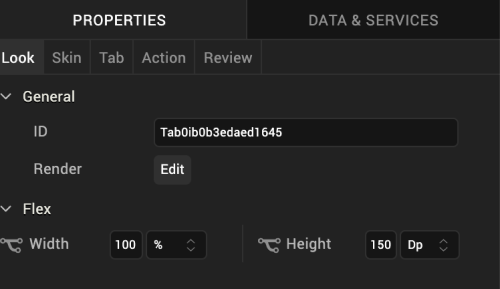
Look Properties
Look properties define the appearance of the widget.

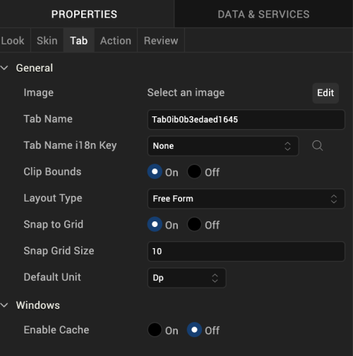
Tab Properties
Tab properties specify properties that are available on any platform supported by Volt MX Iris, and assign platform-specific properties.

Image
Specifies an image to display next to the tab name. To select an image, click Edit to display the Image window. From the list of images, choose an image, and then click OK.
Tab Name
Specifies the name of the tab.
Clip Bounds
Specifies whether to clip child widgets displayed in the tab pane when they go out of boundaries.
Layout Type
Specifies whether the arrangement of widgets in the tab flows horizontally, vertically, or in both directions.
Default: Vertical
Snap to Grid
Specifies whether the widget aligns to the nearest intersection of lines in the grid, or other widgets.
Snap Grid Size
Specifies the grid size. This option is available only when Snap to Grid is enabled.
Default Unit
Specifies the default unit used for interpretation of numbers with no qualifiers when passed to layout properties.
Following are the options:
- dp: Specifies the values in terms of device independent pixels.
- px: Specifies the values in terms of device hardware pixels.
- %: Specifies the values in percentage relative to the parent dimensions.
Actions
Actions define what happens when an event occurs. On a Tab widget, you can run an action when the following events occur:
- onInit: The action is triggered when the user navigates to the tab.
- onTouchStart: The action is triggered when the user touches the touch surface. This event occurs asynchronously.
- onTouchMove: The action is triggered when the touch moves on the touch surface continuously until movement ends. This event occurs asynchronously.
- onTouchEnd: The action is triggered when the user touch is released from the touch surface. This event occurs asynchronously.
For more information, see Add Actions.
Placement Inside a Widget
A Tab widget can only be placed inside a TabPane widget.
| Rev | Author | Edits |
| 8 | SHS | SHS |
| 7.2.1 | SHS | SHS |