TabPane
Use a TabPane widget to organize multiple tabs. Each tab hold a collection of widgets on a form. A user views one tab at a time.
To learn how to use this widget programmatically, refer VoltMX Iris Widget guide.
Important Considerations
The following are important considerations for a TabPane widget:
- You can navigate within the TabPane only using the down key.
- If you press the down key, the focus shifts to the next widget in the TabPane.
- If you press the down key while you are on the last widget in the TabPane, you are taken to the top most widget in the TabPane.
- If you press the right or the left arrow keys, you move to next or previous tabs.
-
Tab cycling is supported (that is, if you are on the last tab and you press the right arrow, you move to the first tab).
- On devices that have a navigation key, the following are applicable:
- Each tab has a context menu. The context menu appears in the menu options when the tab has the focus.
- Widget focus within a tab is saved. For example, if Widget2 of Tab2 has the focus, and you navigate to Tab1 and then back to Tab2, Widget2 still has the focus.
Look Properties
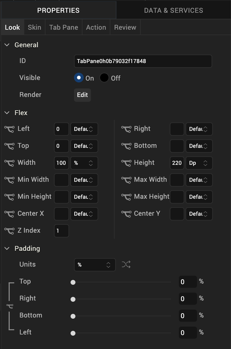
Look properties define the appearance of the widget. The following are the major properties you can set:
- Whether the widget is visible.
- The platforms on which the widget is rendered.
- How the widget aligns with its parent widget and neighboring widgets.
- If the widget displays content, where the content appears.

For descriptions of the properties available on the Look tab of the Properties pane, see Look.
Skin Properties
Skin properties define a skin for the widget, including background color, borders, and shadows. If the widget includes text, you can also specify the text font.
For a TabPane widget, you can apply a skin and its associated properties for the following states
| Skin | Definition |
|---|---|
| Active | The skin applied when a TabPane is active. |
| Active Focus | The skin applied when a TabPane is active and has the focus. |
| Inactive | The skin applied to inactive tabs. |
| Page | The skin for the page indicator. The skin is applicable only when View Type is set to Page and images are specified for Focused Page and Unfocused Page icons. |
For more information about applying skins, see Understanding Skins and Themes.
TabPane Properties
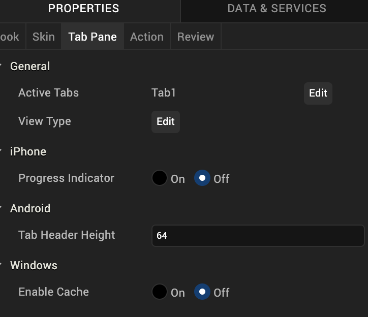
TabPane properties specify properties that are available on any platform supported by Volt MX Iris, and assign platform-specific properties.

Active Tabs
Specifies whether tabs in the TabPane are active or inactive.
Full Screen Widget
For a TabPane on a VBox form, specifies whether the TabPane occupies the entire form.
Note: Do not place more than one full-screen widget on a form.
Note: This property is available only when a TabPane is placed inside a VBox form.
View Type
Specifies the TabPane view type for each platform. To specify the view type, click the Edit button to open the View Type dialog box, select a platform, and then select a view type.
Following are the options:
- Tab
- Collapsible
- Page (iPhone and Android only)
- Panorama (Windows only)
Height
Specifies the height of the TabPane as a percentage of the Height Reference property.
Note: This property is available only when TabPane is placed inside a VBox Forms.
Height Reference
Specifies how the Height percentage is calculated.
Following are the options:
- Form Reference: The height percentage is calculated based on the height of the form, excluding headers and footers. This option does not apply if the TabPane is placed inside a popup or a template.
-
Parent Width: If the TabPane is placed inside a popup or in templates, the width is calculated based on the width of the parent container.
Note: This property is available only when TabPane is placed inside a VBox Forms.
Progress Indicator
Specifies whether the progress indicator is displayed.
Note: This property is specific to the iOS platform.
Progress Indicator Color
Specifies the color of the progress indicator, either Grey or White.
Note: This property is specific to the iOS platform.
Tab Header Height
Specifies the height of the tab header.
Note: This property is specific to the Android platform.
Actions
Actions define what happens when an event occurs. On a Tab widget, you can run an action when the following events occur:
- onTabClick: The action is triggered when the tab is clicked. This action is available only when the View Type is set to Collapsible View, and is triggered when you expand or collapse a tab.
- onTouchStart: The action is triggered when the user touches the touch surface. This event occurs asynchronously.
- onTouchMove: The action is triggered when the touch moves on the touch surface continuously until movement ends. This event occurs asynchronously.
- onTouchEnd: The action is triggered when the user touch is released from the touch surface. This event occurs asynchronously.
For more information, see Add Actions.
Placement inside a Widget
The following table summarizes where a TabPane widget can be placed:
| Flex Form | Yes. |
| VBox Form | Yes, only 1 |
| FlexContainer | Yes |
| FlexScrollContainer | Yes |
| VBox | Yes, only 1 |
| ScrollBox | Horizontal Orientation -NoVertical Orientation- No |
| Tab | No |
| Segment | Horizontal Orientation -NoVertical Orientation- No |
| Popup | Yes, only 1 |
| Template | Header- NoFooter- No |
| Rev | Author | Edits |
| 8 | SHS | SHS |
| 7.2.1 | SHS | SHS |