User elements
User elements are components that you can drag, drop, and edit directly on the canvas. This section covers the available element types and how to use them in Presentation Designer.
Element source
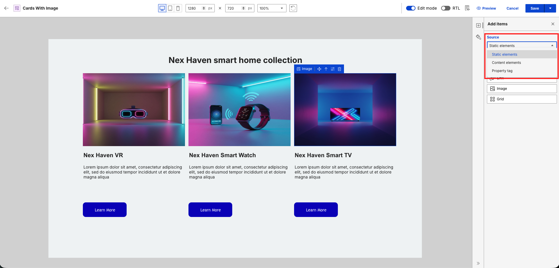
By default, the Add items panel displays static elements. To change the component source, select your preference from the Source dropdown menu.
Element actions
Hover over or select an element on the canvas to view its name and available actions:
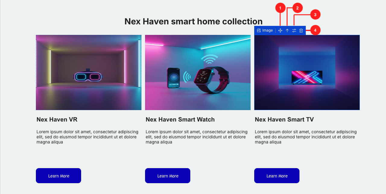
- Move icon: Rearrange the elements on the canvas through drag-and-drop.
- Arrow Up icon: Automatically select the parent of the current element.
- Configure icon: Display additional configuration options for the element.
- Trash icon: Delete the element from the canvas.
Element types
In Presentation Designer, user elements are divided into five categories:
Each category serves a different purpose and each user element comes with its own set of styling and configuration options.
Static elements
Static elements are predefined elements that display content exactly as it looks, ensuring a What You See Is What You Get (WYSIWYG) experience. After you add these elements in your presentation template, they will not change, even if you apply them to different content items. This consistency helps users create organized layouts with confidence, knowing that the design remains the same regardless of the content.
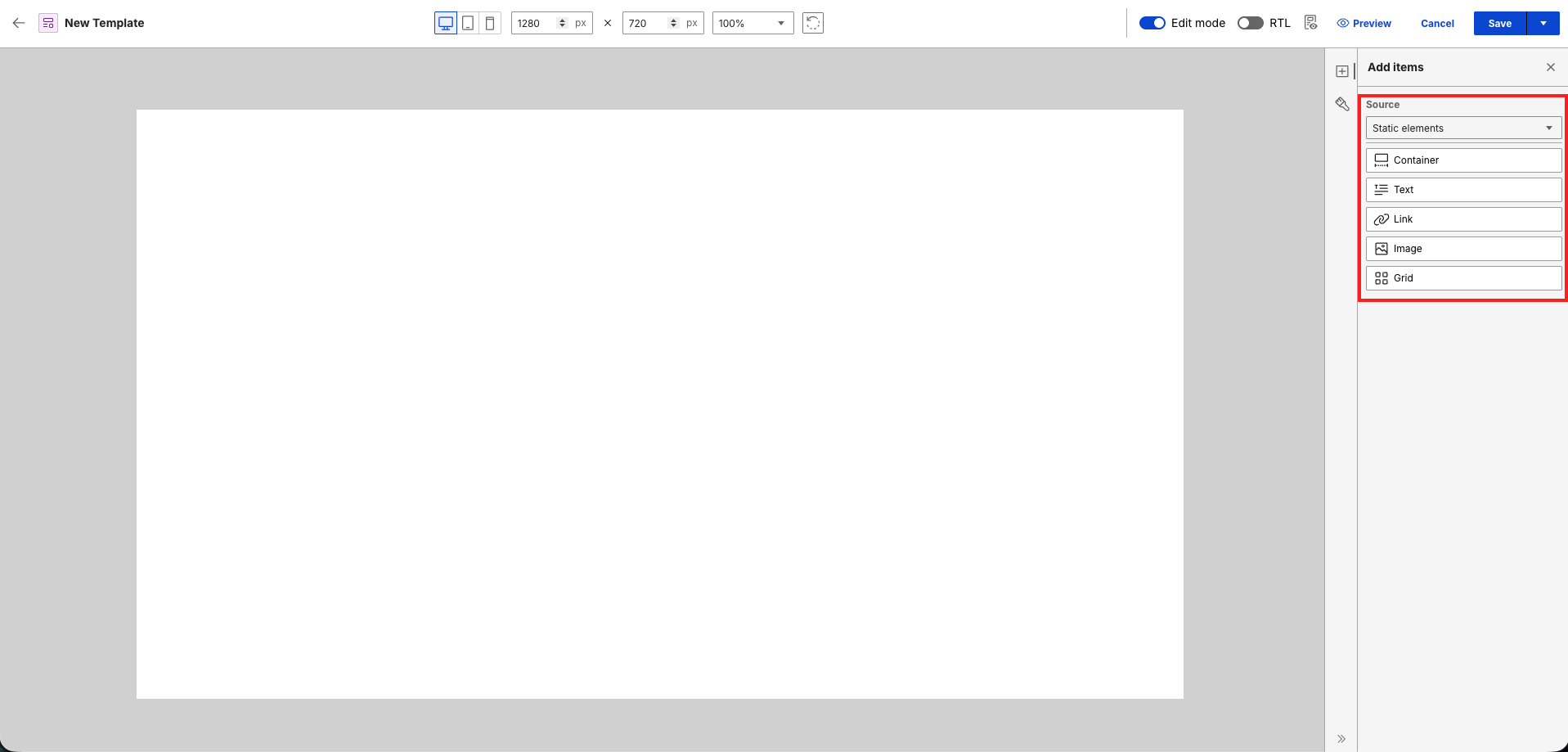
Container
The container element (<div>...</div>) serves as a foundational block for organizing and structuring content. This element allows users to group elements together. You can resize the container through the Style items panel by setting its width and height to fit different design needs. You can also apply other styling options to a container and add other user elements inside it.


Text
Static text elements (for example, <p>Content goes here</p>) are used to display text content which you can also edit on the canvas itself. These elements can include headers, paragraphs, and any other textual information. You can apply formatting and styling from the Style items panel to enhance readability and visual appeal. To edit the text content, click the text element and enter your desired text.

- The first line of text shows the placeholder text that appears when you drag and drop a static text element on the canvas.
- The second line of text is a static text element with actual text content after user input.
- The third line of text is a static text element with actual text content and applied styles.
Note
Placeholder text for the static text element is only a visual representation in Presentation Designer. It represents an empty value for the text content. The words "Static text element" is not saved in the actual markup.
Links
Static links (for example, <a href="https://example.com">Click Here</a>) enable users to create clickable hyperlinks to other websites or resources. You can edit the display text for the link element the same way as editing a text element. Different styling options are also available.

- The first line of text shows the default display text that appears when you drag and drop a static link element on the canvas.
- The second line of text shows the placeholder text that appears when you remove the default display text of the link element.
- The third line of text is a static link element with modified display text content after user input.
- The fourth line of text is a static link element with modified display text content and applied styles.
To set the href attribute, click the Configure button and enter the URL.

Note
When you click a static link element on the canvas, you will not be redirected to the configured URL. To test the link, preview the presentation template in the Authoring portlet.
Images
Static images (for example, <img src="image-url.jpg" alt="Description"/>) are used to render visuals from various sources. You can add images in Presentation Designer using a URL, or using the Digital Asset Management (DAM) feature of HCL DX:
- Drag an Image element onto the canvas.
- Select Configure on the element toolbar.
-
Select an option from the Asset source dropdown:
-
Import from URL: Enter the image path directly in the Add URL field. For example:
https://picsum.photos/id/106/300/200. -
HCL DAM:
Note
If the DAM picker is not configured or available in the environment, the HCL DAM source option appears disabled.
-
Choose the Select image button that appears.
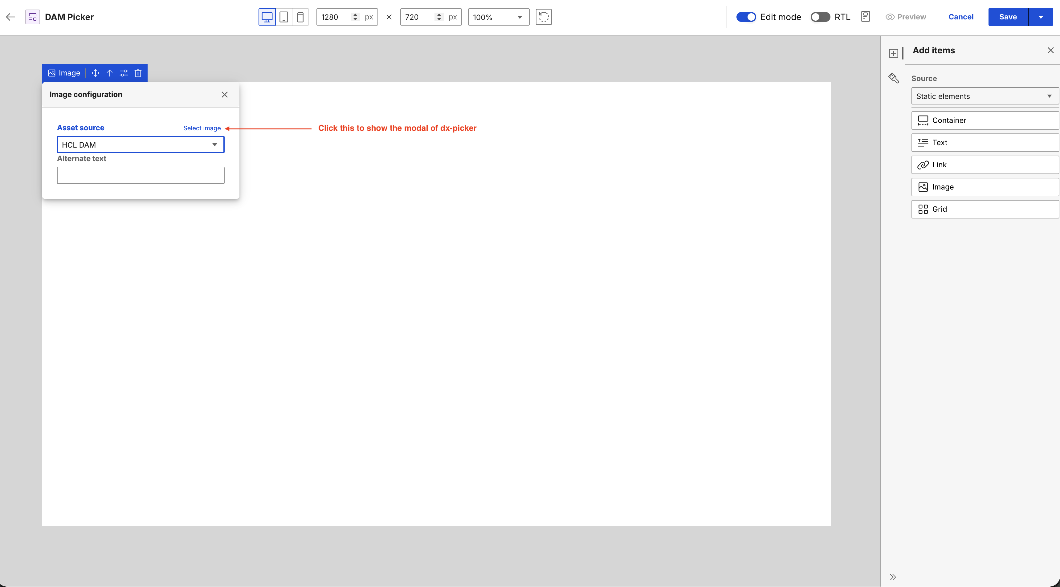
-
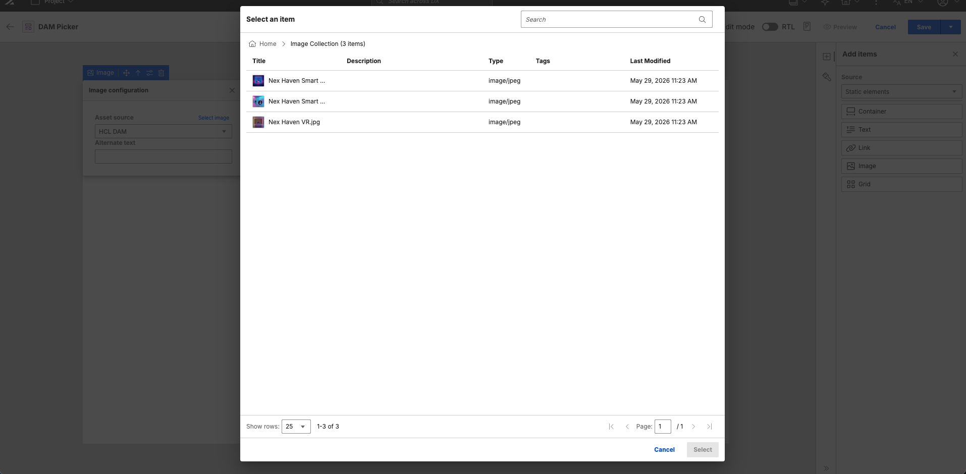
Browse and select an asset inside the DAM Picker dialog.
-
Choose Select to apply the image to the canvas.
-
-
-
(Optional) Enter an alternate text for the image in the Alternate text field.
Note
- The static image element displays a placeholder image icon when there is no image URL set. This placeholder is only a visual representation in Presentation Designer and no image source is saved.
- Switching the asset source back to URL clears DAM-specific values to prevent stale data.
- The selected image label displays only for DAM-compatible image URLs.
- Custom styles can be applied to DAM images through the Style items panel after selection.
Grid
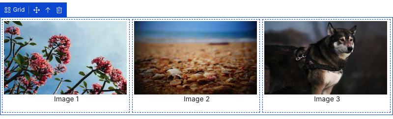
The Grid element (for example, <div class="grid">...</div>) allows for a structured layout of multiple elements in rows and columns. This element is useful for organizing content in a visually appealing way, enabling practitioners to customize the grid structure to fit their content needs.
To manage responsive layouts, you can customize row and column counts for each device context, configure Auto flow settings to control how content wraps on smaller screens, and apply layout changes dynamically using device-specific stylesheet media blocks (@media rules).
Note
The Grid element displays a 1 x 3 grid by default. You can adjust the number of rows and column in the Style items panel. Different styling options for the grid element are also available.
- Drag a Grid element onto the canvas.
-
Enter the following values in the Style items panel:
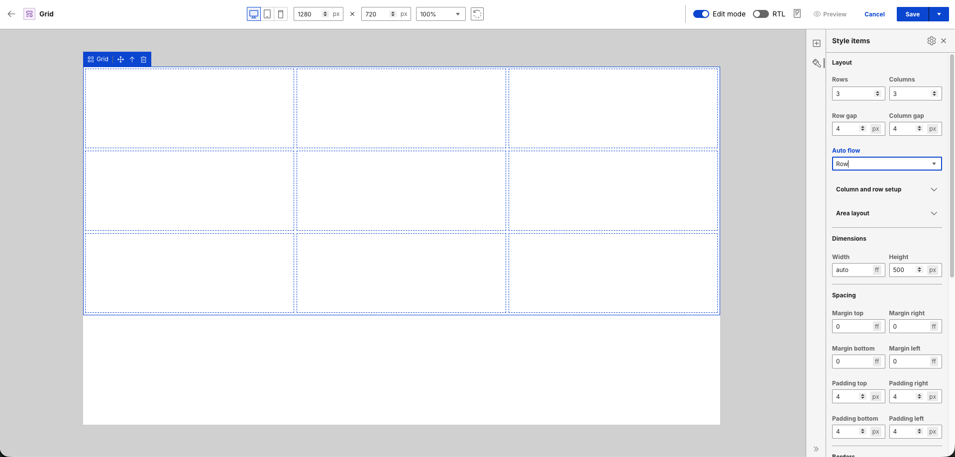
Layout
- Rows: 3
- Columns: 3
Dimensions
- Height: 500px
Spacing
- Padding top: 4px
- Padding right: 4px
- Padding bottom: 4px
- Padding left: 4px
-
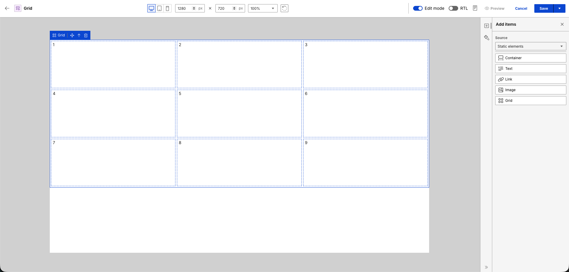
Add static text to each cell.
-
Configure the Auto flow and Area layout sections.
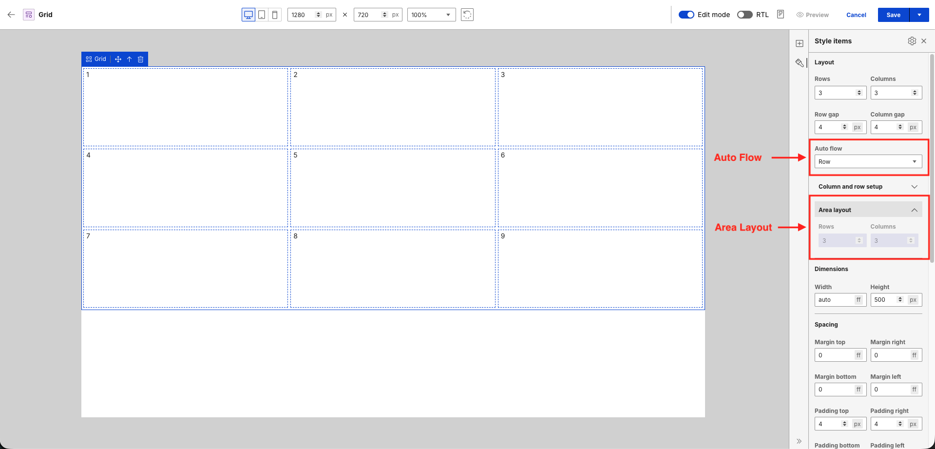
- Auto flow: Controls how grid elements are distributed within the layout. Options include Row, Column, Row dense, and Column dense.
- Area Layout: Provides a count-based layout override that automates responsiveness for Tablet and Mobile. It dynamically balances rows and columns based on the specified track count to keep cells uniform without manual calculations.
Device viewports
Grid properties adapt dynamically to the active device context. Use the viewport switcher at the top of the canvas to configure and preview how these settings behave across different screen sizes:
Desktop
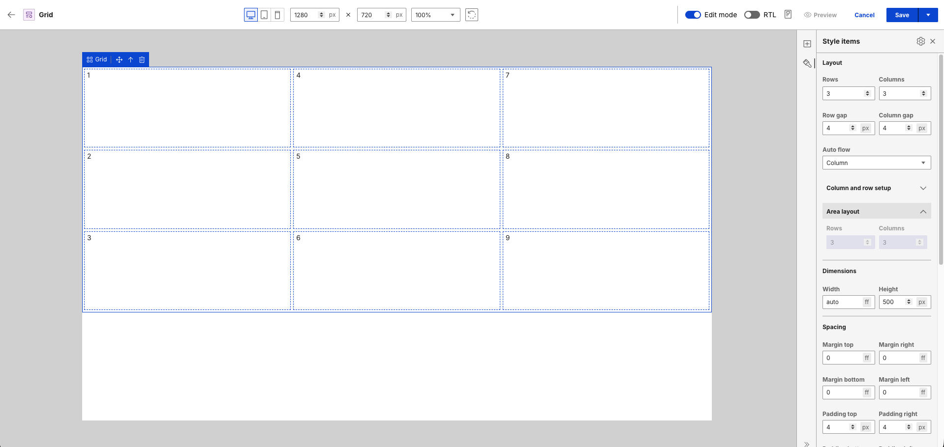
This view serves as the baseline layout. It disables the Area layout option and uses your primary Rows and Columns settings. Changing the Auto flow direction alters the sequence flow. For example:
Row sequences elements from left to right.
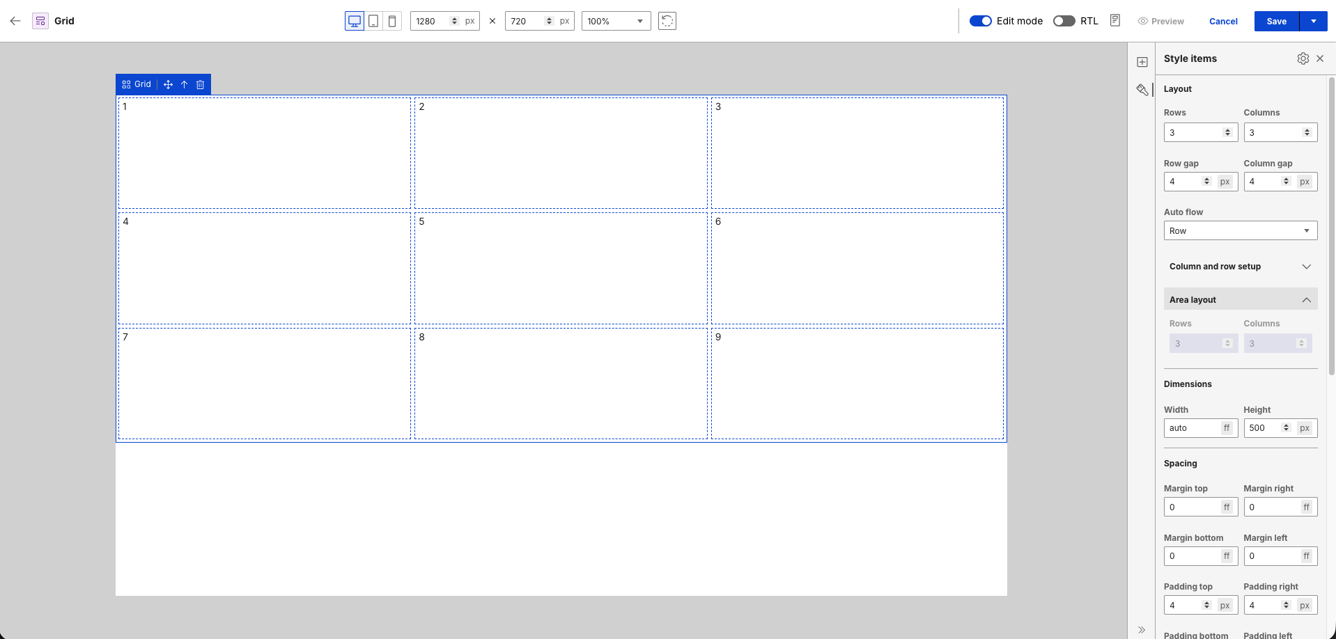
Column sequences elements from top to bottom.
Tablet
Switching to Tablet view enables Area layout, which initially inherits your baseline settings.
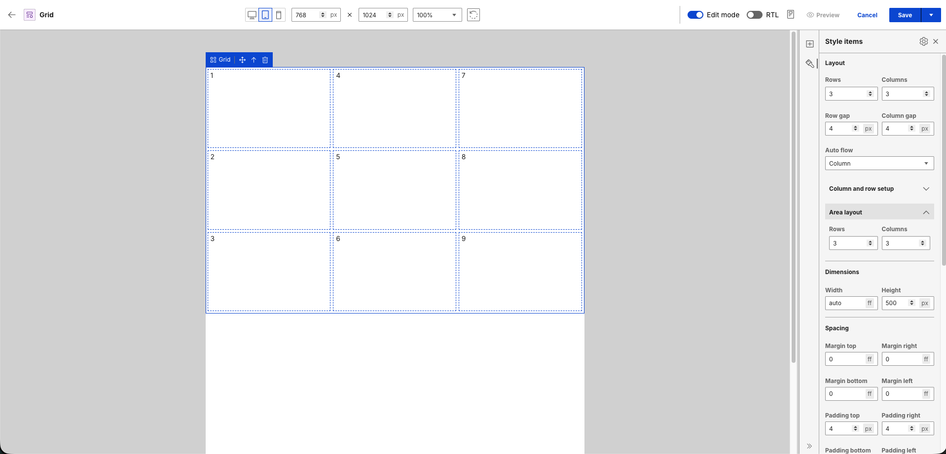
Changing either the Rows or Columns count automatically recalculates the opposite value to maintain a uniform layout balance. For example, reducing Rows to
2automatically scales Columns to5to balance the remaining cells uniformly.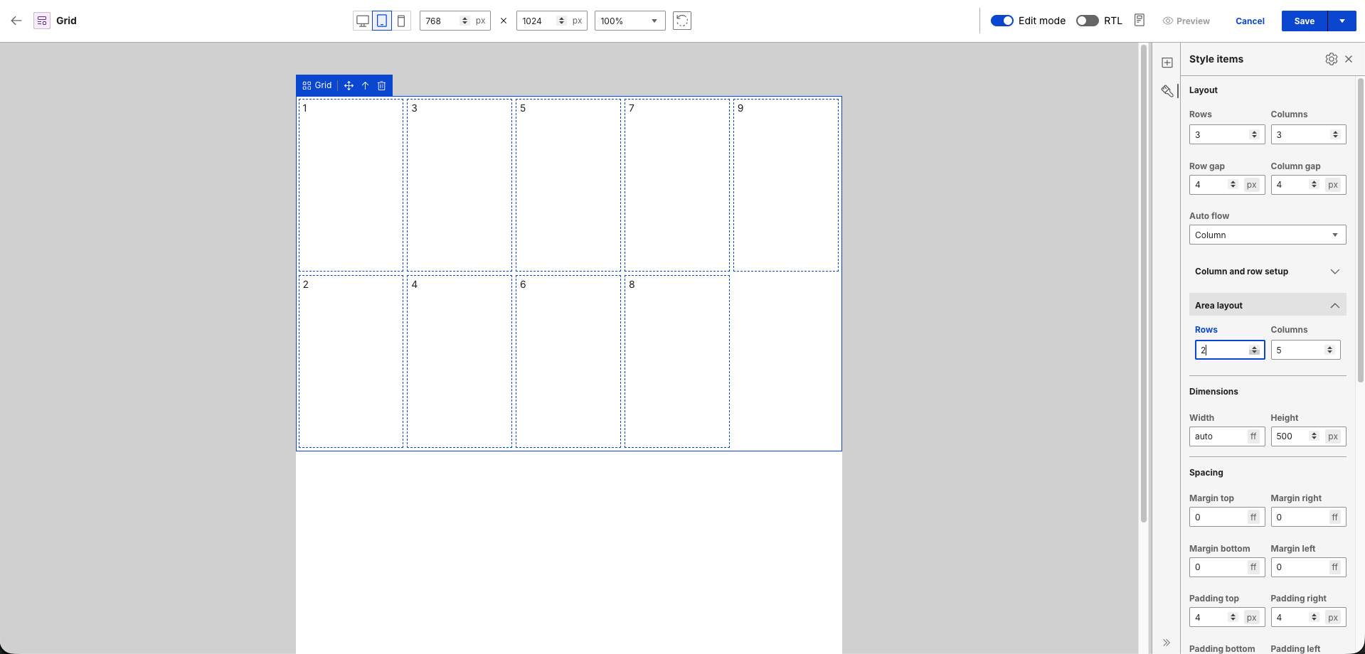
Mobile
Switching to Mobile view resets properties to the Desktop baseline. Adjustments made in Tablet view do not carry over.
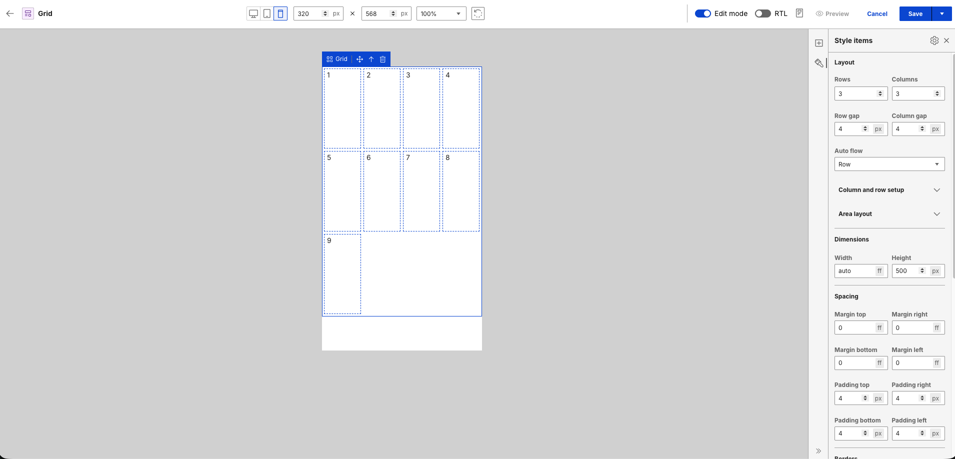
Reducing the Columns count forces the grid tracks to recalculate and stack content vertically for smaller screens. For example, changing Columns to
1automatically updates Rows to9.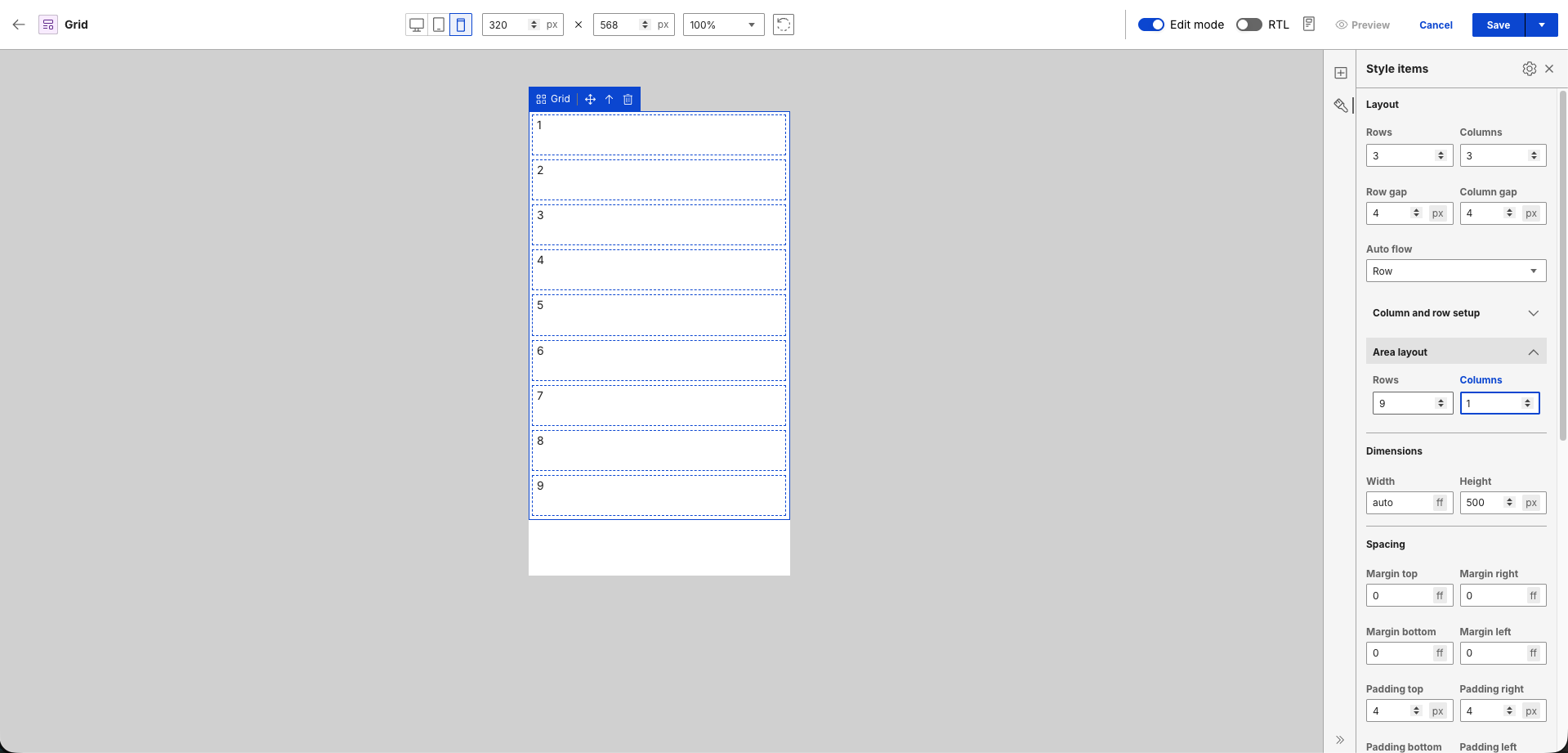
Note
- Area layout values calculate automatically from device-specific row and column settings.
- In Tablet and Mobile views, Area layout overrides rows and columns without modifying the baseline Desktop configuration.
- Layout modifications saved within a specific device context persist independently without affecting other viewports.
Content elements
Content elements (for example, [Element context="current" type="content" key="Element name"]) are elements from a content template. You can search for a content template from which you want to pick elements from. Placeholders are rendered on the canvas in place of the elements.
After setting the element source to Content elements, no elements are initially loaded because no content template has been selected yet.
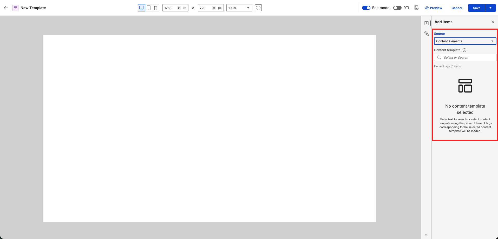
To load the elements, search for a content template in the Content template field and select your desired template.
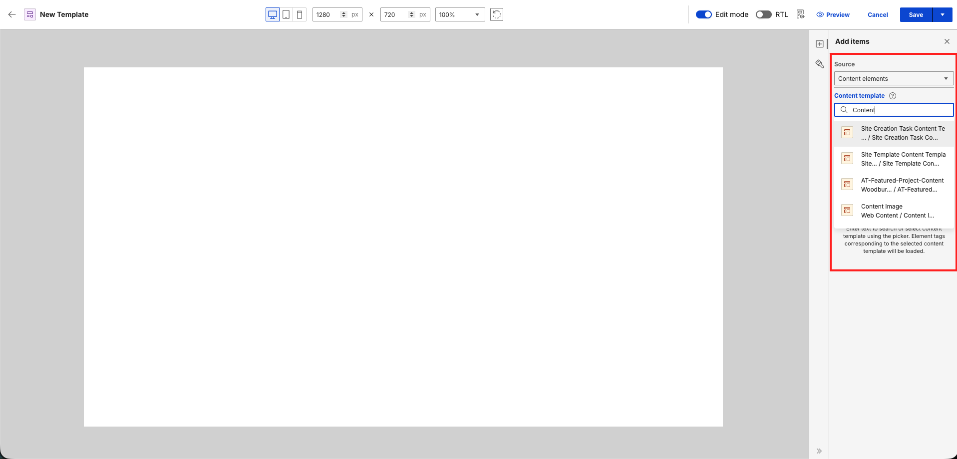
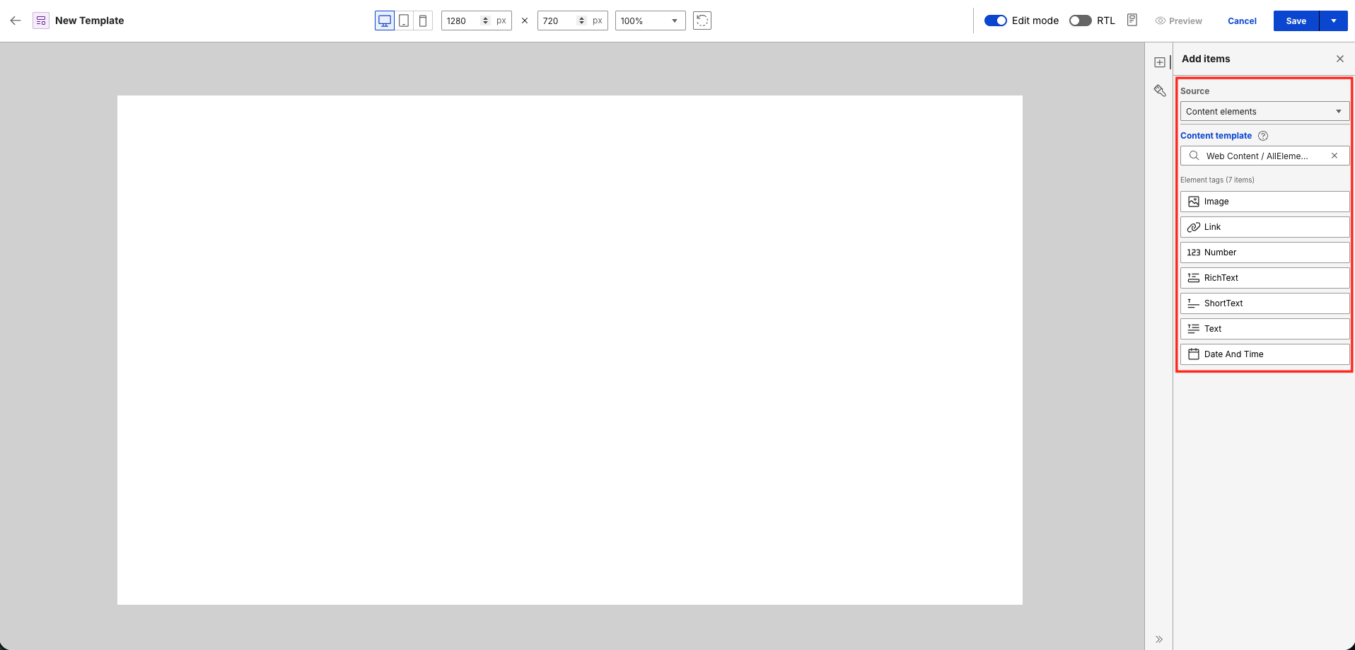
After selecting a content template, it automatically pulls the supported elements from the content template. Each element tag uses the element's display title that is set from the content template.
After you drag and drop an element on the canvas, a placeholder representing the element appears. You cannot edit placeholders in Presentation Designer as the actual display value comes from the content item.
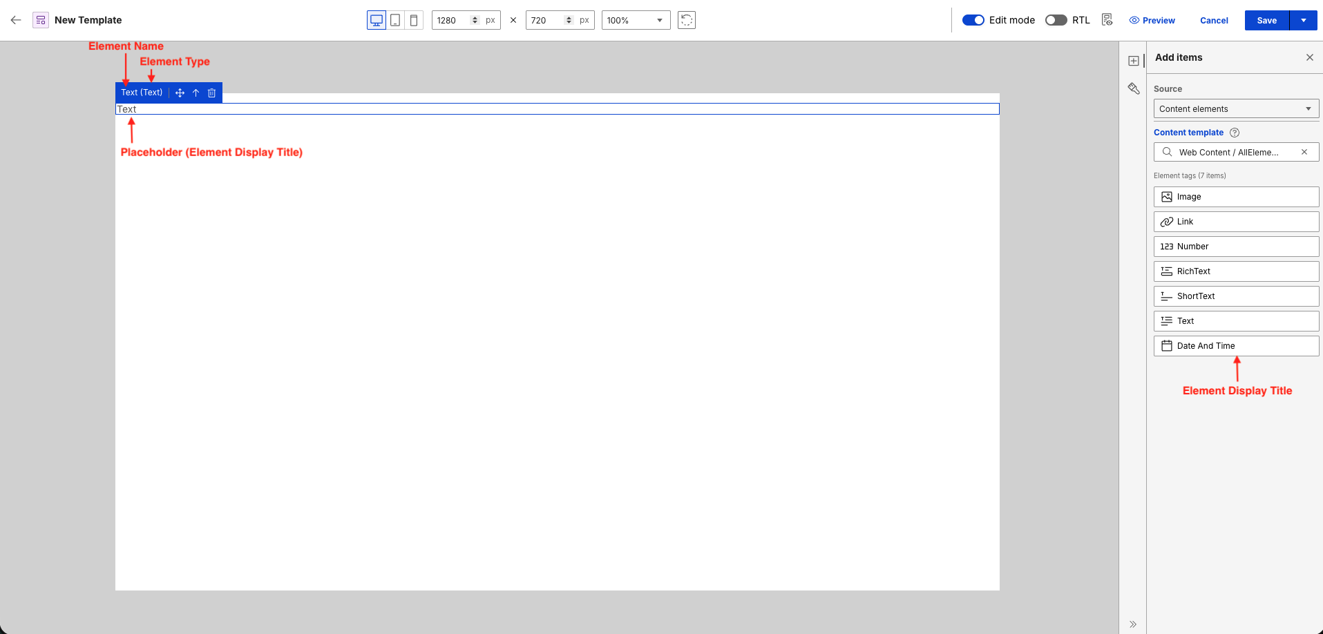
In Presentation Designer, the <p></p> tag wrapper for the element tag is added with the type attribute to determine the element type. Element tags (for example, [Element context="current" type="content" key="Element name"]) use the element name as key and authors can set any element name in a content template. This could produce inconsistencies if Presentation Designer needs to rely on the element tag to determine the element type.

For more information on element tags in the Authoring portlet, refer to Element tag.
Presentation Designer supports the following content elements:
-
Text elements
Text elements (Text, Rich Text, Short Text, Date and Time, Number) represent text content and the value changes based on the content item. In Presentation Designer, the element’s display title from the content template is the placeholder text that appears on the canvas except for Date and Time and Number elements that have their own assigned placeholder value.
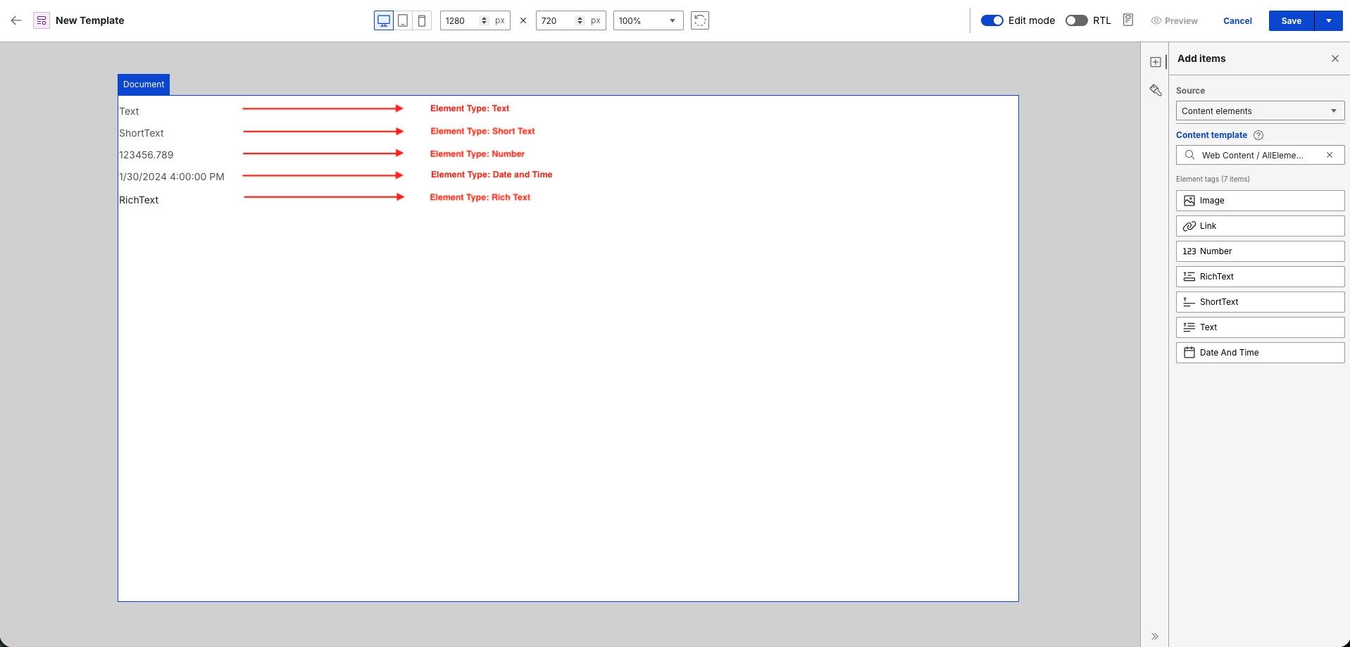
You can apply different styling options to the placeholder of the text elements except for Rich Text. Rich Text elements are set with their own styling in the content item.
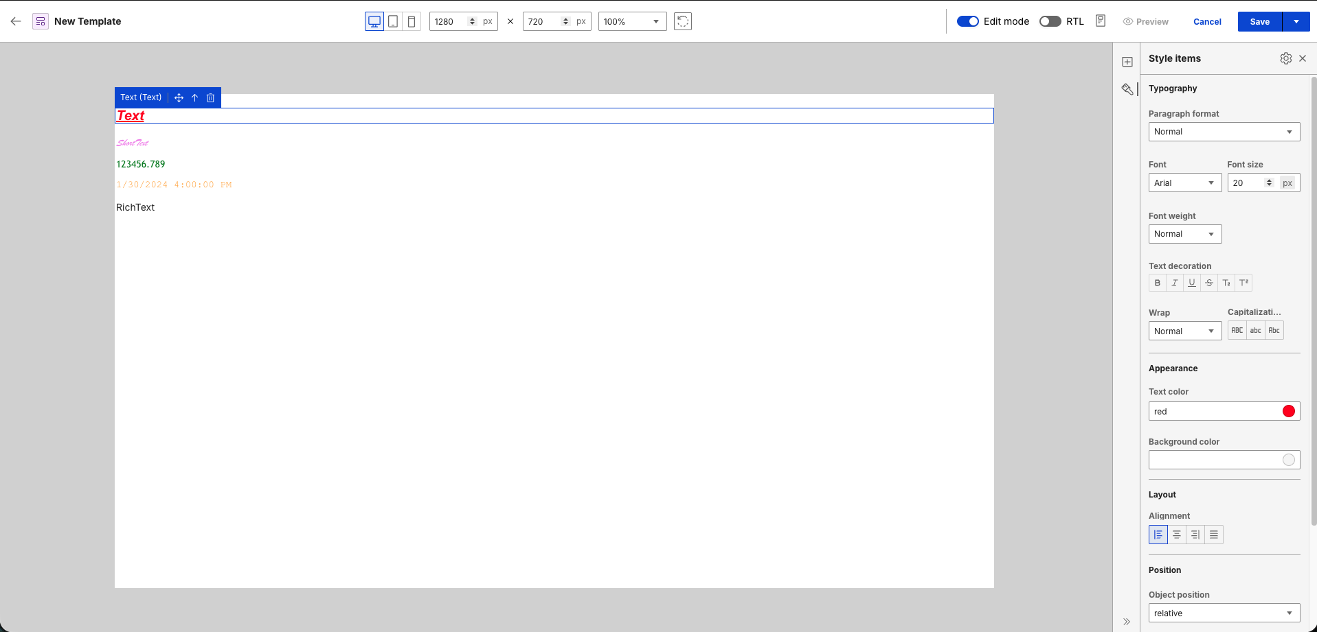
These styles are stored in the
<p></p>tag style attribute. See the styled placeholder Short Text element and the markup generated after saving in the following images:

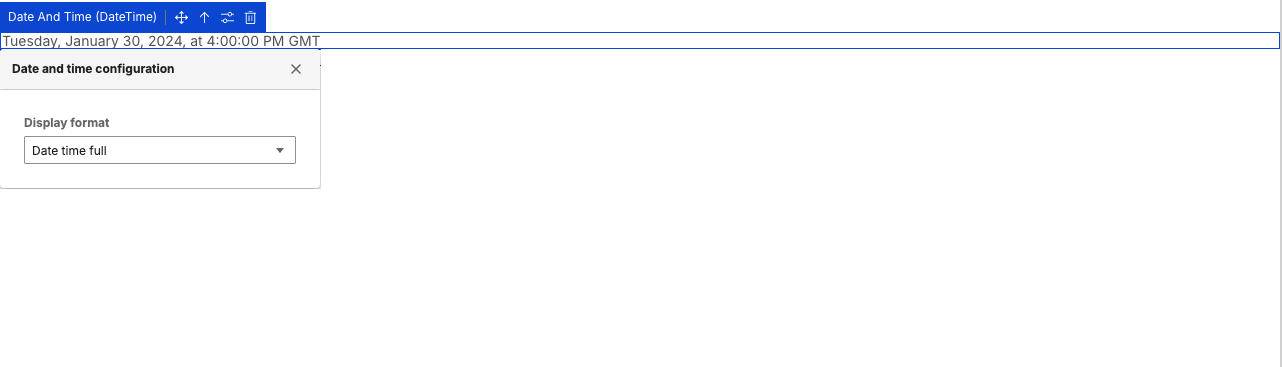
Formatting options are also available for Number and Date and Time elements. The format is visually reflected on the placeholder value and is stored in the format parameter for the Element tag after saving.
Number Format Date and Time Format 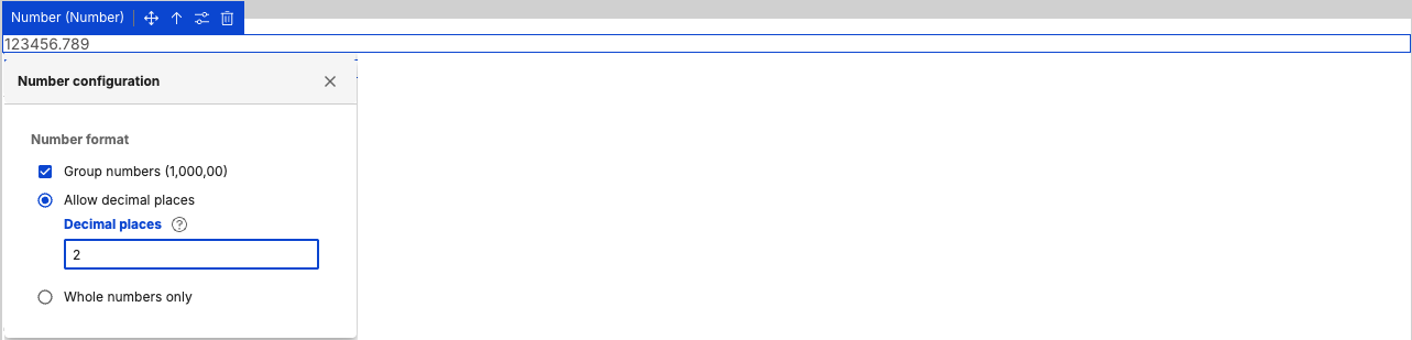

-
Image elements
An image content element represents an actual image. A placeholder image icon is displayed in Presentation Designer and the image source and image attributes (for example, width and height) set in the content item are followed in the preview.

-
Link elements
A link content element represents a hyperlink, which is a connection or reference to another resource depending on what is set on the content item. In Presentation Designer, a placeholder text using the element's display title is shown. You can apply styling options to the placeholder text through the Style items panel, similar to text content elements.

Property tags
Property tags (for example, [Property context="current" type="content" field="title"]) are used to display metadata from content items such as Title, Name, Description, and Last modified date. In Presentation Designer, placeholders are rendered on the canvas for property tags with different styling options available. The actual value changes depending on the content item.
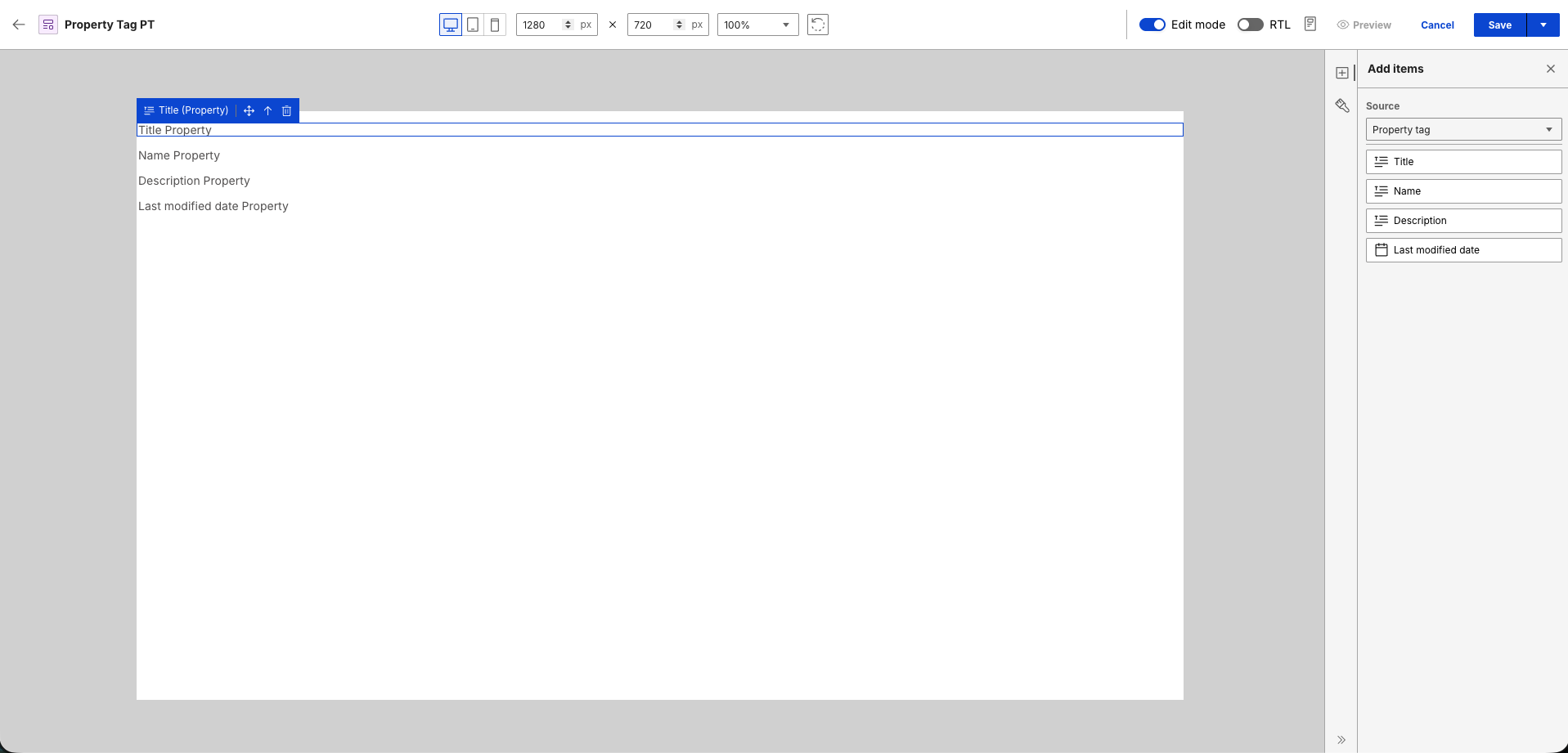
These styles are stored in the <p></p> tag style attribute. See the styled placeholder Property tags:
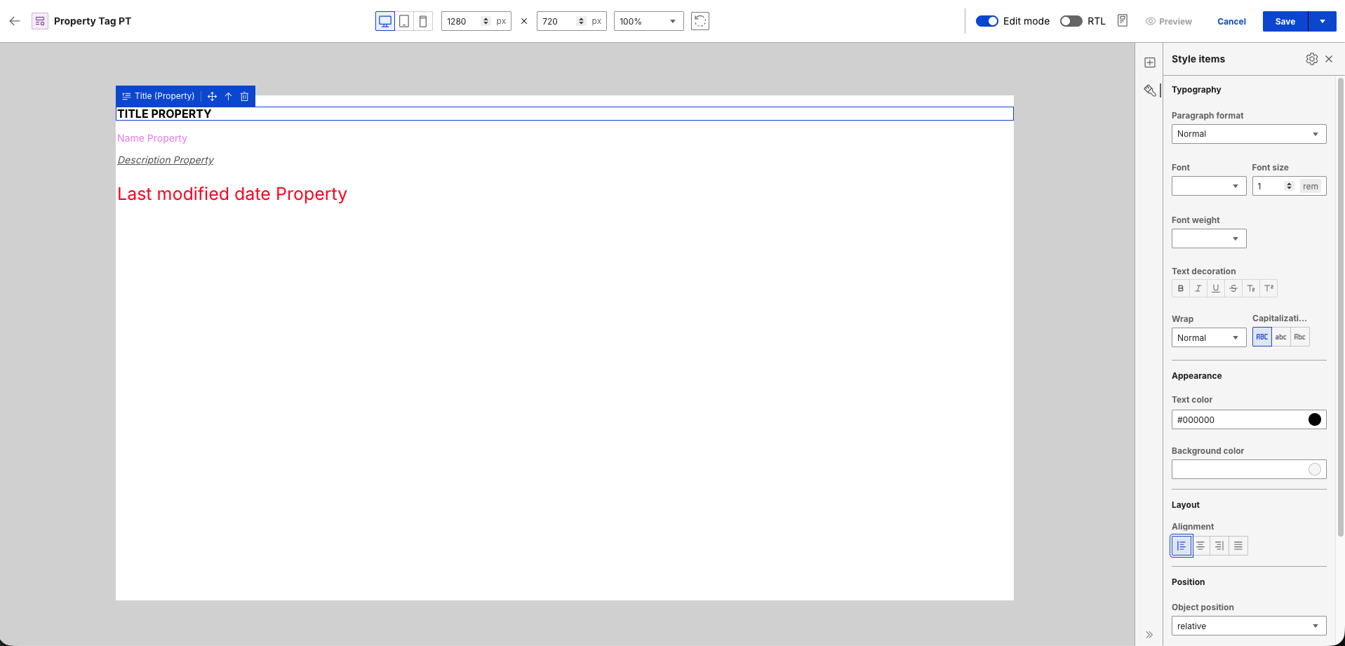
See the following sample markup generated after saving:

For more information on property tags in the Authoring portlet, refer to Property tag.
Generic element tags
Generic element tags are element tags added in a presentation template using the Insert Element Tags from the Authoring portlet.
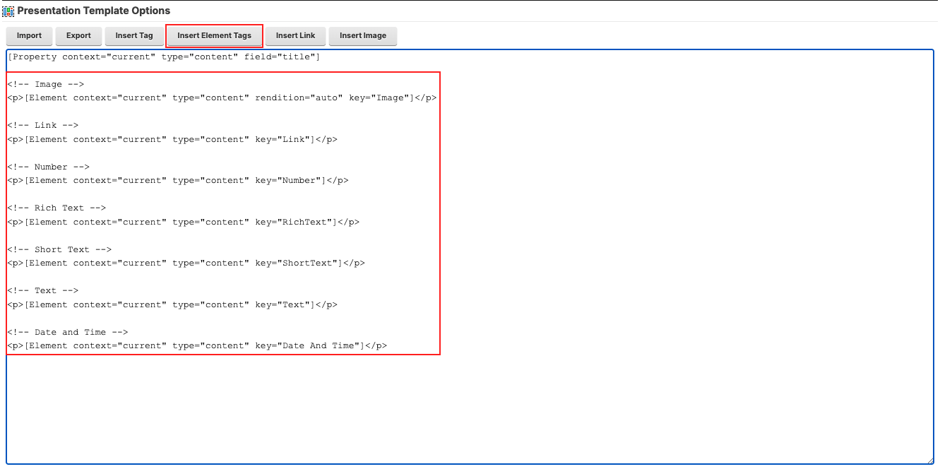
When editing a presentation template that has a generic element tag in Presentation Designer, a placeholder text of the element name is rendered on the canvas.

You can configure the element and assign an element type. Click the Configure button to see the dropdown selection for the element type:
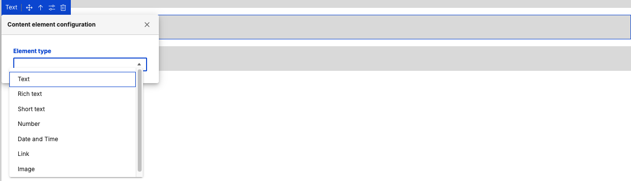
In the following example, Text is selected as an element type, converting the generic element to a Text Content Element.

With the generic element converted into a Text Content Element, you can now apply styling options to the placeholder text from the Style items panel.
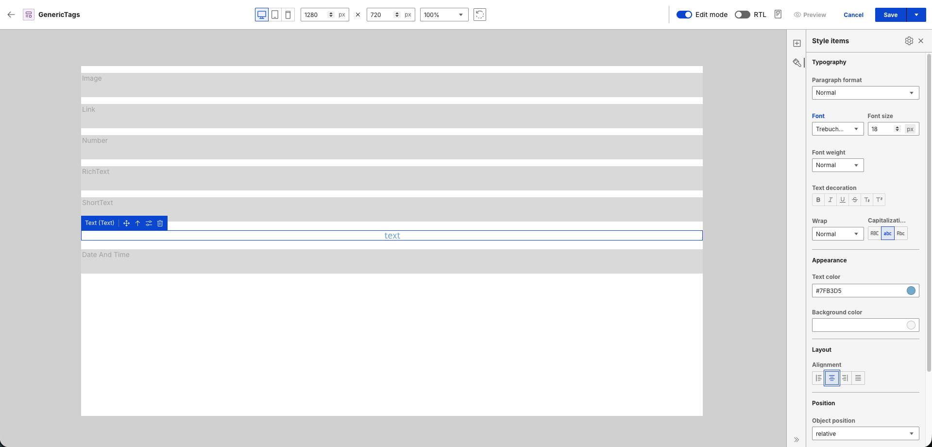
See the markup generated after saving:
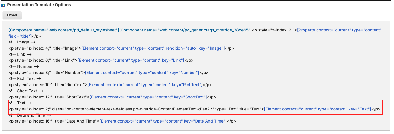
For more information on element tags in the Authoring portlet, refer to Element tag.
Generic tags
Generic tags are any other web content tags that are added in a presentation template using the Insert Tag from the Authoring portlet.

When editing a presentation template that has a generic tag in Presentation Designer, a placeholder is rendered on the canvas to represent each tag. This makes users aware that there are other tags present when editing the presentation template in Presentation Designer.

For more information on web content tags in the Authoring portlet, refer to Creating web content tags.