ComboBox Properties
The properties of ComboBox Widget are as follows:
accessibilityConfig Property
Enables you to control accessibility behavior and alternative text for the widget.
For more information on using accessibility features in your app, see the Accessibility appendix in the Volt MX IrisUser Guide.
Syntax
accessibilityConfig
Type
Object
Read/Write
Read + Write
Remarks
- The accessibilityConfig property is enabled for all the widgets which are supported under the Flex Layout.
Note: From Volt MX Iris V9 SP2 GA version, you can provide i18n keys as values to all the attributes used inside the
accessibilityConfigproperty. Values provided in the i18n keys take precedence over values provided ina11yLabel,a11yValue, anda11yHintfields.
The accessibilityConfig property is a JavaScript object which can contain the following key-value pairs.
| Key | Type | Description | ARIA Equivalent |
|---|---|---|---|
| a11yIndex | Integer with no floating or decimal number. | This is an optional parameter. Specifies the order in which the widgets are focused on a screen. | For all widgets, this parameter maps to the aria-index, index, or taborder properties. |
| a11yLabel | String | This is an optional parameter. Specifies alternate text to identify the widget. Generally the label should be the text that is displayed on the screen. | For all widgets, this parameter maps to the aria-labelledby property of ARIA in HTML. > Note: For the Image widget, this parameter maps to the alt attribute of ARIA in HTML. |
| a11yValue | String | This is an optional parameter. Specifies the descriptive text that explains the action associated with the widget. On the Android platform, the text specified for a11yValue is prefixed to the a11yHint. | This parameter is similar to the a11yLabel parameter. If the a11yValue is defined, the value of a11yValue is appended to the value of a11yLabel. These values are separated by a space. |
| a11yHint | String | This is an optional parameter. Specifies the descriptive text that explains the action associated with the widget. On the Android platform, the text specified for a11yValue is prefixed to the a11yHint. | For all widgets, this parameter maps to the aria-describedby property of ARIA in HTML. |
| a11yHidden | Boolean | This is an optional parameter. Specifies if the widget should be ignored by assistive technology. The default option is set to false. This option is supported on iOS 5.0 and above, Android 4.1 and above, and SPA | For all widgets, this parameter maps to the aria-hidden property of ARIA in HTML. |
| a11yARIA | Object | This is an optional parameter. For each widget, the key and value provided in this object are added as the attribute and value of the HTML tags respectively. Any values provided for attributes such as aria-labelledby and aria-describedby using this attribute, takes precedence over values given in a11yLabel and a11yHint fields. When a widget is provided with the following key value pair or attribute using the a11yARIA object, the tabIndex of the widget is automatically appended as zero.{"role": "main"}``aria-label |
This parameter is only available on the Desktop Web platform. |
Android limitations
- If the results of the concatenation of a11y fields result in an empty string, then
accessibilityConfigis ignored and the text that is on widget is read out. - The soft keypad does not gain accessibility focus during the right/left swipe gesture when the keypad appears.
SPA/Desktop Web limitations
- When
accessibilityConfigproperty is configured for any widget, thetabIndexattribute is added automatically to theaccessibilityConfigproperty. - The behavior of accessibility depends on the Web browser, Web browser version, Voice Over Assistant, and Voice Over Assistant version.
- Currently SPA/Desktop web applications support only a few ARIA tags. To achieve more accessibility features, use the attribute a11yARIA. The corresponding tags will be added to the DOM as per these configurations.
Example 1
This example uses the button widget, but the principle remains the same for all widgets that have an accessibilityConfig property.
//This is a generic property that is applicable for various widgets.
//Here, we have shown how to use the accessibilityConfig Property for button widget.
/* You need to make a corresponding use of the accessibilityConfig property for other applicable widgets. */

Form1.myButton.accessibilityConfig = {
    "a11yLabel": "Label",
    "a11yValue": "Value",
    "a11yHint": "Hint"
};
Example 2
This example uses the button widget to implement internationalization in accessibilityConfig property, but the principle remains the same for all widgets.
/*Sample code to implement internationalization in accessibilityConfig property in Native platform.*/

Form1.myButton.accessibilityConfig = {
    "a11yLabel": voltmx.i18n.getLocalizedString("key1")
};
/* Sample code to implement internationalization in accessibilityConfig property in Desktop Web platform. */

Form1.myButton.accessibilityConfig = {
    "a11yLabel": "voltmx.i18n.getLocalizedString(\"key3\")"
};
Platform Availability
- Available in the IDE
- iOS, Android, SPA, and Desktop Web
anchorPoint Property
Specifies the anchor point of the widget bounds rectangle using the widget's coordinate space.
Syntax
anchorPoint
Type
JSObject
Read/Write
Read + Write
Remarks
The value for this property is a JavaScript dictionary object with the keys "x" and "y". The values for the "x" and "y" keys are floating-point numbers ranging from 0 to 1. All geometric manipulations to the widget occur about the specified point. For example, applying a rotation transform to a widget with the default anchor point causes the widget to rotate around its center.
The default value for this property is center ( {"x":0.5, "y":0.5} ), that represents the center of the widgets bounds rectangle. The behavior is undefined if the values are outside the range zero (0) to one (1).
Example
Form1.widget1.anchorPoint = {
    "x": 0.5,
    "y": 0.5
};
Platform Availability
- iOS, Android, Windows, and SPA
blockedUISkin Property
Specifies the skin that must be used to block the interface until the action in progress (for example, a service call) is completed.
Syntax
blockedUISkin
Type
String
Read/Write
Read + Write
Remarks
The default value for this property is none. That means no skin is applied. To specify a skin, select a skin from the list.
Note: For the skin to be available in the list, you must add a skin for Blocked UI under Widget Skins.
Example
//Sample code to set the blockedUISkin property for a ComboBox Widget.
frmCombobox.myCombobox.blockedUISkin="blockUiSkn";
Platform Availability
- Available in the IDE
- SPA (iPhone/Android/BlackBerry/Windows NTH)
contentAlignment Property
This property specifies the alignment of the text on the widget with respect to its boundaries.
Syntax
contentAlignment
Type
Number
Read/Write
Read+Write
Remarks
The default value for the property is CONTENT_ALIGN_CENTER.
The following are the available options:
- constants.CONTENT_ALIGN_TOP_LEFT
- constants.CONTENT_ALIGN_TOP_CENTER
- constants.CONTENT_ALIGN_TOP_RIGHT
- constants.CONTENT_ALIGN_MIDDLE_LEFT
- constants.CONTENT_ALIGN_CENTER
- constants.CONTENT_ALIGN_MIDDLE_RIGHT
- constants.CONTENT_ALIGN_BOTTOM_LEFT
- constants.CONTENT_ALIGN_BOTTOM_CENTER
- constants.CONTENT_ALIGN_BOTTOM_RIGHT
Limitations
Desktop Web/ SPA platforms do not support contentAlignment property in Camera widget, ComboBox widget and ListBox widget.
Example
 /* Sample code to set the contentAlignment property of the widgetID Button widget in frmHome Form. */

frmHome.widgetID.contentAlignment=constants.CONTENT_ALIGN_TOP_LEFT;
Platform Availability
- Available in IDE
- Available on all platforms
dropDownImage Property
Specifies the image to be used for the drop-down box indicator. This is an inverted triangle by default. If you do not specify an image, the drop-down box displays the default image.
Syntax
dropDownImage
Type
String/image object
Read/Write
No
Remarks
For iOS platform, the drop down image should be 20px * 33px for non retina devices and for retina devices the image size should be 40px * 66px.
Example
Using a locally defined image:
//Sample code to set the dropDownImage property for a ComboBox Widget.
frmCombobox.myCombobox.dropDownImage="ddimage.png";
Using an image object (voltmx.image):
//Sample code to set the dropDownImage property for a ComboBox Widget using Image Object

var imgObjRef = voltmx.image.createImage("local.png");
frmCombobox.myCombobox.dropDownImage=imgObjRef;
Platform Availability
- Available in the IDE
- iOS
- BlackBerry
enable Property
The enable property is used to control the actionability of the widgets. In a scenario where you want to display a widget but not invoke any action on the widget, configure the enable property to false to achieve it.
This is a constructor level property and applicable for all widgets in Volt MX Iris.
Syntax
enable
Type
Boolean
Read/Write
Read + Write
Remarks
The default value of this property is true.
When enable property is configured to true, the action associated with a widget can be invoked by the user in the application.
When enable property is configured to false, the action associated with a widget cannot be invoked by the user in the application.
Example
//This is a generic property and is applicable for many widgets.

/* The example provided is for the Button widget. Make the changes required in the example while using other widgets. */

frmButton.myBtn.enable= true;
Platform Availability
- Android, iOS, Windows, SPA, and Desktop web
enableCache Property
The property enables you to improve the performance of Positional Dimension Animations.
Syntax
enableCache
Type
Boolean
Read/Write
Read + Write
Remarks
The default value for this property is true.
Note: When the property is used, application consumes more memory. The usage of the property enables tradeoff between performance and visual quality of the content. Use the property cautiously.
Example
Form1.widgetID.enableCache = true;
Platform Availability
- Available in the IDE.
- Windows
focusSkin Property
Specifies the look and feel of the ComboBox when in focus.
Syntax
focusSkin
Type
String
Read/Write
Read + Write
Remarks
In Desktop Web platform, Chrome browser does not support if the properties defined in font tab are different for skin and focusSkin.
Note: You must be aware of the following:
1. On J2ME non-touch devices, if you do not specify the focusSkin, it is not possible to identify the focus change between the widgets.
2. Mobile Web does not support this property, instead browser specific focus will be applied.
3. On Windows Platform, focusSkin is applied only to the selected item, but not to the entire widget when in focus.
Example
//Sample code to set the focusSkin property for a ComboBox Widget.

frmCombobox.myCombobox.focusSkin="comboFSkin";
Platform Availability
- Available in the IDE
- Available on all platforms
groupCells Property
Specifies if the group cells style must be applied.
Syntax
groupCells
Type
Boolean
Read/Write
No
Remarks
The default value for this property is false. This property is applicable only when viewType is set as COMBOBOX_VIEW_TYPE_TABLEVIEW.
Example
//Sample code to enable the groupCells property for a ComboBox Widget.

frmCombobox.myCombobox.groupCells=true;
Platform Availability
- Available in the IDE
- iPad
- iPhone
hoverSkin Property
Specifies the look and feel of a widget when the cursor hovers on the widget.
Syntax
hoverSkin
Type
String
Read/Write
Read + Write
Example
Setting the hoverSkin property on an existing widget
FormHover.widgetID.hoverSkin="theHoverSkin";
//the Hover Skin is a hover skin created under Skins tab
Note: To apply hoverSkin for dynamically created widgets or cloned widgets, assign hoverSkin dynamically after adding the widget to the form hierarchy. This is applicable for the Desktop web platform.
formid.widgetid.hoverSkin = "skinname";
Platform Availability
- Available in the IDE
- Windows
id Property
id is a unique identifier of button consisting of alpha numeric characters. Every ComboBox should have a unique id within an Form.
Syntax
id
Type
String - [Mandatory]
Read/Write
Read + Write
Example
//Defining the properties for ComboBox with the id:"combobox1"
var comboBasic = {
    id: "combobox1",
    isVisible: true
};

var comboLayout = {
    containerWeight: 100
};

var comboPSP = {};

//Creating the ComboBox.
combo = new voltmx.ui.ComboBox(comboBasic, comboLayout, comboPSP);

//Reading the id of the ComboBox
alert("ComboBox ID is ::" + combo.id);
Platform Availability
- Available in the IDE
- Available on all platforms
info Property
A custom JSObject with the key value pairs that a developer can use to store the context with the widget. This will help in avoiding the globals to most part of the programming.
Syntax
info
Type
JSObject
Read/Write
Read + Write
Remarks
This is a non-Constructor property. You cannot set this property through widget constructor. But you can read and write data to it.
Info property can hold any JSObject. After assigning the JSObject to info property, the JSObject should not be modified. For example,
var inf = {
    a: 'hello'
};
widget.info = inf;

//works
widget.info.a = 'hello world';

/*This will not update the widget info a property to Hello world.
widget.info.a will have old value as hello.*/
Example
//Sample code to set info property for a ComboBox widget

frmCombobox.myCombobox.info = {
    key: "comboboxitems"
};

//Reading the info of the CollectionView widget.
voltmx.print("Combobox widget info:" +frmCombobox.myCombobox.info);
Platform Availability
- Not available in the IDE
- Available on all platforms
inputAccessoryViewType Property
While building iPhone applications that support or provide text input, it is necessary to create some extra buttons (or other controls) beyond the ones provided by the default keyboard interface. Volt MX AppPlatform by default, adds the Previous, Next, and Done buttons to the applicable input controls. These buttons allow specific operations needed by your application, such as moving to the next or previous text field, making the keyboard disappear and so on. The area above the keyboard is known as Input Accessory View.
Syntax
inputAccessoryViewType
Type
Number
Read/Write
Yes
Remarks
The default value for this property is COMBOBOX_INPUTACCESSORYVIEW_DEFAULT.
This property, allows you to specify the type of accessory view that will be shown for all the input controls for Combobox widget.
Note: For iOS, a header with 'Prev' and Next' buttons is added to the keypad by default. You can turn off this header at three levels: application-level, form-level, and widget-level.
To know more about how to set inputAccessoryViewType property at application-level and form-level, you can refer the inputAccessoryViewType property under Flexform widget.
To turn on/off the header at widget-level, assign any of the following constants to the inputAccessoryViewType property. You must specify each constant with the ‘constants.xx’ prefix.
- COMBOBOX_INPUTACCESSORYVIEW_NONE: Use this option if you do not want to specify the toolbar. This option should be used carefully, as setting this option for widgets like calendar leaves the user with no option to select and drop-down like a wheel calendar.
- COMBOBOX_INPUTACCESSORYVIEW_DEFAULT:Specifies that the toolbar that is defined in the Application level settings. To set the Application level settings, right-click on the project and navigate to Properties> Native App>iPhone/iPad.
-
COMBOBOX_INPUTACCESSORYVIEW_NEXTPREV: Specifies the navigation options as Next, Previous, and Done for a form.
-
COMBOBOX_INPUTACCESSORYVIEW_CANCEL: Specifies that the input accessory view has a Cancel button. This constant does not trigger any events.
Example
//Sample code to set the inputAccessoryViewType property for a ComboBox Widget.

frmCbox.myCbox.inputAccessoryViewType=constants.COMBOBOX_INPUTACCESSORYVIEWTYPE_DEFAULT;
Platform Availability
- Available in the IDE
- iPhone
- iPad
isVisible Property
This property controls the visibility of a widget on the form.
Syntax
isVisible
Type
Boolean
Read/Write
Read + Write
Remarks
The default value for this property is true.
You can set the visibility of a widget dynamically from code using the setVisibility method.
Example
//Sample code to set the isVisible property for a ComboBox Widget.

frmCombobox.myCombobox.isVisible=true;
Platform Availability
- Available in the IDE
- Available on all platforms
lockTextScroll Property
This property allows you to enable/disable the horizontal scrolling for the selected item in the ComboBox Widget.
Syntax
lockTextScroll
Type
Boolean
Read/Write
Read + Write
Remarks
The default value for this property is false.
If set to true, the scrolling for the selected item is disabled. If set to false, the scrolling for the selected item is enabled.
Example
//Sample code to enable the lockTextScroll property for a ComboBox Widget.

frmCombobox.myCombobox.lockTextScroll=true;
Platform Availability
- Not available in the IDE
- This property is available on Windows Phone 8/8/1 platforms
masterData Property
Specifies the set of values that must be displayed for the user to make a selection from the available choices.
Syntax
masterData
Type
Array
Read/Write
Read + Write
Remarks
The default value for this property is user defined. You must specify the key and the display value
To specify the set of values, click the Ellipsis ( ) button against the property to open the MasterData for ComboBox window.
In the Master Data window, you can specify the Key, Display Value, i18n Key, and the Accessibility Config. You can use the Selected column to specify the choice to be shown as selected when rendered. You can do this by selecting true against the choice that you wish to show as selected.
If the key or the display value is nil, the value will not be listed as one of the available choices.
The following image illustrates the MasterData for ComboBox window:
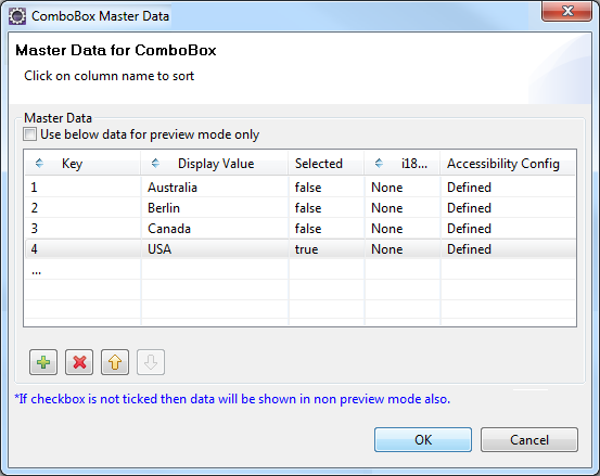
Note: Select the Use as test data in preview mode option if you want to see the data you enter in the Master Data when you use the quick preview feature of the IDE. (For more information on Quick Preview, see the VoltMX Iris User Guide.
Note: The accessibilityConfigObject is optional and the object should contain the keys as defined in the accessibilityConfig property.
//Format of the masterData property

[
    ["key1","value1",accessibilityConfigObject],
    ["key2","value2",accessibilityConfigObject],
    ["keyn","valuen",accessibilityConfigObject]
]
Example
//Sample code to set the masterData property for a ComboBox Widget.

frmCombobox.myCombobox.masterData = [
 ["A", "Asia", accessibilityConfigObject],
 ["E", "Europe", accessibilityConfigObject],
 ["AU", "Australia", accessibilityConfigObject],
 ["NA", "North America", accessibilityConfigObject]
];
Platform Availability
- Available in the IDE
- Available on all platforms
masterDataMap Property
Specifies the set of values from which you can make a selection. You must set the values from the code.
Syntax
masterDataMap
Type
Array
Read/Write
Read + Write
Remarks
This is a non-Constructor property. You cannot set this property through widget constructor. But you can read and write data to it.
This property is applicable only if the masterData is not set. You must use either the masterData or the masterDataMap property to set data for the ComboBox.
You must specify a key, value, and the accessibilityConfig in a master data map.
//Format of the masterDataMap property
[
    [{
            "mykey": "item1",
            "myvalue": "Item One",
            "accessibilityConfig": acObject
        }, {
            "mykey": "item2",
            "myvalue": "Item Two",
            "accessibilityConfig": acObject
        }, ..., ["mykey": "itemn", "myvalue": "Item N", "accessibilityConfig": "acObject}
    ],

    "
            mykey ",
    "
            myvalue "
]
Note: The accessibilityConfig is the standard key expected in each items data array. It is optional and the object should contain the keys as defined in the accessibilityConfig property.
Note: If the key or the value is null/nil, the value will not be listed as one of the available choices.
Example
//Sample code to set the masterDataMap property for a ComboBox Widget.

frmCombobox.myCombobox.masterDataMap = [
 [{
  "mykey": "key1",
  "myvalue": "value1",
  "accessibilityConfig": acObject
 }, {
  "mykey": "key2",
  "myvalue": "value2",
  "accessibilityConfig": acObject
 }, {
  "mykey": "key3",
  "myvalue": "value3",
  "accessibilityConfig": acObject
 }], "mykey", "myvalue"
];
Availability
- Not available in the IDE
- Available on all platforms
opacity Property
Specifies the opacity of the widget. The value of this property must be in the range 0.0 (transparent) to 1.0 (opaque). Any values outside this range are fixed to the nearest minimum or maximum value.
Specifies the opacity of the widget. Valid opacity values range from 0.0 (transparent), to 1.0 (opaque). Values set to less than zero will default to zero. Values more than 1.0 will default to 1. Interaction events set on a transparent widget will still be fired. To disable the events, also set the “isVisible” property to “false”.
Syntax
opacity
Type
Number
Read/Write
Read + Write
Remarks
Note: This property has more priority compared to the values coming from the configured skin.
Example
//Sample code to make the widget transparent by using the opacity property.
frmHome.widgetID.opacity = 0;

//Sample code to make the widget opaque by using the opacity property.
frmHome.widgetID.opacity = 1;
Platform Availability
- Not available in the IDE.
- iOS, Android, Windows, SPA, and Desktop Web
parent Property
Helps you access the parent of the widget. If the widget is not part of the widget hierarchy, the parent property returns null.
Syntax
parent
Read/Write
Read only
Remarks
Note: The property works for all the widgets inside a FlexForm, FlexContainer or FlexScrollContainer.
Example
function func() {

    voltmx.print("The parent of the widget" + JSON.stringify(Form1.widgetID.parent));

}
Platform Availability
- Not available in the IDE
- iOS, Android, Windows, SPA, and Desktop Web
placeholder Property
Specifies the temporary or substitute text (a hint provided as a word or phrase) that must be displayed on the ComboBox until the actual selection is made. If you do not specify the placeholder text, the first option in the list is shown as the selected value.
Syntax
placeholder
Type
String
Read/Write
Read + Write
Remarks
On iPhone platform, placeholder is supported only when the viewType is set as COMBOBOX_VIEW_TYPE_LISTVIEW.
Example
If you specify a value for the placeholder property and set selectedkey=nil or selectedkeyvalue=nil, then the specified placeholder is displayed to the user when the Combo Box is rendered.
//Sample code to set the placeholder property for a ComboBox Widget.

frmCombobox.myCombobox.placeholder= "Please select a value";
Platform Availability
- Available in the IDE
- iPad
- iPhone
- BlackBerry
- Windows Phone
- J2ME
popupFocusSkin Property
Specifies the skin that is applied to each item in the native popup (list of options available) that appears when you select the ComboBox.
Syntax
popupFocusSkin
Type
String
Read/Write
Read + Write
Example
//Sample code to set the popupFocusSkin property for a ComboBox Widget.

frmCombobox.myCombobox.popupFocusSkin= "popFSkn";
Platform Availability
- Available in the IDE
- This property is available on BlackBerry platform only
popupSkin Property
Specifies the skin that is applied to each item in the native popup (list of options available) that appears when you select the ComboBox.
Syntax
popupSkin
Type
String
Read/Write
Read + Write
Example
//Sample code to set the popupSkin property for a ComboBox Widget.

frmCombobox.myCombobox.popupSkin= "popSkn";
Platform Availability
- Available in the IDE
- This property is available on BlackBerry platform only.
popupTitle Property
Specifies the title text to be displayed for the ComboBox.
Syntax
popupTitle
Type
String
Read/Write
Read + Write
Remarks
The default value for this property is Please Select.

Example
//Sample code to set the popupTitle property for a ComboBox Widget.

frmCombobox.myCombobox.popupTitle="ComboPopUp";
Platform Availability
- Available in the IDE.
- Android
retainContentAlignment Property
This property is used to retain the content alignment property value, as it was defined.
Note: Locale-level configurations take priority when invalid values are given to this property, or if it is not defined.
The mirroring widget layout properties should be defined as follows.
function getIsFlexPositionalShouldMirror(widgetRetainFlexPositionPropertiesValue) {
    return (isI18nLayoutConfigEnabled &&
    localeLayoutConfig[defaultLocale]
    ["mirrorFlexPositionalProperties"] == true &&
    !widgetRetainFlexPositionPropertiesValue);
}
The following table illustrates how widgets consider Local flag and Widget flag values.
| Properties | Local Flag Value | Widget Flag Value | Action |
|---|---|---|---|
| Mirror/retain FlexPositionProperties | true | true | Use the designed layout from widget for all locales. Widget layout overrides everything else. |
| Mirror/retain FlexPositionProperties | true | false | Use Mirror FlexPositionProperties since locale-level Mirror is true. |
| Mirror/retain FlexPositionProperties | true | not specified | Use Mirror FlexPositionProperties since locale-level Mirror is true. |
| Mirror/retain FlexPositionProperties | false | true | Use the designed layout from widget for all locales. Widget layout overrides everything else. |
| Mirror/retain FlexPositionProperties | false | false | Use the Design/Model-specific default layout. |
| Mirror/retain FlexPositionProperties | false | not specified | Use the Design/Model-specific default layout. |
| Mirror/retain FlexPositionProperties | not specified | true | Use the designed layout from widget for all locales. Widget layout overrides everything else. |
| Mirror/retain FlexPositionProperties | not specified | false | Use the Design/Model-specific default layout. |
| Mirror/retain FlexPositionProperties | not specified | not specified | Use the Design/Model-specific default layout. |
Syntax
retainContentAlignment
Type
Boolean
Read/Write
No (only during widget-construction time)
Example
//This is a generic property that is applicable for various widgets.
//Here, we have shown how to use the retainContentAlignment property for Button widget.
/* You need to make a corresponding use of the
retainContentAlignment property for other applicable widgets. */
var btn = new voltmx.ui.Button({
    "focusSkin": "defBtnFocus",
    "height": "50dp",
    "id": "myButton",
    "isVisible": true,
    "left": "0dp",
    "skin": "defBtnNormal",
    "text": "text always from top left",
    "top": "0dp",
    "width": "260dp",
    "zIndex": 1
}, {
    "contentAlignment": constants.CONTENT_ALIGN_TOP_LEFT,
    "displayText": true,
    "padding": [0, 0, 0, 0],
    "paddingInPixel": false,
    "retainFlexPositionProperties": false,
    "retainContentAlignment": true
}, {});
Platform Availability
- Available in IDE
- Windows, iOS, Android, and SPA
retainFlexPositionProperties Property
This property is used to retain flex positional property values as they were defined. The flex positional properties are left, right, and padding.
Note: Locale-level configurations take priority when invalid values are given to this property, or if it is not defined.
The mirroring widget layout properties should be defined as follows.
function getIsFlexPositionalShouldMirror(widgetRetainFlexPositionPropertiesValue) {
    return (isI18nLayoutConfigEnabled &&
    localeLayoutConfig[defaultLocale]
    ["mirrorFlexPositionalProperties"] == true &&
    !widgetRetainFlexPositionPropertiesValue);
}
The following table illustrates how widgets consider Local flag and Widget flag values.
| Properties | Local Flag Value | Widget Flag Value | Action |
|---|---|---|---|
| Mirror/retain FlexPositionProperties | true | true | Use the designed layout from widget for all locales. Widget layout overrides everything else. |
| Mirror/retain FlexPositionProperties | true | false | Use Mirror FlexPositionProperties since locale-level Mirror is true. |
| Mirror/retain FlexPositionProperties | true | not specified | Use Mirror FlexPositionProperties since locale-level Mirror is true. |
| Mirror/retain FlexPositionProperties | false | true | Use the designed layout from widget for all locales. Widget layout overrides everything else. |
| Mirror/retain FlexPositionProperties | false | false | Use the Design/Model-specific default layout. |
| Mirror/retain FlexPositionProperties | false | not specified | Use the Design/Model-specific default layout. |
| Mirror/retain FlexPositionProperties | not specified | true | Use the designed layout from widget for all locales. Widget layout overrides everything else. |
| Mirror/retain FlexPositionProperties | not specified | false | Use the Design/Model-specific default layout. |
| Mirror/retain FlexPositionProperties | not specified | not specified | Use the Design/Model-specific default layout. |
Syntax
retainFlexPositionProperties
Type
Boolean
Read/Write
No (only during widget-construction time)
Example
//This is a generic property that is applicable for various widgets.
// Here, we have shown how to use the retainFlexPositionProperties property for Button widget.
/* You need to make a corresponding use of the
retainFlexPositionProperties property for other applicable widgets. */
var btn = new voltmx.ui.Button({
    "focusSkin": "defBtnFocus",
    "height": "50dp",
    "id": "myButton",
    "isVisible": true,
    "left": "0dp",
    "skin": "defBtnNormal",
    "text": "always left",
    "top": "0dp",
    "width": "260dp",
    "zIndex": 1
}, {
    "contentAlignment": constants.CONTENT_ALIGN_CENTER,
    "displayText": true,
    "padding": [0, 0, 0, 0],
    "paddingInPixel": false,
    "retainFlexPositionProperties": true,
    "retainContentAlignment": false
}, {});
Platform Availability
- Available in IDE
- Windows, iOS, Android, and SPA
retainFlowHorizontalAlignment Property
This property is used to convert Flow Horizontal Left to Flow Horizontal Right.
Note: Locale-level configurations take priority when invalid values are given to this property, or if it is not defined.
The mirroring widget layout properties should be defined as follows.
function getIsFlexPositionalShouldMirror(widgetRetainFlexPositionPropertiesValue) {
    return (isI18nLayoutConfigEnabled &&
    localeLayoutConfig[defaultLocale]
    ["mirrorFlexPositionalProperties"] == true &&
    !widgetRetainFlexPositionPropertiesValue);
}
The following table illustrates how widgets consider Local flag and Widget flag values.
| Properties | Local Flag Value | Widget Flag Value | Action |
|---|---|---|---|
| Mirror/retain FlexPositionProperties | true | true | Use the designed layout from widget for all locales. Widget layout overrides everything else. |
| Mirror/retain FlexPositionProperties | true | false | Use Mirror FlexPositionProperties since locale-level Mirror is true. |
| Mirror/retain FlexPositionProperties | true | not specified | Use Mirror FlexPositionProperties since locale-level Mirror is true. |
| Mirror/retain FlexPositionProperties | false | true | Use the designed layout from widget for all locales. Widget layout overrides everything else. |
| Mirror/retain FlexPositionProperties | false | false | Use the Design/Model-specific default layout. |
| Mirror/retain FlexPositionProperties | false | not specified | Use the Design/Model-specific default layout. |
| Mirror/retain FlexPositionProperties | not specified | true | Use the designed layout from widget for all locales. Widget layout overrides everything else. |
| Mirror/retain FlexPositionProperties | not specified | false | Use the Design/Model-specific default layout. |
| Mirror/retain FlexPositionProperties | not specified | not specified | Use the Design/Model-specific default layout. |
Syntax
retainFlowHorizontalAlignment
Type
Boolean
Read/Write
No (only during widget-construction time)
Example
//This is a generic property that is applicable for various widgets.
//Here, we have shown how to use the retainFlowHorizontalAlignment property for Button widget.
/* You need to make a corresponding use of the
retainFlowHorizontalAlignment property for other applicable widgets. */
var btn = new voltmx.ui.Button({
 "focusSkin": "defBtnFocus",
 "height": "50dp",
 "id": "myButton",
 "isVisible": true,
 "left": "0dp",
 "skin": "defBtnNormal",
 "text": "always left",
 "top": "0dp",
 "width": "260dp",
 "zIndex": 1
}, {
 "contentAlignment": constants.CONTENT_ALIGN_CENTER,
 "displayText": true,
 "padding": [0, 0, 0, 0],
 "paddingInPixel": false,
 "retainFlexPositionProperties": true,
 "retainContentAlignment": false,
 "retainFlowHorizontalAlignment ": false
}, {});
Platform Availability
- Available in IDE
- Windows, iOS, Android, and SPA
selectedKey Property
Specifies the value to be shown as selected. If you do not select a value, the return value is null/nil.
Syntax
selectedKey
Type
String
Read/Write
Read + Write
Remarks
On Android platform, if you do not select a value, the first item in the ComboBox is selected.
If you create a ComboBox with multiple values, you can choose to show a specific value as selected when the ComboBox is rendered.
Example
//Sample code to set the selectedKey property for a ComboBox Widget with the key:key1.

frmCombobox.myCombobox.selectedKey="key1";
//Sample code to read the selectedKey property of the ComboBox widget.
alert("ComboBox selectedKey is ::" + frmCombobox.myCombobox.selectedKey);
Availability
- Not available in the IDE
- Available on all platforms.
selectedKeyValue Property
Returns the array of selected key-value pair. If you do not select a value, the return value is null/nil.
Syntax
selectedKeyValue
Type
Array
Read/Write
Read + Write
Example
//Sample code to set the selectedKeyValue property for a ComboBox Widget.

frmCombobox.myCombobox.selectedKeyValue = [
 ["key1", "value1"],
 ["key2", "value2"]
];
//Sample code to read the selectedKey property of the ComboBox widget.
alert("ComboBox selectedKey is ::" + frmCombobox.myCombobox.selectedKeyValue);
Availability
Not available in the IDE.
- Not available in the IDE
- Available on all platforms.
showAppMenu Property
This property provides you to show or hide the app menu when the dialog is open.
Syntax
showAppMenu
Type
Boolean
Read/Write
Read + Write
Remarks
The default value for this property true.
When this property is set to true, the app menu is visible.
When this property is set to false, the app menu is hidden.
Example
//Sample code to enable the showAppMenu property for a ComboBox Widget.

frmCombobox.myCombobox.showAppMenu=true;
Platform Availability
- Not available in the IDE
- This property is available on Windows 8.1 platform only.
singleLineText Property
If the length of the text is more than the space available, the selected options text will be displayed truncated, in a single line with (...) ellipses. The position of the ellipses is controlled by textTruncatePosition property. The default ellipses position is at the end of the line if textTruncatePosition property is not set.
Syntax
singleLineText
Type
Boolean
Read/Write
Read + Write
Remarks
The default value for this property is false.
Example
//Sample code to enable the singleLineText property for a ComboBox Widget.

frmCombobox.myCombobox.singleLineText=true;
Platform Availability
- Not available in the IDE
- This property is available on Android/Android Tablet platform
singleLineTextInPopup Property
If the length of the text is more than the space available, the popup options text will be displayed truncated, in a single line with (...) ellipses. The position of the ellipses is controlled by textTruncatePositionInPopup property. The default ellipses position is at the end of the line if textTruncatePositionInPopup property is not set.
Syntax
singleLineTextInPopup
Type
Boolean
Read/Write
Read + Write
Remarks
The default value for this property false.
Example
//Sample code to enable the singleLineTextInPopup property for a ComboBox Widget.

frmCombobox.myCombobox.singleLineTextInPopup=true;
Platform Availability
- Not available in the IDE
- This property is available on Android/Android Tablet platform
skin Property
Specifies the look and feel of the ComboBox when not in focus.
Syntax
skin
Type
String
Read/Write
Read + Write
Remarks
In Desktop Web platform, Chrome browser does not support if the properties defined in font tab are different for skin and focusSkin.
In Android platform, you can apply skin only to the dropdown list that displays when ComboBox is clicked.
Example
//Sample code to set the skin property for a ComboBox Widget.

frmCombobox.myCombobox.skin="comboSkin";
Platform Availability
- Available in the IDE
- Available on all platforms
textTruncatePosition Property
When the property singleLineText is set to true, this property controls the position of the ellipses (...), in the selected option text.
Syntax
textTruncatePosition
Type
Number
Read/Write
Read + Write
Remarks
The options are:
- constants.TEXT_TRUNCATE_START
- constants.TEXT_TRUNCATE_MIDDLE
- constants.TEXT_TRUNCATE_END (Default)
Example
/*Sample code to set the textTruncatePosition property for a ComboBox Widget to TEXT_TRUNCATE_MIDDLE.*/

frmCombobox.myCombobox.textTruncatePosition=constants.TEXT_TRUNCATE_MIDDLE;
Platform Availability
- Not available in the IDE
- This property is available on Android/Android Tablet platform
textTruncatePositionInPopup Property
When the property singleLineTextInPopup is set to true, this property controls the position of the ellipses (...), in the popup options text.
Syntax
textTruncatePositionInPopup
Type
Number
Read/Write###
Read + Write
Remarks
The options are:
- constants.TEXT_TRUNCATE_START
- constants.TEXT_TRUNCATE_MIDDLE
- constants.TEXT_TRUNCATE_END (Default)
Example
/*Sample code to set the textTruncatePositionInPopup property for a ComboBox Widget to TEXT_TRUNCATE_MIDDLE.*/

frmCombobox.myCombobox.textTruncatePositionInPopup=constants.TEXT_TRUNCATE_MIDDLE;
Platform Availability
- Not available in the IDE
- This property is available on Android/Android Tablet platform.
tickedImage Property
Specifies the image to be displayed when you make a selection.
Syntax
tickedImage
Type
String
Read/Write
No
Remarks
If you specify a tickedImage, ensure that you also specify an unTickedImage. If not specified, the behavior will be undefined.
Example
/*Sample code to set the tickedImage property for a ComboBox Widget with "tickedImg.png".*/

frmCombobox.myCombobox.tickedImage="tickedImg.png";
Platform Availability
- Available in the IDE
- iPad
- iPhone
toolTip Property
Specifies the hint text when the cursor hovers over a widget, without clicking it. The text entered in the tooltip appears as a small box when the cursor hovers over a widget.
Syntax
toolTip
Type
String
Read/Write
Read + Write
Example
//Sample code to set the toolTip property for a ComboBox Widget.

frmCombobox.myCombobox.toolTip="Sample text";
Platform Availability
- Available in the IDE
- This property is available on Windows Tablet
transform Property
Contains an animation transformation that can be used to animate the widget.
Syntax
transform
Type
JSObject
Read/Write
Read + Write
Remarks
This property is set to the identify transform by default. Any transformations applied to the widget occur relative to the widget's anchor point. The transformation contained in this property must be created using the voltmx.ui.makeAffineTransform function.
Example
This example uses the button widget, but the principle remains the same for all widgets that have a transform property.
//Animation sample
var newTransform = voltmx.ui.makeAffineTransform();
newTransform.translate3D(223, 12, 56);

//translates by 223 xAxis,12 in yAxis,56 in zAxis
widget.transform = newTransform;
Platform Availability
- iOS, Android, Windows, and SPA
unTickedImage Property
Specifies the image to be displayed when a selection is cleared.
Syntax
unTickedImage
Type
String
Read/Write
No
Remarks
If you specify an unTickedImage, ensure that you also specify a tickedImage. If not specified, the behavior will be undefined.
Example
//Sample code to set the unTickedImage property for a ComboBox Widget.

frmCombobox.myCombobox.unTickedImage="unTickedImg.png";
Platform Availability
- Available in the IDE
- iPad
- iPhone
viewConfig Property
Specifies the view configuration for different viewtypes.
Syntax
viewConfig
Type
JSObject
Read/Write
Read + Write
Remarks
You can set the configuration for toggle view.
toggleViewConfig: The property to configure the properties of COMBOBOX_VIEW_TYPE_TOGGLEVIEW.
viewStyle: Accepts the view style. This property is not supported in iOS7 and above versions. Following are the available options:
- COMBOBOX_TOGGLE_VIEW_STYLE_PLAIN
- COMBOBOX_TOGGLE_VIEW_STYLE_BORDERED
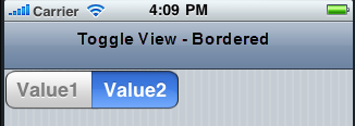
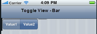
- COMBOBOX_TOGGLE_VIEW_STYLE_BAR
equalSegments: Specifies the boolean value which indicates if the segments must be equal.
enableTint: Specifies the boolean value to enable tintColor property. When this property is set to true, tintColor property is displayed.
tintColor: Specifies the tint color in RGB format. The default color is blue.
Note: Below are the view configuration properties in Desktop Web when the viewType is set as COMBOBOX_VIEW_TYPE_EDITVIEW.
autoSuggest: Enables the users to quickly find and select from a pre-populated list of values as they type, leveraging searching and filtering.
Type: Boolean
Default:false
editableAreaSkin: This property is displayed only when the autoSuggest is set to true. This property specifies the skin to be applied to the editor area of the ComboBox.
Type: String
Example
/* Sample code to set the viewConfig property for a ComboBox Widget when the viewType property is set as COMBOBOX_VIEW_TYPE_EDITVIEW. */

frmCombobox.myCombobox.viewConfig = {
 autoSuggest: true,
 editableAreaSkin: "editareaskin"
};
Platform Availability
- Available in the IDE
- iPad
- iPhone
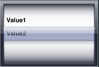
viewType Property
Specifies the view mode of the ComboBox.
Syntax
viewType
Type
Number
Read/Write
Read + Write
Remarks
The default option for this property is COMBOBOX_VIEW_TYPE_LISTVIEW.
In the Desktop Web platform, if the viewType is set as COMBOBOX_VIEW_TYPE_EDITVIEW, then autoSuggest property is displayed.
Following are the available options on different platforms:
- COMBOBOX_VIEW_TYPE_LISTVIEW (applicable on all platforms)
- COMBOBOX_VIEW_TYPE_EDITVIEW (applicable on Desktop Web only)
- COMBOBOX_VIEW_TYPE_TABLEVIEW (applicable on iPhone and iPad platforms)
- COMBOBOX_VIEW_TYPE_TOGGLEVIEW (applicable on iPhone and iPad platforms)
- COMBOBOX_VIEW_TYPE_ONSCREENWHEEL (applicable on iPhone and iPad platforms)
- COMBOBOX_VIEW_TYPE_SPINNER (applicable on Android/Android Tablet only)
For toggleView you can further select the View Style as plain, bordered, or bar.
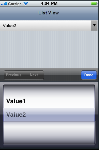
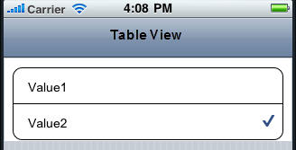
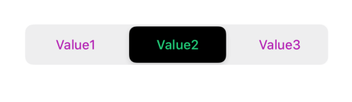
The following images illustrate the modes:
listView
Note: If you select the listView and do not specify a selection in the masterData, the default behavior of the platform is to select the first entry on the list.
tableView
toggleView
onscreenwheel
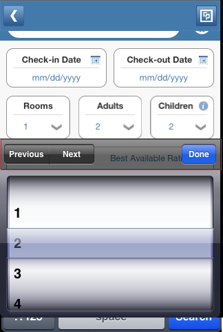
The below image illustrate the nextprevtoolbar set to a Combo Box. The highlighted toolbar is achieved on setting the Mode as onscreenwheel to the Combo Box and Input Accessory View Type as nextprevtoolbar to the Form.
Example
//Sample code to set the viewType property for a ComboBox Widget as Editview.

frmCombobox.myCombobox.viewType=constants.COMBOBOX_VIEW_TYPE_EDITVIEW;
Platform Availability
- Available in the IDE
- iPad
- iPhone
- Android/Android Tablet ( only Spinner view is available for the platform)
- Windows Tablet
wheelBackgroundColor Property
Specifies the background color for the wheel that is displayed when you click the ComboBox. This property is applicable only when you set the viewType as COMBOBOX_VIEW_TYPE_ONSCREENWHEEL.
Syntax
wheelBackgroundColor
Type
JSObject
Read/Write
Read + Write
Example
//Sample code to set the wheelBackgroundColor property for a ComboBox Widget.

frmCombobox.myCombobox.wheelBackgroundColor="0000ff00";
Platform Availability
- Not available in the IDE
- iPad
- iPhone
widgetSwipeMove Property
This property is used to enable and configure left or right swipe actions for a widget. The widgetSwipeMove Property can be used for all widgets . The most common use case is for implementing swipe action for individual rows in Segment.
Syntax
widgetSwipeMove
Type
String
Read/Write
Read + Write
Input Parameters
| Parameter Name | Type | Default Value | Description |
| translate | Boolean | true | This is an optional parameter. When the value of this parameter is set as true, the widget moves along with the swipe in the same direction. |
| Xboundaries | Array | Size of the current widget | This is an optional parameter and it defines the boundaries of the swipe in the X-axis. |
| swipeLeft/swipeRight | JS Object | This is an optional parameter and it is used to define the configuration of the widget while swiping to the left/ right. Each swipeLeft or swipeRightparameter is an array of configuration attributes containing translateRange , callback , translatePos , and translate. This JS Object defines the behavior of the widget during the swipe action. | |
| translateRange | Array | Size of the current widget | This is an optional parameter and it defines the sub-boundaries for the action when the swipe action ends. |
| translatePos | Array | Previous position of the widget | This is an optional parameter and it determines the final translation position to be applied to the widget when the widget swipe reaches the translateRange value. |
| callback | JS Object | null | This is an optional parameter and it defines the callback which needs to be triggered when the finger swipe reaches the sub boundary defined in translateRange. The attributes inside this parameter are described in the following table. |
The following table consists of the parameters of the callback parameter:
| Parameter Name | Type | Description |
| widgetHandle | This parameter consists of the widget handle or ID of the widget on which the swipe action has been performed. | |
| context | JS Object | This is applicable only for widgets inside the Segment with row templates. Each context parameter consists of rowIndex, sectionIndex and widgetref |
| rowIndex | Number | This parameter stores the row index of the Segment containing the swiped widget. |
| sectionIndex | Number | This parameter stores the section index of the Segment containing the swiped widget. |
| widgetref | widgetHandle | This parameter stores the handle of the Segment containing the swiped widget. |
Remarks
- For a Segment, the widgetSwipeMove Property is configured while setting the data of the Segment.
Note: It is not recommended to assign the widgetSwipeMove property on a top Flex container of the segment template widget.
Limitations
-
When a translation animation is applied to the same widget that has widgetSwipeMove already configured, the action which has been performed last takes precedence. For example, if you have set a translation animation on a FlexContainer and then set the widgetSwipeMove property, the actions set in widgetSwipeMove take precedence over the translation animation.
-
The state of the swipe transition of the widget is not retained.
-
In a Segment, the widgetSwipeMove Property must be configured for the rows so that they reset to the previous position.
-
If the widgetSwipeMove property is configured on a top level Flex container of a segment template, the onRowClick event will not be triggered. - Applicable on iOS, Android, and SPA.
-
Android limitation: On Android devices, when the user lifts their finger, the transition occurs immediately.
Example
Following is a code snippet for a mail app. Here we have used a Segment for listing the mail and the widgetSwipeMove Property has been configured for the SwipeFlex FlexContainer.
//This is a generic property that is applicable for various widgets.
//Here, we have shown how to use the widetSwipeMove property for Button widget.
/*You need to make a corresponding use of the
widgetSwipeMove property for other applicable widgets.*/
//Example of a swipe move configuration.
var swipeMoveConfig = {
 "translate": true,
 "Xboundaries": ["-60%", "60%"],
 "swipeLeft": [{
  "translateRange": ["-60%", "0%"],
  "callback": null,
  "translatePos": "-60%",
  "translate": true
 }, {
  "translateRange": ["0%", "60%"],
  "callback": null,
  "translatePos": "0%",
  "translate": true
 }],
 "swipeRight": [{
  "translateRange": ["-60%", "0%"],
  "callback": null,
  "translatePos": "0%",
  "translate": true
 }, {
  "translateRange": ["0%", "60%"],
  "callback": this.onCallback1,
  "translatePos": "60%",
  "translate": true
 }]
};

this.view.myButton.widgetSwipeMove=swipeMoveConfig;
Platform Availability
- Android, iOS, and SPA