Form Methods
Form Methods
This widget has been deprecated. Older applications that use it will still function, but new applications should use the FlexForm widget.
Form Widget has the following methods associated with it:
- add
- addAt
- show
- destroy
- remove
- removeAt
- replaceAt
- widgets
- setTitleBarLeftSideButtonSkin
- setTitleBarRightSideButtonSkin
- setTitleBarSkin
- showTitleBar
- hideTitleBar
- scrollToWidget
- scrollToBeginning
- scrollToEnd
add
This method is used to add widgets to the form. When the widgets are added to the current visible form, then the changes will reflect immediately. Adding a widget to the Form or Box hierarchy, which is already a part of the other widget hierarchy, will lead to undefined behaviors. You have to explicitly remove the widget from one hierarchy before adding it to another Form or Box.
Syntax
add(widgetArray)
Parameters
widgetArray [JSObject]- Mandatory
Comma separated list of widgets.
formid [widgetref] - Mandatory
Handle to the widget instance.
Return Values
No values are returned.
Exceptions
WidgetError
Example
//Procedure to create an OK button.
var basicConfBut = {id:"buttonForOk", text:"OK", isVisible:true,onClick:gotofrmNext, setEnabled:true, skin: "btnskn", focusSkin: "btnfocusskn"};

var layoutConfBut = {contentAlignment:constants.CONTENT_ALIGN_BOTTOM_RIGHT, containerWeight:100};

var buttonForOk = new voltmx.ui.Button(basicConfBut, layoutConfBut, {});

//Procedure to create a Cancel button.
var basicConfBut = {id:"buttonForCancel", text:"Cancel", isVisible:true,onClick:gotofrmPrevious, setEnabled:true, skin: "btnskn", focusSkin: "btnfocusskn"};

var layoutConfBut = {contentAlignment:constants.CONTENT_ALIGN_BOTTOM_LEFT, containerWeight:100};

var buttonForCancel = new voltmx.ui.Button(basicConfBut, layoutConfBut, {});

//Method to add an OK and a Cancel button.
frmHome.add(buttonForOk, buttonForCancel);
Platform Availability
Available on all platforms
addAt
This method is used to add widgets to the Form container at the specified index. Widget is prepended if index <0 and appended at the end of the container if the index > size+1. Size is the number of widgets already present in the container. If a new widget is added or removed will reflect immediately from the form hierarchy model perspective, however the changes are displayed when the Form appears. When the widgets are added to the current visible form, then the changes will reflect immediately. Adding a widget to the Form or Box hierarchy, which is already a part of the other widget hierarchy, will lead to undefined behaviors. You have to explicitly remove the widget from one hierarchy before adding it to another Form or Box.
Syntax
addAt(widgetref, index, animationConfig)
Note: The parameter animationConfig is supported only on iOS ( version 5.0 and above) and Android (version 3.0 and above) platforms.
Parameters
widgetref - Mandatory
Reference of the name of the widget.
index [Number] - Mandatory
Index number at which the widget is to be added.
formid [widgetref] - Mandatory
Handle to the widget instance.
animationConfig [JSObject] - Optional
Specifies the animation configuration object. Following are the parameters of the JSObject:
Note: A non dictionary object or passing a null to animationConfig is ignored and will be treated as widget without any animation. Passing an empty dictionary will make the API assume the defaults for each of the supported key in the animation configuration.
animEffect - Optional
Specifies the animation effect. Following are the available options of animation effect:
- constants.ANIMATION_EFFECT_EXPand: Specifies the widget must expand gradually by increasing the height of the widget.
- constants.ANIMATION_EFFECT_REVEAL: Specifies the widget must appear gradually by decreasing the transparency of the widget.
- constants.ANIMATION_EFFECT_NONE: This is the default option. Specifies animation should not be applied to the widget. However the layout animations are applied on the Form. The animation events are not triggered when this option is set.
animDuration - Optional
Specifies the duration of the animation effect in seconds. The default value is 1 second. The negative values are ignored and defaulted to 1 second.
animDelay - Optional
Specifies the delay of the animation effect in seconds. The default value is 0 second. The negative values are ignored and defaulted to 0 second.
animCurve - Optional
Specifies the animation curve to be applied while playing the animation. An animation curve defines the speed of the animations at different intervals of the animation duration. Following are the available options of animation curve:
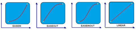
- constants.ANIMATION_CURVE_EASEIN: Specifies the animation effect to start slow in the beginning.
- constants.ANIMATION_CURVE_EASEOUT: Specifies the animation effect to slowdown towards the end.
- constants.ANI2MATION_CURVE_EASEINOUT: Specifies the animation effect to start slow and slowdown towards the end.
- constants.ANIMATION_CURVE_LINEAR: This is the default value. Specifies the animation effect to continue with the same speed from start to end.
animCallBacks - Optional
It is a JS dictionary containing the events invoked by the platform during the animation life cycle. Following are the available events:
- animStarted: Invoked at the beginning of the animation without any parameters. Following is the signature of the event:
function animStarted()
- animEnded: Invoked at the end of the animation without any parameters. Following is the signature of the event:
function animEnded()
Note: Passing an invalid type other than the above events lead to run time exceptions/ crashes.
Return Values
No values are returned.
Exceptions
WidgetError
Example
//Defining animation configuration.
var withAnimConfig="animEffect":constants.ANIMATION_EFFECT_EXPand,
    "animDuration":1.5,"animDelay":0.4,
    "animCurve":constants.ANIMATION_CURVE_LINEAR,
    "animCallBacks":{
        "animStarted":startCallBackFunc,
        "animEnded":endCallBackFunc
    }
}

//Procedure to create an OK button.
var basicConfBut = {id:"buttonForOk",
    text:"OK",
    isVisible:true,
    onClick:gotofrmNext,
    setEnabled:true,
    skin:"btnskn",
    focusSkin:"btnfocusskn"};

var layoutConfBut = {contentAlignment:constants.CONTENT_ALIGN_BOTTOM_RIGHT,
    containerWeight:100};

var buttonForOk = new voltmx.ui.Button(basicConfBut,
    layoutConfBut,
    {});

//Method to add an OK button at index 1.
frmHome.addAt(buttonForOk, 1, withAnimConfig);
Platform Availability
Available on all platforms
show
This method is used to display the form.
Syntax
show()
Parameters
formname - Mandatory
Reference of the name of the Form.
formid [widgetref] - Mandatory
Handle to the widget instance.
Return Values
None
Exceptions
None
Example
        //Defining properties of a form.
var basicConf = {id:"formHome", title:"Form Home for FORM",addWidgets:addwidgetsfrmNew, skin:"frmskn"};

var layoutConf = {contentAlignment:constants.CONTENT_ALIGN_TOP_CENTER, containerWeight:100};

var pspConf = {titleBar: true, titleBarSkin: "skntitlebar"};

//Creating a form using the properties defined above.
var myForm = new voltmx.ui.Form(basicConf,layoutConf,pspConf)

//Showing a form using show method.
myForm.show()
Platform Availability
Available on all platforms
destroy
This method is used to destroy any unwanted forms at any point in time, and allows increasing the application life by reducing the memory usage.
Note: Destroying the current form might lead to unexpected behavior.
Syntax
destroy()
Parameters
formname- Mandatory
Reference of the name of the Form.
formid [widgetref] - Mandatory
Handle to the widget instance.
Return Values
None
Exceptions
None
Example
//Defining properties of a form.
var basicConf = {id:"formHome", title:"Form Home for FORM",addWidgets:addwidgetsfrmNew, skin:"frmskn"};

var layoutConf = {contentAlignment:constants.CONTENT_ALIGN_TOP_CENTER, containerWeight:100};

var pspConf = {titleBar: true, titleBarSkin: "skntitlebar"};

//Creating a form using the properties defined above.
var myForm = new voltmx.ui.Form(basicConf,layoutConf,pspConf)
//Destroying a form using destroy method.
myForm.destroy()
Platform Availability
Available on all platforms
remove
This method removes a widget from the form container. If a widget is removed from a form, will reflect immediately from the Form hierarchy model perspective; however the changes are displayed when the Form appears. When the widgets are removed from the current visible Form, then the changes will reflect immediately.
Syntax
remove(widgetref)
Parameters
widgetref - Mandatory
Reference of the name of the widget.
formid [widgetref] - Mandatory
Handle to the widget instance.
Return Values
The current Form handle is returned.
Exceptions
WidgetError
Example
//Defining properties of a form.
var basicConf = {id:"formHome", title:"Form Home for FORM",addWidgets:addwidgetsfrmNew, skin:"frmskn"};

var layoutConf = {contentAlignment:constants.CONTENT_ALIGN_TOP_CENTER, containerWeight:100};

var pspConf = {titleBar: true, titleBarSkin: "skntitlebar"};

//Creating a form using the properties defined above.
var myForm = new voltmx.ui.Form(basicConf,layoutConf,pspConf)

//Procedure to create an OK button.
var basicConfBut = {id:"buttonForOk", text:"OK", isVisible:true,onClick:gotofrmNext, setEnabled:true, skin: "btnskn", focusSkin: "btnfocusskn"};

var layoutConfBut = {contentAlignment:constants.CONTENT_ALIGN_BOTTOM_RIGHT, containerWeight:100};

var buttonForOk = new voltmx.ui.Button(basicConfBut, layoutConfBut, {});

//Removing a form using remove method.
myForm.remove(buttonForOk)
Platform Availability
Available on all platforms
removeAt
This method removes a widget at the given index from the Form container. If a widget is removed from the form, will reflect immediately from the Form hierarchy model perspective; however the changes are displayed when the Form appears. When the widgets are removed from the current visible Form, then the changes will reflect immediately.
Note: If the index is not within the limits then removeAt will be silent and doesn't yield any result.
Syntax
removeAt(index, animationConfig)
Note: The parameter animationConfig is supported only on iOS ( version 5.0 and above) and Android (version 3.0 and above) platforms.
Parameters
index [Number] - Mandatory
Specifies the position in number format.
formid [widgetref] - Mandatory
Handle to the widget instance.
animationConfig [JSObject] - Optional
Specifies the animation configuration object. Following are the parameters of the JSObject:
Note: A non dictionary object or passing a null to animationConfig is ignored and will be treated as widget without any animation. Passing an empty dictionary will make the API assume the defaults for each of the supported key in the animation configuration.
animEffect - Optional
Specifies the animation effect. Following are the available options of animation effect:
- constants.ANIMATION_EFFECT_COLLAPSE: Specifies the widget must collapse gradually by decreasing the height of the widget. This option is applicable only when visibility is turned on.
- constants.ANIMATION_EFFECT_FADE: Specifies the widget must disappear gradually by increasing the transparency of the widget.
- constants.ANIMATION_EFFECT_NONE: This is the default option. Specifies animation should not be applied to the widget. However the layout animations are applied on the Form. The animation events are not triggered when this option is set.
animDuration - Optional
Specifies the duration of the animation effect in seconds. The default value is 1 second. The negative values are ignored and defaulted to 1 second.
animDelay - Optional
Specifies the delay of the animation effect in seconds. The default value is 0 second. The negative values are ignored and defaulted to 0 second.
animCurve - Optional
Specifies the animation curve to be applied while playing the animation. An animation curve defines the speed of the animations at different intervals of the animation duration. Following are the available options of animation curve:
- constants.ANIMATION_CURVE_EASEIN: Specifies the animation effect to start slow in the beginning.
- constants.ANIMATION_CURVE_EASEOUT: Specifies the animation effect to slowdown towards the end.
- constants.ANIMATION_CURVE_EASEINOUT: Specifies the animation effect to start slow and slowdown towards the end.
- constants.ANIMATION_CURVE_LINEAR: This is the default value. Specifies the animation effect to continue with the same speed from start to end.
animCallBacks - Optional
It is a JS dictionary containing the events invoked by the platform during the animation life cycle. Following are the available events:
- animStarted: Invoked at the beginning of the animation without any parameters. Following is the signature of the event:function animStarted(
- animEnded: Invoked at the end of the animation without any parameters. Following is the signature of the event:function animEnded()
Note: Passing an invalid type other than the above events lead to run time exceptions/ crashes.
Return Values
Reference of the name of the widget to be removed.
Exceptions
WidgetError
Example
//Defining animation configuration.
var withAnimConfig1={
    "animEffect":constants.ANIMATION_EFFECT_COLLAPSE,
    "animDuration":1,
    "animDelay":0,
    "animCurve":constants.ANIMATION_CURVE_LINEAR,}

//Defining properties of a form.
var basicConf = {id:"formHome", title:"Form Home for FORM",addWidgets:addwidgetsfrmNew, skin:"frmskn"};

var layoutConf = {contentAlignment:constants.CONTENT_ALIGN_TOP_CENTER, containerWeight:100};

var pspConf = {titleBar: true, titleBarSkin: "skntitlebar"};

//Creating a form using the properties defined above.
var myForm = new voltmx.ui.Form(basicConf,layoutConf,pspConf)

//Procedure to create an OK button.
var basicConfBut = {id:"buttonForOk", text:"OK", isVisible:true,onClick:gotofrmNext, setEnabled:true, skin: "btnskn", focusSkin: "btnfocusskn"};

var layoutConfBut = {contentAlignment:constants.CONTENT_ALIGN_BOTTOM_RIGHT, containerWeight:100};

var buttonForOk = new voltmx.ui.Button(basicConfBut, layoutConfBut, {});

//Removing a form using remove method at index 1.
myForm.removeAt(1, withAnimConfig1);
Platform Availability
Available on all platforms
replaceAt
This method replaces a widget with another widget in a form. If a widget is replaced from the form, will reflect immediately from the Form hierarchy model perspective; however the changes are displayed when the Form appears.
Note: Post this operation widget that was replaced will get garbage collected unless you hold explicitly a reference to the replaced widget.
Syntax
replaceAt(widgetref, index, animationConfig)
Parameters
widgetref - Mandatory
Reference of the name of the widget.
index [Number] - Mandatory
Specifies the position in number format. Following are the rules applicable for index:
- If the index < 0, then first widget in the container gets replaced.
- If the index > size -1, then the last widget in the container widget gets replaced. The term size refers to the number of widgets present in the container widget.
animationConfig [JSObject] - Optional
Specifies the animation configuration object. Following are the parameters of the JSObject:
Note: A non dictionary object or passing a null to animationConfig is ignored and will be treated as widget without any animation. Passing an empty dictionary will make the API assume the defaults for each of the supported key in the animation configuration.
animEffect - Optional
Specifies the animation effect. Following are the available options of animation effect:
- constants.ANIMATION_EFFECT_FLIP_RIGHT: Specifies the widget must flip from right to left.
- constants.ANIMATION_EFFECT_FLIP_LEFT: Specifies the widget must flip from left to right.
- constants.ANIMATION_EFFECT_NONE: This is the default option. Specifies animation should not be applied to the widget, but layout animations are applied on the Form that may be change the current widgets layout. The animation events are not triggered when this option is set.
animDuration - Optional
Specifies the duration of the animation effect in seconds. The default value is 1 second. The negative values are ignored and defaulted to 1 second.
animDelay - Optional
Specifies the delay of the animation effect in seconds. The default value is 0 second. The negative values are ignored and defaulted to 0 second.
animCurve - Optional
Specifies the animation curve to be applied while playing the animation. An animation curve defines the speed of the animations at different intervals of the animation duration. Following are the available options of animation curve:
- constants.ANIMATION_CURVE_EASEIN: Specifies the animation effect to start slow in the beginning.
- constants.ANIMATION_CURVE_EASEOUT: Specifies the animation effect to slowdown towards the end.
- constants.ANIMATION_CURVE_EASEINOUT: Specifies the animation effect to start slow and slowdown towards the end.
- constants.ANIMATION_CURVE_LINEAR: This is the default value. Specifies the animation effect to continue with the same speed from start to end.
animCallBacks - Optional
It is a JS dictionary containing the events invoked by the platform during the animation life cycle. Following are the available events:
- animStarted Invoked at the beginning of the animation without any parameters. Following is the signature of the event: function animStarted()
- animEnded Invoked at the end of the animation without any parameters. Following is the signature of the event: function animEnded()
Note: Passing an invalid type other than the above events lead to run time exceptions/ crashes.
Return Values
Reference of the name of the widget to be removed.
Exceptions
WidgetError
Example
//Defining animation configuration.
var withAnimConfig2={
    "animEffect":constants.ANIMATION_EFFECT_FLIP_RIGHT,
    "animDuration":2,
    "animDelay":3,
    "animCurve":constants.ANIMATION_CURVE_LINEAR,
    "animCallBacks":{"animStarted":startCallBackFunc,"animEnded":endCallBackFunc}
}

//Defining properties of a form.
var basicConf = {id:"formHome", title:"Form Home for FORM",addWidgets:addwidgetsfrmNew, skin:"frmskn"};

var layoutConf = {contentAlignment:constants.CONTENT_ALIGN_TOP_CENTER, containerWeight:100};

var pspConf = {titleBar: true, titleBarSkin: "skntitlebar"};

//Creating a form using the properties defined above.
var myForm = new voltmx.ui.Form(basicConf,layoutConf,pspConf)

//Procedure to create an OK button.
var basicConfBut = {id:"buttonForOk", text:"OK", isVisible:true,onClick:gotofrmNext, setEnabled:true, skin: "btnskn", focusSkin: "btnfocusskn"};

var layoutConfBut = {contentAlignment:constants.CONTENT_ALIGN_BOTTOM_RIGHT, containerWeight:100};

var buttonForOk = new voltmx.ui.Button(basicConfBut, layoutConfBut, {});

//Method to replaceAt.
myForm.replaceAt(buttonForOK,2,withAnimConfig2);
Platform Availability
- iOS
- Android
widgets
This method returns an array of the widget references which are direct children of Form.
Syntax
widgets()
Parameters
formid [widgetref] - Mandatory
Handle to the widget instance.
Return Values
This method returns Read only array of widget references. Modifying the array and changing the position of widgets in this array doesn't reflect in the Form hierarchy, however you can get handle to the widgets through this array and modify the widgets through widget level methods as exposed by individual widgets.
Exceptions
WidgetError
Example
//Defining properties of a form.
var basicConf = {id:"formHome", title:"Form Home for FORM",addWidgets:addwidgetsfrmNew, skin:"frmskn"};

var layoutConf = {contentAlignment:constants.CONTENT_ALIGN_TOP_CENTER,
    containerWeight:100};

var pspConf = {titleBar: true, titleBarSkin: "skntitlebar"};

//Creating a form using the properties defined above.
var myForm = new voltmx.ui.Form(basicConf,layoutConf,pspConf)

//Procedure to create an OK button.
var basicConfBut = {id:"buttonForOk",
    text:"OK",
    isVisible:true,
    onClick:gotofrmNext,
    setEnabled:true,
    skin:"btnskn",
    focusSkin:"btnfocusskn"};

var layoutConfBut = {contentAlignment:constants.CONTENT_ALIGN_BOTTOM_RIGHT,
    containerWeight:100};

var buttonForOk = new voltmx.ui.Button(basicConfBut,
    layoutConfBut,
    {});

//Method to return myForm widgets.
myForm.widgets();
Platform Availability
Available on all platforms
setTitleBarLeftSideButtonSkin
This method enables you to set the properties for a left-side button of a titlebar.
Syntax
setTitleBarLeftSideButtonSkin(text,skin,callBack)
Parameters
formid [widgetref] - Mandatory
Handle to the widget instance.
text [String] - Mandatory
Specifies the text of the title bar left side button.
skin [String]- Mandatory
Specifies the skin of the button. It supports fontColor and image properties only.
callBack [event call back]- Mandatory
Specifies the event call back to be invoked on tapping left button.
Return Values
None
Exceptions
None
Platform Availability
This method is available on iPhone/iPad.
setTitleBarRightSideButtonSkin
This method enables you to set the properties for a right-side button of a titlebar.
Syntax
setTitleBarRightSideButtonSkin(text,skin,callBack)
Parameters
formid [widgetref] - Mandatory
Handle to the widget instance.
text [String] - Mandatory
Specifies the text of the title bar right side button.
skin [String]- Mandatory
Specifies the skin of the button. It supports fontColor and image properties only.
callBack [event call back]- Mandatory
Specifies the event call back to be invoked on tapping right button.
Return Values
None
Exceptions
None
Platform Availability
This method is available on iPhone/iPad.
setTitleBarSkin
This method enables you to set the skin for a titlebar of a form.
Syntax
setTitleBarSkin()
Parameters
formid [widgetref] - Mandatory
Handle to the widget instance.
Return Values
None
Exceptions
None
Platform Availability
This method is available on iPhone/iPad.
showTitleBar
This method gives you the control to show a titlebar within a form.
Syntax
showTitleBar()
Parameters
formid [widgetref] - Mandatory
Handle to the widget instance.
Return Values
None
Exceptions
None
Platform Availability
This method is available on iPhone/iPad.
hideTitleBar
This method gives you the control to hide a titlebar within a form.
Syntax
hideTitleBar()
Parameters
formid [widgetref] - Mandatory
Handle to the widget instance.
Return Values
None
Exceptions
None
Platform Availability
This method is available on iPhone/iPad.
scrollToWidget
This method gives you the control to scroll the form up to the position of selected widget.
Note: In iOS platform, this method brings the widget to viewable area on the form.
Syntax
scrollToWidget(widgetref)
Parameters
widgetref - Mandatory
Reference of the name of the widget.
formid [widgetref] - Mandatory
Handle to the widget instance.
Return Values
None
Exceptions
WidgetError
Example
//Procedure to create a label for OK button.
var basicConfLbl = {id:"buttonForOk", text:"OK", isVisible:true};

var layoutConfLbl = {contentAlignment:constants.CONTENT_ALIGN_BOTTOM_RIGHT, containerWeight:100};

var labelForOk = new voltmx.ui.Label(basicConfLbl, layoutConfLbl, {});

//Defining properties for a form.
var basicConf = {id:"formHome", title:"My Form"};

var layoutConf = {padding: [20,20,20,20]};

//Creating a form with the properties defined above.
var frmScrollToWidget= new voltmx.ui.Form(basicConf, layoutConf, {} );

//Method to scroll the form upto label.
frmScrollToWidget.scrollToWidget(labelForOk);
Platform Availability
Available on all platforms
scrollToBeginning
This method gives you the control to scroll to the beginning of the form.
Syntax
scrollToBeginning()
Parameters
formid [widgetref] - Mandatory
Handle to the widget instance.
Return Values
None
Exceptions
WidgetError
Example
//Defining properties for a form.
var basicConf = {id:"formHome", title:"My Form"};

var layoutConf = {padding: [20,20,20,20]};

//Creating a form with the properties defined above.
var frmScrollToWidget= new voltmx.ui.Form(basicConf, layoutConf, {} );

//Method to scroll to the beginning of the form.
frmScrollToWidget.scrollToWidget(labelForOk);
Platform Availability
Available on all platforms except Server side Mobile Web
scrollToEnd
This method gives you the control to scroll to the end of the form.
Syntax
scrollToEnd()
Parameters
formid [widgetref] - Mandatory
Handle to the widget instance.
Return Values
None
Exceptions
WidgetError
Example
//Defining properties for a form.
var basicConf = {id:"formHome", title:"My Form"};

var layoutConf = {padding: [20,20,20,20]};

//Creating a form with the properties defined above.
var frmScrollToWidget= new voltmx.ui.Form(basicConf, layoutConf, {} );

//Method to scroll to the end of the form.
frmScrollToWidget.scrollToWidget(labelForOk);
Platform Availability
Available on all platforms except Server side Mobile Web