Link Properties
Link Properties
The properties for Link widget are:
accessibilityConfig Property
Enables you to control accessibility behavior and alternative text for the widget.
For more information on using accessibility features in your app, see the Accessibility appendix in the Volt MX IrisUser Guide.
Syntax
accessibilityConfig
Type
Object
Read/Write
Read + Write
Remarks
- The accessibilityConfig property is enabled for all the widgets which are supported under the Flex Layout.
Note: From Volt MX Iris V9 SP2 GA version, you can provide i18n keys as values to all the attributes used inside the
accessibilityConfigproperty. Values provided in the i18n keys take precedence over values provided ina11yLabel,a11yValue, anda11yHintfields.
The accessibilityConfig property is a JavaScript object which can contain the following key-value pairs.
| Key | Type | Description | ARIA Equivalent |
|---|---|---|---|
| a11yIndex | Integer with no floating or decimal number. | This is an optional parameter. Specifies the order in which the widgets are focused on a screen. | For all widgets, this parameter maps to the aria-index, index, or taborder properties. |
| a11yLabel | String | This is an optional parameter. Specifies alternate text to identify the widget. Generally the label should be the text that is displayed on the screen. | For all widgets, this parameter maps to the aria-labelledby property of ARIA in HTML. > Note: For the Image widget, this parameter maps to the alt attribute of ARIA in HTML. |
| a11yValue | String | This is an optional parameter. Specifies the descriptive text that explains the action associated with the widget. On the Android platform, the text specified for a11yValue is prefixed to the a11yHint. | This parameter is similar to the a11yLabel parameter. If the a11yValue is defined, the value of a11yValue is appended to the value of a11yLabel. These values are separated by a space. |
| a11yHint | String | This is an optional parameter. Specifies the descriptive text that explains the action associated with the widget. On the Android platform, the text specified for a11yValue is prefixed to the a11yHint. | For all widgets, this parameter maps to the aria-describedby property of ARIA in HTML. |
| a11yHidden | Boolean | This is an optional parameter. Specifies if the widget should be ignored by assistive technology. The default option is set to false. This option is supported on iOS 5.0 and above, Android 4.1 and above, and SPA | For all widgets, this parameter maps to the aria-hidden property of ARIA in HTML. |
| a11yARIA | Object | This is an optional parameter. For each widget, the key and value provided in this object are added as the attribute and value of the HTML tags respectively. Any values provided for attributes such as aria-labelledby and aria-describedby using this attribute, takes precedence over values given in a11yLabel and a11yHint fields. When a widget is provided with the following key value pair or attribute using the a11yARIA object, the tabIndex of the widget is automatically appended as zero.{"role": "main"}``aria-label |
This parameter is only available on the Desktop Web platform. |
Android limitations
- If the results of the concatenation of a11y fields result in an empty string, then
accessibilityConfigis ignored and the text that is on widget is read out. - The soft keypad does not gain accessibility focus during the right/left swipe gesture when the keypad appears.
SPA/Desktop Web limitations
- When
accessibilityConfigproperty is configured for any widget, thetabIndexattribute is added automatically to theaccessibilityConfigproperty. - The behavior of accessibility depends on the Web browser, Web browser version, Voice Over Assistant, and Voice Over Assistant version.
- Currently SPA/Desktop web applications support only a few ARIA tags. To achieve more accessibility features, use the attribute a11yARIA. The corresponding tags will be added to the DOM as per these configurations.
Example 1
This example uses the button widget, but the principle remains the same for all widgets that have an accessibilityConfig property.
//This is a generic property that is applicable for various widgets.
//Here, we have shown how to use the accessibilityConfig Property for button widget.
/*You need to make a corresponding use of the accessibilityConfig property for other applicable widgets.*/

Form1.myButton.accessibilityConfig = {
    "a11yLabel": "Label",
    "a11yValue": "Value",
    "a11yHint": "Hint"
};
Example 2
This example uses the button widget to implement internationalization in accessibilityConfig property, but the principle remains the same for all widgets.
/*Sample code to implement internationalization in accessibilityConfig property in Native platform.*/

Form1.myButton.accessibilityConfig = {
    "a11yLabel": voltmx.i18n.getLocalizedString("key1")
};
/*Sample code to implement internationalization in accessibilityConfig property in Desktop Web platform.*/

Form1.myButton.accessibilityConfig = {
    "a11yLabel": "voltmx.i18n.getLocalizedString(\"key3\")"
};
Platform Availability
- Available in the IDE
- iOS, Android, SPA, and Desktop Web
backgroundColor Property
Specifies the background color of the widget.
Syntax
backgroundColor
Type
Color constant or Hexadecimal number
Read/Write
Read + Write
Remarks
- The initial value of backgroundColor has to be specified explicitly. If not, Iris will not deduce the values from the existing skin and this will lead to undefined behavior.
- Colors can be specified using a 6 digit or an 8-digit hex value with alpha position. For example, ffff65 or ffffff00.
- When the 4-byte color format (RGBA) string is used, an alpha (A) value of 65 specifies that the color is transparent. If the value is 00, the color is opaque. The Alpha value is in percentage and must be given in the hexadecimal value for the color (100% in hexadecimal value is 65).
For example, red complete opaque is FF000000. Red complete transparent is FF000065. The values 0x and # are not allowed in the string. - A color constant is a String that is defined at the theme level. Ensure that you append the $ symbol at the beginning of the color constant.
- This property does not have a default value.
- This property has more priority than (and overrides) the background property of the configured skin. Even if there is no skin configured for the widget, this property updates the skin.
- The backgroundColor, backgroundColorTwoStepGradient, backgroundColoMultiStepGradient, and backgroundImage properties are mutually exclusive. The property that was set most recently is given higher priority over other properties.
Example
This example uses the button widget, but the principle remains the same for all widgets that have the backgroundColor property.
Form1.btn1.backgroundColor = "ea5075";
Platform Availability
- Android
- iOS
- Desktop Web (Not available on Desktop Web Legacy SDK)
blockedUISkin Property
Specifies the skin that must be used to block the interface until the action in progress (for example, a service call) is completed.
Syntax
blockedUISkin
Type
String
Read/Write
Read + Write
Remarks
The default value for this property is null (No skin is applied).
To specify a skin, select a skin from the list.
For the skin to be available in the list, you must add a skin for Blocked UI under Widget Skins.
Example
//Sample code to set the blockedUISkin property of a Link widget.

frmLink.MyLink.blockedUISkin="blkSkin";
Platform Availability
- Available in the IDE
- SPA (iPhone/Android/BlackBerry/Windows NTH)
containerWeight Property
Specifies the percentage of the parent width that should allocated to the widget. The parent widget space is distributed to its child widgets based on this weight factor. All its child widgets should sum up to 100% of width except when placed in voltmx.ui.ScrollBox.
Syntax
containerWeight
Type
Number
Read/Write
Yes - (Read and Write)
Example
//Sample code to set the containerWeight property of a Link widget.
frmLink.myLink.containerWeight=80;
Accessible from IDE
No
Platform Availability
Available on all platforms
contentAlignment Property
Specifies the alignment of the text on the Link with respect to its boundaries. A default value CONTENT_ALIGN_CENTER is assigned for all platforms.
Syntax
contentAlignment
Type
Number
Read/Write
No
Remarks
To choose another alignment, click the drop-down arrow and select the desired alignment. However, to change the default value on a particular platform, select the button next to the drop-down and select respective platform and choose the value.

The default value for the property is CONTENT_ALIGN_CENTER (the default value for all platforms is center; content is aligned at the center of the button.)
The following are the available options:
CONTENT_ALIGN_TOP_LEFT - Specifies the text should align at top left corner of the button.
CONTENT_ALIGN_TOP_CENTER - Specifies the text should align at top center of the button.
CONTENT_ALIGN_TOP_RIGHT- Specifies the text should align at top right of the button.
CONTENT_ALIGN_MIDDLE_LEFT- Specifies the text should align at middle left of the button.
CONTENT_ALIGN_CENTER- Specifies the text should align at center of the button.
CONTENT_ALIGN_MIDDLE_RIGHT- Specifies the text should align at middle right of the button.
CONTENT_ALIGN_BOTTOM_LEFT- Specifies the text should align at bottom left of the button.
CONTENT_ALIGN_BOTTOM_CENTER- Specifies the text should align at bottom center of the button.
CONTENT_ALIGN_BOTTOM_RIGHT - Specifies the text should align at bottom right of the button.
Example
//Sample code to set the contentAlignment property of a Link widget.

frmLink.myLink.contentAlignment=constants.CONTENT_ALIGN_TOP_LEFT;
Accessible from IDE
Yes
Platform Availability
Available on all platforms
contextMenu Property
A context menu is a menu that appears upon clicking a widget. A context menu typically offers a limited set of choices that are applicable for that widget. Usually these choices are actions, related to the widget.
Syntax
contextMenu
Type
Array (voltmx.ui.MenuItem)
Read/Write
Read + Write
Remarks
If you define a context menu for a widget, the steps involved to invoke the context menu on a platform and the appearance of the context menu varies.
In Desktop Web, on right-click mouse the context specific menu will be displayed with the array of menu items.
The following are the characteristics of a context menu on BlackBerry platform:
- You can invoke the context menu either by clicking on the widget (applicable only on BlackBerry versions 6.x and above) or by a long press on the screen (or trackpad).
- You can choose to add icons to indicate the menu items in the context menu (applicable only on BlackBerry versions 6.x and above).
- BlackBerry layouts menu items in a 3 item grid view. The menu items Switch Application, Help, Close, and Full Menu are added automatically based on the number of menu items added in the context menu. For example, If you add a context menu with 2 items, it will display Full Menu item along with the items added. If you add a context menu with 3 items, it will display Full Menu, Help, Switch Application items along with the items added.
- If the focus is on a widget that has a context menu; and if you click the "menu key", the Full Menu appears along with the context menu items.
- On Blackberry Non-Touch Devices, only Full Menu item is displayed irrespective of number of items added in the context menu.
- The context menu items in the Full Menu will disappear if the focus is shifted from the widget which has the context menu.
The following are the characteristics of a context menu on Android platform:
- You can invoke the context menu by a long press on the widget.
- The menu items are displayed as text (no support for icons).
- There is no support for sub-menus in a context menu.
Example
//Sample code to set the contextMenu property of a Link widget.

frmLink.myLink.contextMenu=[menu1, menu2];
Note: On Android platform, the image icon, separator, and submenu properties are not supported.
Platform Availability
- Android
- BlackBerry
- Windows Phone
enableCache Property
The property enables you to improve the performance of Positional Dimension Animations.
Syntax
enableCache
Type
Boolean
Read/Write
Read + Write
Remarks
The default value for this property is true.
Note: When the property is used, application consumes more memory. The usage of the property enables tradeoff between performance and visual quality of the content. Use the property cautiously.
Example
Form1.widgetID.enableCache = true;
Platform Availability
- Available in the IDE.
- Windows
externalURL Property
Specifies that the URL must be opened directly from the web site without having to contact the Volt MX Server.
Syntax
externalURL
Type
String
Read/Write
No
Remarks
For example, in a Banking Application, for Terms and Conditions section, you can provide an external URL which will open the required section in a new window rather than opening the section in the same window.
Example
//Defining properties for a link widget with externalURL:"http://www.google.co.in"
var linkBasic = {
    id: "link1",
    skin: "linkSkin",
    focusSkin: "linkFSkin",
    text: "Click here",
    isVisible: true
};

var linkLayout = {
    containerWeight: 100,
    padding: [5, 5, 5, 5],
    margin: [5, 5, 5, 5],
    paddingInPixel: true,
    marginInPixel: true,
    hExpand: true
};

var linkPSP = {
    externalURL: "http://www.google.co.in"
};

//Creating link widget.
var link1 = new voltmx.ui.Link(linkBasic, linkLayout, linkPSP);
Platform Availability
- Available in the IDE
- Available on Server side Mobile Web (advanced) platform only
focusSkin Property
Specifies the look and feel of the Link when in focus.
Syntax
focusSkin
Type
String
Read/Write
Read + Write
Remarks
You must be aware of the following:
- On J2ME non-touch devices, if you do not specify the Focus skin, it is not possible to identify the focus change between the widgets.
- Mobile Web does not support this property, instead browser specific focus will be applied.
Example
//Sample code to set the focusSkin property of a Link widget.

frmLink.myLink.focusSkin="linkFSkin";
Platform Availability
- Available in the IDE
- Available on all platforms.
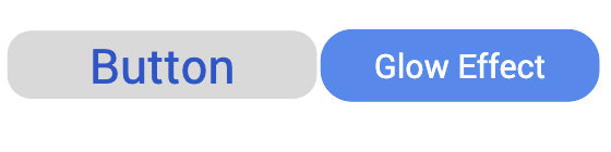
glowEffect Property
Specifies if there must be glow effect when you touch the link.
Syntax
glowEffect
Type
Boolean
Read/Write
No
Remarks
The default value for this property is false.
- If set to false, the link will not have glow effect.
- If set to true, the link will have glow effect.
The glow appears on the button only for a moment on touch and disappears.
The following image illustrates a link with and without the glow effect:
Example
//Sample code to set the glowEffect property of a Link widget.

frmLink.myLink.glowEffect=true;
Platform Availability
- Available in the IDE
- iPad
- iPhone
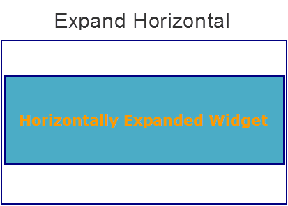
hExpand Property
Specifies if the widget should occupy all the width available to it.
Syntax
hExpand
Type
Boolean
Read/Write
No
Remarks
Default:true
If set to false, the widget occupies the preferred width. The preferred width of a widget is the sum of its contents width, padding and margin.
If set to true, the widget ensures that the entire width available to it, is occupied.
Example
//Sample code to set the hExpand property of a Link widget.

frmLink.myLink.hExpand=true;
Accessible from IDE
Yes
Platform Availability
Available on all platforms except Desktop Web, and SPA
hoverSkin Property
Specifies the look and feel of a widget when the cursor hovers on the widget.
Syntax
hoverSkin
Type
String
Read/Write
Read + Write
Example
//Sample code to set the hoverSkin property of a Link widget.

frmLink.myLink.hoverSkin="hskin";
Platform Availability
- Available in the IDE
- Windows Tablet
id Property
id is a unique identifier of Link consisting of alpha numeric characters. Every Link should have a unique id within an Form.
Syntax
id
Type
String
Read/Write
Read only
Example
//Defining properties for a link widget with id:"link1".
var linkBasic = {
    id: "link1",
    skin: "linkSkin",
    focusSkin: "linkFSkin",
    text: "Click here",
    isVisible: true
};

var linkLayout = {
    widgetAlignment: constants.WIDGET_ALIGN_TOP_LEFT,
    contentAlignment: CONTENT_ALIGN_TOP_LEFT,
    containerWeight: 100
};

var linkPSP = {};

//Creating the link.
var link1 = new voltmx.ui.Link(linkBasic, linkLayout, linkPSP);

//Reading Id of Link.
alert("Link id::" + link1.id);
Platform Availability
- Available in the IDE
- Available on all platforms
info Property
A custom JSObject with the key value pairs that a developer can use to store the context with the widget. This will help in avoiding the globals to most part of the programming.
Syntax
info
Type
JSObject
Read/Write
Read + Write
Remarks
This is a non-Constructor property. You cannot set this property through widget constructor. But you can read and write data to it.
Info property can hold any JSObject. After assigning the JSObject to info property, the JSObject should not be modified. For example,
var inf = {
    a: 'hello'
};
widget.info = inf; //works

widget.info.a = 'hello world';
/*This will not update the widget info a property to Hello world.
widget.info.a will have old value as hello.*/
Example
//Sample code to set info property for a Link widget.

frmLink.myLink.info = {
   key: "link text"
};

//Reading the info of the Link widget.
voltmx.print("Link widget info:" +frmLink.myLink.info);
Platform Availability
Available on all platforms
isVisible Property
This property controls the visibility of a widget on the form.
Syntax
isVisible
Type
Boolean
Read/Write
Read + Write
Remarks
The default value for this property is true.
- If set to false, the widget is not displayed.
- If set to true, the widget is displayed.
This property is not applicable if the widget is placed in a Segment. When the widget is placed in a Segment, the Visibility of the widget is controlled by the data property of the segment.
Example
//Sample code to set isVisible property of a Link widget.

frmLink.myLink.isVisible=true;
Note: In addition, the visibility of the widget can be controlled using the setVisibility method for this widget.
Platform Availability
- Available in the IDE
- Available on all platforms
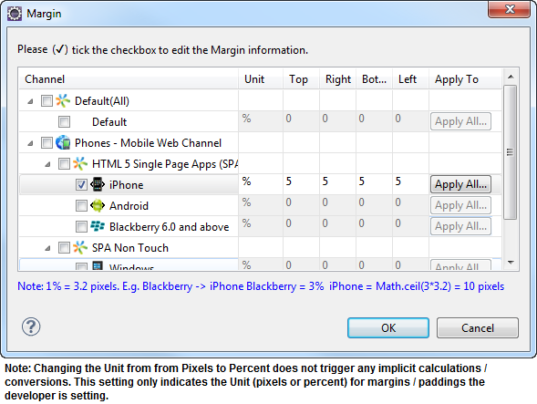
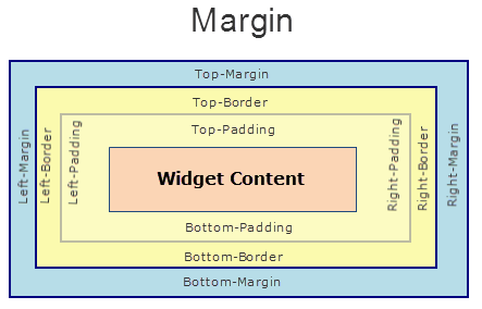
margin Property
Defines the space around a widget. You can use this option to define the left, top, right, and bottom distance between the widget and the next widget.
Syntax
margin
Type
Array of Numbers
Read/Write
Read + Write
Remarks
To define the margin values for a platform, click the ( ) button against the property to open the Margin screen. Select the checkbox against the platform for which you want to define the margins and enter the top, left, right, and bottom margin values.
If you want to use the margin values set for a platform across other platforms, you can click the Apply To button and select the platforms on which you want the margin values to be applied.
The following image illustrates the window to define the margins for platforms:
The following image illustrates a widget with a defined margin:
Example
//Sample code to set margin property of a Link widget.

frmLink.myLink.margin=[5, 5, 5, 5];
Platform Availability
- Available in the IDE
- Available on all platforms.
marginInPixel Property
Indicates if the margin is to be applied in pixels or in percentage.
Default: false
If set to true, the margins are applied in pixels.
If set to false, the margins are applied as set in margin property.
Syntax
marginInPixel
Type
Boolean
Read/Write
No
Example
//Sample code to set marginInPixel property of a Link widget.

frmLink.myLink.marginInPixel=true;
Accessible from IDE
Yes
Platform Availability
- iPhone
- iPad
- Android
- Windows Phone
- Windows Desktop
[padding Property
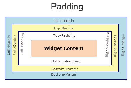
Defines the space between the content of the widget and the widget boundaries. You can use this option to define the top, left, right, and bottom distance between the widget content and the widget boundary.
Syntax
padding
Type
Array of Numbers
Read/Write
Yes - (Read and Write)
Remarks
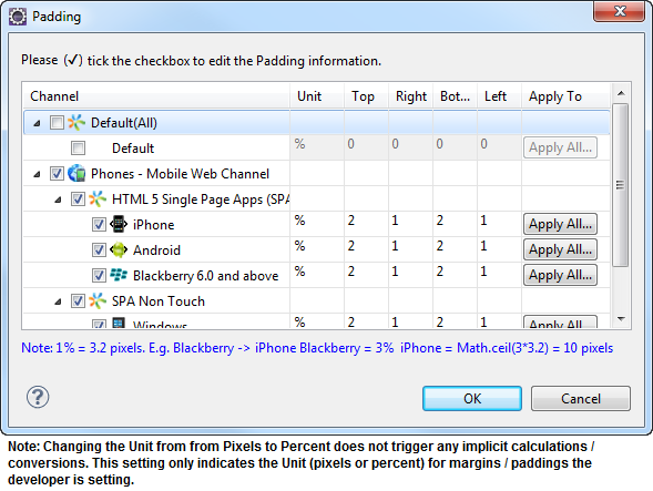
To define the padding values for a platform, click the () button against the property to open the Padding screen. Select the checkbox against the platform for which you want to define the padding's and enter the top, left, right, and bottom padding values.
If you want to use the padding values set for a platform across other platforms, you can click the Apply To button and select the platforms on which you want the padding values to be applied.
The following image illustrates the window to define the padding's for platforms:
The following image illustrates a widget with a defined padding:
Example
//Sample code to set padding property of a Link widget.

frmLink.myLink.padding=[5,5,5,5];
Accessible from IDE
Yes
Platform Availability
Available on all platforms except Mobile Web (basic).
paddingInPixel
Indicates if the padding is to be applied in pixels or in percentage.
Syntax
paddingInPixel
Type
Boolean
Read/Write
No
Remarks
Default: false
If set to true, the padding are applied in pixels.
If set to false, the padding are applied as set in padding property.
This property can be set to true or false only for iPhone, iPad, Android and Windows Phone. On other platforms this property does not give any results even when set to true.
For backward compatibility on older projects, this property is will be made true for iPhone, iPad, Android and Windows Phone and for other platforms it will be false.
Example
//Sample code to set paddingInPixel property of a Link widget.

frmLink.myLink.paddingInPixel=true;
Accessible from IDE
Yes
Platform Availability
- iPhone
- iPad
- Android
- Windows Phone
- Windows Desktop
retainContentAlignment Property
This property is used to retain the content alignment property value, as it was defined.
Note: Locale-level configurations take priority when invalid values are given to this property, or if it is not defined.
The mirroring widget layout properties should be defined as follows.
function getIsFlexPositionalShouldMirror(widgetRetainFlexPositionPropertiesValue) {
    return (isI18nLayoutConfigEnabled &&
    localeLayoutConfig[defaultLocale]
    ["mirrorFlexPositionalProperties"] == true &&
    !widgetRetainFlexPositionPropertiesValue);
}
The following table illustrates how widgets consider Local flag and Widget flag values.
| Properties | Local Flag Value | Widget Flag Value | Action |
|---|---|---|---|
| Mirror/retain FlexPositionProperties | true | true | Use the designed layout from widget for all locales. Widget layout overrides everything else. |
| Mirror/retain FlexPositionProperties | true | false | Use Mirror FlexPositionProperties since locale-level Mirror is true. |
| Mirror/retain FlexPositionProperties | true | not specified | Use Mirror FlexPositionProperties since locale-level Mirror is true. |
| Mirror/retain FlexPositionProperties | false | true | Use the designed layout from widget for all locales. Widget layout overrides everything else. |
| Mirror/retain FlexPositionProperties | false | false | Use the Design/Model-specific default layout. |
| Mirror/retain FlexPositionProperties | false | not specified | Use the Design/Model-specific default layout. |
| Mirror/retain FlexPositionProperties | not specified | true | Use the designed layout from widget for all locales. Widget layout overrides everything else. |
| Mirror/retain FlexPositionProperties | not specified | false | Use the Design/Model-specific default layout. |
| Mirror/retain FlexPositionProperties | not specified | not specified | Use the Design/Model-specific default layout. |
Syntax
retainContentAlignment
Type
Boolean
Read/Write
No (only during widget-construction time)
Example
//This is a generic property that is applicable for various widgets.
//Here, we have shown how to use the retainContentAlignment property for Button widget.
/*You need to make a corresponding use of the
retainContentAlignment property for other applicable widgets.*/
var btn = new voltmx.ui.Button({
    "focusSkin": "defBtnFocus",
    "height": "50dp",
    "id": "myButton",
    "isVisible": true,
    "left": "0dp",
    "skin": "defBtnNormal",
    "text": "text always from top left",
    "top": "0dp",
    "width": "260dp",
    "zIndex": 1
}, {
    "contentAlignment": constants.CONTENT_ALIGN_TOP_LEFT,
    "displayText": true,
    "padding": [0, 0, 0, 0],
    "paddingInPixel": false,
    "retainFlexPositionProperties": false,
    "retainContentAlignment": true
}, {});
Platform Availability
- Available in IDE
- Windows, iOS, Android, and SPA
retainFlexPositionProperties Property
This property is used to retain flex positional property values as they were defined. The flex positional properties are left, right, and padding.
Note: Locale-level configurations take priority when invalid values are given to this property, or if it is not defined.
The mirroring widget layout properties should be defined as follows.
function getIsFlexPositionalShouldMirror(widgetRetainFlexPositionPropertiesValue) {
    return (isI18nLayoutConfigEnabled &&
    localeLayoutConfig[defaultLocale]
    ["mirrorFlexPositionalProperties"] == true &&
    !widgetRetainFlexPositionPropertiesValue);
}
The following table illustrates how widgets consider Local flag and Widget flag values.
| Properties | Local Flag Value | Widget Flag Value | Action |
|---|---|---|---|
| Mirror/retain FlexPositionProperties | true | true | Use the designed layout from widget for all locales. Widget layout overrides everything else. |
| Mirror/retain FlexPositionProperties | true | false | Use Mirror FlexPositionProperties since locale-level Mirror is true. |
| Mirror/retain FlexPositionProperties | true | not specified | Use Mirror FlexPositionProperties since locale-level Mirror is true. |
| Mirror/retain FlexPositionProperties | false | true | Use the designed layout from widget for all locales. Widget layout overrides everything else. |
| Mirror/retain FlexPositionProperties | false | false | Use the Design/Model-specific default layout. |
| Mirror/retain FlexPositionProperties | false | not specified | Use the Design/Model-specific default layout. |
| Mirror/retain FlexPositionProperties | not specified | true | Use the designed layout from widget for all locales. Widget layout overrides everything else. |
| Mirror/retain FlexPositionProperties | not specified | false | Use the Design/Model-specific default layout. |
| Mirror/retain FlexPositionProperties | not specified | not specified | Use the Design/Model-specific default layout. |
Syntax
retainFlexPositionProperties
Type
Boolean
Read/Write
No (only during widget-construction time)
Example
//This is a generic property that is applicable for various widgets.
//Here, we have shown how to use the retainFlexPositionProperties property for Button widget.
/*You need to make a corresponding use of the
retainFlexPositionProperties property for other applicable widgets.*/
var btn = new voltmx.ui.Button({
    "focusSkin": "defBtnFocus",
    "height": "50dp",
    "id": "myButton",
    "isVisible": true,
    "left": "0dp",
    "skin": "defBtnNormal",
    "text": "always left",
    "top": "0dp",
    "width": "260dp",
    "zIndex": 1
}, {
    "contentAlignment": constants.CONTENT_ALIGN_CENTER,
    "displayText": true,
    "padding": [0, 0, 0, 0],
    "paddingInPixel": false,
    "retainFlexPositionProperties": true,
    "retainContentAlignment": false
}, {});
Platform Availability
- Available in IDE
- Windows, iOS, Android, and SPA
retainFlowHorizontalAlignment Property
This property is used to convert Flow Horizontal Left to Flow Horizontal Right.
Note: Locale-level configurations take priority when invalid values are given to this property, or if it is not defined.
The mirroring widget layout properties should be defined as follows.
function getIsFlexPositionalShouldMirror(widgetRetainFlexPositionPropertiesValue) {
    return (isI18nLayoutConfigEnabled &&
    localeLayoutConfig[defaultLocale]
    ["mirrorFlexPositionalProperties"] == true &&
    !widgetRetainFlexPositionPropertiesValue);
}
The following table illustrates how widgets consider Local flag and Widget flag values.
| Properties | Local Flag Value | Widget Flag Value | Action |
|---|---|---|---|
| Mirror/retain FlexPositionProperties | true | true | Use the designed layout from widget for all locales. Widget layout overrides everything else. |
| Mirror/retain FlexPositionProperties | true | false | Use Mirror FlexPositionProperties since locale-level Mirror is true. |
| Mirror/retain FlexPositionProperties | true | not specified | Use Mirror FlexPositionProperties since locale-level Mirror is true. |
| Mirror/retain FlexPositionProperties | false | true | Use the designed layout from widget for all locales. Widget layout overrides everything else. |
| Mirror/retain FlexPositionProperties | false | false | Use the Design/Model-specific default layout. |
| Mirror/retain FlexPositionProperties | false | not specified | Use the Design/Model-specific default layout. |
| Mirror/retain FlexPositionProperties | not specified | true | Use the designed layout from widget for all locales. Widget layout overrides everything else. |
| Mirror/retain FlexPositionProperties | not specified | false | Use the Design/Model-specific default layout. |
| Mirror/retain FlexPositionProperties | not specified | not specified | Use the Design/Model-specific default layout. |
Syntax
retainFlowHorizontalAlignment
Type
Boolean
Read/Write
No (only during widget-construction time)
Example
//This is a generic property that is applicable for various widgets.
//Here, we have shown how to use the retainFlowHorizontalAlignment property for Button widget.
/*You need to make a corresponding use of the
retainFlowHorizontalAlignment property for other applicable widgets. */
var btn = new voltmx.ui.Button({
 "focusSkin": "defBtnFocus",
 "height": "50dp",
 "id": "myButton",
 "isVisible": true,
 "left": "0dp",
 "skin": "defBtnNormal",
 "text": "always left",
 "top": "0dp",
 "width": "260dp",
 "zIndex": 1
}, {
 "contentAlignment": constants.CONTENT_ALIGN_CENTER,
 "displayText": true,
 "padding": [0, 0, 0, 0],
 "paddingInPixel": false,
 "retainFlexPositionProperties": true,
 "retainContentAlignment": false,
 "retainFlowHorizontalAlignment ": false
}, {});
Platform Availability
- Available in IDE
- Windows, iOS, Android, and SPA
showProgressIndicator Property
Specifies if the progress indicator must be displayed when the link is clicked.
Syntax
showProgressIndicator
Type
Boolean
Read/Write
No
Remarks
This is typically set to true, if it is known at design time that the link onClick event handling is going to trigger a long running call.
The following image illustrates the progress indicator on iPhone:

Example
//Sample code to set showProgressIndicator property of a Link widget.

frmLink.myLink.showProgressIndicator=true;
Platform Availability
- Available in the IDE
- iPad
- iPhone
- Server side Mobile Web (advanced)
skin Property
Specifies the look and feel of the Link when not in focus.
Syntax
skin
Type
String
Read/Write
Read + Write
Remarks
On the Windows Tablet platform, because of native behavior a skin with font style as underline is not supported.
Example
//Sample code to set the skin property of a Link widget.

frmLink.myLink.skin="linkSkin";
Platform Availability
- Available in the IDE
- Available on all platforms
submitURL Property
Specifies the URL to which the current Form data should be submitted, without contacting Volt MX Server.
Syntax
submitURL
Type
Boolean
Read/Write
No
Remarks
The default value for this property is false.
If set to false, then the URL is submitted contacting the Volt MX Server.
If set to true, then the URL is submitted without contacting the Volt MX Server.
This is typically required when the data collection is done using Volt MX Iris Form but is actually posted to a third-party site.
For example, for an application that requires the user to provide confidential data, you can route the data directly to the server of the website without contacting the Volt MX Server using the externalURL property. Doing so, opens the resultant site in the same window rather than opening it in a new window.
Example
//Defining properties for a link widget with submitURL:"http://www.google.co.in"
var linkBasic = {
    id: "link1",
    skin: "linkSkin",
    focusSkin: "linkFSkin",
    text: "Click here",
    isVisible: true
};

var linkLayout = {
    containerWeight: 100,
    padding: [5, 5, 5, 5],
    margin: [5, 5, 5, 5],
    paddingInPixel: true,
    marginInPixel: true,
    hExpand: true
};

var linkPSP = {
    submitURL: "http://www.google.co.in"
};

//Creating link widget
var link1 = new voltmx.ui.Link(linkBasic, linkLayout, linkPSP);
Platform Availability
- Available in the IDE
- Available on Server side Mobile Web (advanced) platform only
text Property
Specifies a general or descriptive text for the Link widget.
Syntax
text
Type
String
Read/Write
Read + Write
Example
//Sample code to set the text property of a Link widget.

frmLink.myLink.text="Click here";
Platform Availability
- Available in the IDE
- Available on all platforms
toolTip Property
Specifies the hint text when the cursor hovers over a widget, without clicking it. The text entered in the tooltip appears as a small box when the cursor hovers over a widget.
Syntax
toolTip
Type
String
Read/Write
Read + Write
Example
//Sample code to set the toolTip property of a Link widget.

frmLink.myLink.toolTip="sample text";
Platform Availability
- Available in the IDE
- Available on all platforms except BlackBerry
widgetAlignment Property
Indicates how a widget is to be anchored with respect to its parent. Each of these below options have a horizontal alignment attribute and a vertical alignment attribute. For example, WIDGET_ALIGN_TOP_LEFT specifies the vertical alignment as TOP and horizontal alignment as LEFT.
Syntax
widgetAlignment
Type
Number
Read/Write
No
Remarks
Horizontal alignment attributes are only applicable if hExpand is false.
The default value for the property is WIDGET_ALIGN_CENTER.
The widget alignment can be controlled by the below options:
- WIDGET_ALIGN_TOP_LEFT
- WIDGET_ALIGN_TOP_CENTER
- WIDGET_ALIGN_TOP_RIGHT
- WIDGET_ALIGN_MIDDLE_LEFT
- WIDGET_ALIGN_CENTER
- WIDGET_ALIGN_MIDDLE_CENTER
- WIDGET_ALIGN_MIDDLE_RIGHT
- WIDGET_ALIGN_BOTTOM_LEFT
- WIDGET_ALIGN_BOTTOM_CENTER
- WIDGET_ALIGN_BOTTOM_RIGHT
Example
//Sample code to set the widgetAlignment property of a Link widget.

frmLink.myLink.widgetAlignment=constants.WIDGET_ALIGN_TOP_LEFT;
Platform Availability
- Available in the IDE
- Available on all platforms