SegmentedUI Properties
The properties for the Segment widget are:
accessibilityConfig Property
Enables you to control accessibility behavior and alternative text for the widget.
For more information on using accessibility features in your app, see the Accessibility appendix in the VoltMX IrisUser Guide.
Syntax
accessibilityConfig
Type
Object
Read/Write
Read + Write
Remarks
- The accessibilityConfig property is enabled for all the widgets which are supported under the Flex Layout.
Note: From VoltMX Iris V9 SP2 GA version, you can provide i18n keys as values to all the attributes used inside the
accessibilityConfigproperty. Values provided in the i18n keys take precedence over values provided ina11yLabel,a11yValue, anda11yHintfields.
The accessibilityConfig property is a JavaScript object which can contain the following key-value pairs.
| Key | Type | Description | ARIA Equivalent |
|---|---|---|---|
| a11yIndex | Integer with no floating or decimal number. | This is an optional parameter. Specifies the order in which the widgets are focused on a screen. | For all widgets, this parameter maps to the aria-index, index, or taborder properties. |
| a11yLabel | String | This is an optional parameter. Specifies alternate text to identify the widget. Generally the label should be the text that is displayed on the screen. | For all widgets, this parameter maps to the aria-labelledby property of ARIA in HTML. > Note: For the Image widget, this parameter maps to the alt attribute of ARIA in HTML. |
| a11yValue | String | This is an optional parameter. Specifies the descriptive text that explains the action associated with the widget. On the Android platform, the text specified for a11yValue is prefixed to the a11yHint. | This parameter is similar to the a11yLabel parameter. If the a11yValue is defined, the value of a11yValue is appended to the value of a11yLabel. These values are separated by a space. |
| a11yHint | String | This is an optional parameter. Specifies the descriptive text that explains the action associated with the widget. On the Android platform, the text specified for a11yValue is prefixed to the a11yHint. | For all widgets, this parameter maps to the aria-describedby property of ARIA in HTML. |
| a11yHidden | Boolean | This is an optional parameter. Specifies if the widget should be ignored by assistive technology. The default option is set to false. This option is supported on iOS 5.0 and above, Android 4.1 and above, and SPA | For all widgets, this parameter maps to the aria-hidden property of ARIA in HTML. |
| a11yARIA | Object | This is an optional parameter. For each widget, the key and value provided in this object are added as the attribute and value of the HTML tags respectively. Any values provided for attributes such as aria-labelledby and aria-describedby using this attribute, takes precedence over values given in a11yLabel and a11yHint fields. When a widget is provided with the following key value pair or attribute using the a11yARIA object, the tabIndex of the widget is automatically appended as zero.{"role": "main"}``aria-label |
This parameter is only available on the Desktop Web platform. |
Android limitations
- If the results of the concatenation of a11y fields result in an empty string, then
accessibilityConfigis ignored and the text that is on widget is read out. - The soft keypad does not gain accessibility focus during the right/left swipe gesture when the keypad appears.
SPA/Desktop Web limitations
- When
accessibilityConfigproperty is configured for any widget, thetabIndexattribute is added automatically to theaccessibilityConfigproperty. - The behavior of accessibility depends on the Web browser, Web browser version, Voice Over Assistant, and Voice Over Assistant version.
- Currently SPA/Desktop web applications support only a few ARIA tags. To achieve more accessibility features, use the attribute a11yARIA. The corresponding tags will be added to the DOM as per these configurations.
Example 1
This example uses the button widget, but the principle remains the same for all widgets that have an accessibilityConfig property.
//This is a generic property that is applicable for various widgets.
//Here, we have shown how to use the accessibilityConfig Property for button widget.
/*You need to make a corresponding use of the accessibilityConfig property for other applicable widgets.*/

Form1.myButton.accessibilityConfig = {
    "a11yLabel": "Label",
    "a11yValue": "Value",
    "a11yHint": "Hint"
};
Example 2
This example uses the button widget to implement internationalization in accessibilityConfig property, but the principle remains the same for all widgets.
/*Sample code to implement internationalization in accessibilityConfig property in Native platform.*/

Form1.myButton.accessibilityConfig = {
    "a11yLabel": voltmx.i18n.getLocalizedString("key1")
};
/*Sample code to implement internationalization in accessibilityConfig property in Desktop Web platform.*/

Form1.myButton.accessibilityConfig = {
    "a11yLabel": "voltmx.i18n.getLocalizedString(\"key3\")"
};
Platform Availability
- Available in the IDE
- iOS, Android, SPA, and Desktop Web
alternateRowSkin Property
Specifies the skin that is applied to every alternate even numbered row in the segment.
Syntax
alternateRowSkin
Type
String
Read/Write
Read + Write
Remarks
For example, if you have 5 segments, the alternate row skin is applied to segments 2 and 4.
If you delete any even segment using the method removeAt, the odd indexes will reset and become even. The Alternate skin is applied to these new even indexes.
For example, if you have 5 segments and you delete segment 2, the odd indexes reset and segment 3 becomes segment 2 and the alternate skin is applied to it.
Example
//Sample code to define the alternateRowSkin property for Segment.
frmSegment.mySegment.alternateRowSkin="alternateSkin";
Platform Availability
- Available in the IDE
- Available on all platforms
anchorPoint Property
Specifies the anchor point of the widget bounds rectangle using the widget's coordinate space.
Syntax
anchorPoint
Type
JSObject
Read/Write
Read + Write
Remarks
The value for this property is a JavaScript dictionary object with the keys "x" and "y". The values for the "x" and "y" keys are floating-point numbers ranging from 0 to 1. All geometric manipulations to the widget occur about the specified point. For example, applying a rotation transform to a widget with the default anchor point causes the widget to rotate around its center.
The default value for this property is center ( {"x":0.5, "y":0.5} ), that represents the center of the widgets bounds rectangle. The behavior is undefined if the values are outside the range zero (0) to one (1).
Example
Form1.widget1.anchorPoint = {
    "x": 0.5,
    "y": 0.5
};
Platform Availability
- iOS, Android, Windows, and SPA
animateFocusChanges Property
This property is used to bring the row specified in the selectedRowIndex property to the visible region.
Syntax
animateFocusChanges
Type
Boolean
Read/Write
Read + Write
Remarks
- If you set the animateFocusChanges property as true, the row specified in the selectedRowIndex property moves to the viewable area on the screen with animation. This property is supported for all the values of the property viewtype.
- If you set the animateFocusChanges property as false, the selected row moves to the viewable area without animation.
Example
frmHome.seg.animateFocusChanges = true;
Platform Availability
Not available in the IDE.
- iOS
autogrowMode Property (Deprecated)
The autogrowMode property is deprecated in 6.0.3 release. The autogrowMode property is used to set the height of a widget dynamically based on the derived height of the widget’s content, or from the child widget’s contents. The options are:
- voltmx.flex.AUTOGROW_NONE (value is 0)
- voltmx.flex.AUTOGROW_HEIGHT (value is 1)
Syntax
autogrowMode
Type
Number
Read/Write
Read only
Remarks
Note: If you want to configure this property in VoltMX Iris, configure the height property of FlexContainer as preferred, then VoltMX Iris generates the autogrowMode property as voltmx.flex.AUTOGROW_HEIGHT.
The default value for this property is voltmx.flex.AUTOGROW_NONE.
Note: If one or all the child widgets height or other properties such as centerY, top, bottom, minHeight or maxHeight are used in determining the height given in percentage (%), then the autogrowMode property will not work for the FlexContainer and its height fallback to default configuration value.
Rules and priorities of autogrowMode property
-
The autogrowMode property is ignored if the height of the widget is computable either through explicit value or implicit calculation.
-
If the autogrowMode property is configured as voltmx.flex.AUTOGROW_HEIGHT, then preferredSize (based on content or child widgets ) is computed, and min/max constraints are applied.
- If the autogrowMode property is configured as voltmx.flex.AUTOGROW_NONE, the default value is applied with min/max constraints.
- The height of a FlexContainer widget will not grow dynamically if the height of any widget changes because of the change in widget's skin state (such as from normal to focus).
- If a widgets top value is given in negative values, then the widget is clipped in case of Free Form and overlapped on the previous widget in case of Flow Vertical.
- The autogrowMode property is not supported for a FlexContainer widget that is placed inside an HBox or a VBox.
- For example, a FlexContainer (flexA) has a FlexContainer (flexB), which is not set to grow dynamically, whose clipBounds is set to false. The children of flexB that are out of the bounds of flexB do not have any effect on the height of flexA. Only the heights of direct children of flexA will decide the height of flexA.
- In templates, FlexContainer will grow only in SegmentedUI Table View only. In all other views, autogrowMode property is not supported.
- The autogrowMode property for a FlexContainer is not supported in the Tab Widget.
- In the Windows 10 platform, the autogrowMode property of a SegmentedUI is not supported inside a FlexContainer.
- In the Android platform, the autogrowMode property of a SegmentedUI with a large number of rows leads to performance and memory issues.
- When animating the height property of the child widget of a FlexContainer in iOS, Windows, and SPA platforms, after the animation is complete, then parent containers height increases based on the value provided in 100th step when fillMode is configured as voltmx.anim.FILL_MODE_FORWARDS.
- When animating the height property of the child widget of a FlexContainer in the Android platform, the parent container's height grows along with the child widget's height.
When to Use
- If the height of the FlexContainer is dependent on the heights of the child widgets that are added.
- If you are using the FlexContainer in a SegmentedUI template, where each row of the SegmentedUI row height is dependent on the child widgets content. Configure the height property of the FlexContainer as preferred, then VoltMX Iris generates the autogrowMode property as voltmx.flex.AUTOGROW_HEIGHT.
Example
Setting the autogrowMode property on an existing widget
//widget will use the set height flex property to derive height
frmHome.autogrow1.autogrowMode=voltmx.flex.AUTOGROW_NONE;

//widget will use the widget contents or child widget contents to derive height
frmHome.autogrow1.autogrowMode=voltmx.flex.AUTOGROW_HEIGHT;
Platform Availability
Not available in the IDE.
- iOS
- Android
- Windows
- SPA
border Property
Specifies the border to the SegmentedUI.
Syntax
border
Type
Number
Read/Write
Read + Write
Remarks
The default value for this property is SEGUI_BORDER_BOTH_BOTTOM_TOP.
The available options are:
- SEGUI_BORDER_NONE: The border is not displayed on the segment.
- SEGUI_BORDER_TOP_ONLY: The border is displayed on top of the segment.
- SEGUI_BORDER_BOTTOM_ONLY: The border is displayed at the bottom of the segment.
- SEGUI_BORDER_BOTH_BOTTOM_TOP: The border is displayed on top and bottom of the segment.
This property is applicable only when the segment viewType is set to SEGUI_VIEW_TYPE_TABLE_VIEW.
To set the value through code, prefix the option with constants. such as constants..
Example
//Sample code to define border property for a Segment widget.
frmSegment.mySegment.border=constants.SEGUI_BORDER_TOP_ONLY;
Platform Availability
- Available in the IDE
- Server side Mobile Web (basic)
- Server side Mobile Web (BJS)
- Server side Mobile Web (advanced)
- SPA
bottom Property
This property determines the bottom edge of the widget and is measured from the bottom bounds of the parent container.
The bottom property determines the position of the bottom edge of the widget’s bounding box. The value may be set using DP (Device Independent Pixels), Percentage, or Pixels. In freeform layout, the distance is measured from the bottom edge of the parent container. In flow-vertical layout, the value is ignored. In flow-horizontal layout, the value is ignored.
The bottom property is used only if the Height property is not provided.
Syntax
bottom
Type
String
Read/Write
Read + Write
Remarks
The property determines the bottom edge of the widget and is measured from the bottom bounds of the parent container.
If the layout Type is set as voltmx.flex.FLOW_VERTICAL, the bottom property is measured from the top edge of bottom sibling widget. The vertical space between two widgets is measured from bottom of the top sibling widget and the top of the bottom sibling widget.
Example
//Sample code to set the bottom property for widgets by using DP, Percentage and Pixels.
frmHome.widgetID.bottom = "50dp";

frmHome.widgetID.bottom = "10%";

frmHome.widgetID.bottom = "10px";
Platform Availability
- Available in the IDE
- iOS, Android, Windows, SPA , and Desktop Web
bounces Property
Specifies whether the scroll view bounces past the edge of the content and back again.
Syntax
bounces
Type
Boolean
Remarks
The default value for this property is true.
If set to false, the scroll view bounce is not applied.
If set to true, the scroll view bounce is applied.
This property is applicable only when the segment viewType is set to SEGUI_VIEW_TYPE_TABLE_VIEW.
Example
//Sample code to enable bounces property for a Segment widget.
frmSegment.mySegment.bounces=true;
Platform Availability
- Available in the IDE
- iOS and SPA
centerX Property
This property determines the center of a widget measured from the left bounds of the parent container.
The centerX property determines the horizontal center of the widget’s bounding box. The value may be set using DP (Device Independent Pixels), Percentage, or Pixels. In freeform layout, the distance is measured from the left edge of the parent container. In flow-vertical layout, the distance is measured from the left edge of the parent container. In flow-horizontal layout, the distance is measured from the right edge of the previous sibling widget in the hierarchy.
Syntax
centerX
Type
String
Read/Write
Read + Write
Remarks
If the layout Type is set as voltmx.flex.FLOW_HORIZONTAL, the centerX property is measured from right edge of the left sibling widget.
Example
//Sample code to set the centerX property for widgets by using DP, Percentage and Pixels.
frmHome.widgetID.centerX = "50dp";

frmHome.widgetID.centerX = "10%";

frmHome.widgetID.centerX = "10px";
Platform Availability
- Available in the IDE
- iOS, Android, Windows, SPA, and Desktop Web
centerY Property
This property determines the center of a widget measured from the top bounds of the parent container.
The centerY property determines the vertical center of the widget’s bounding box. The value may be set using DP (Device Independent Pixels), Percentage, or Pixels. In freeform layout, the distance is measured from the top edge of the parent container. In flow-horizontal layout, the distance is measured from the top edge of the parent container. In flow-vertical layout, the distance is measured from the bottom edge of the previous sibling widget in the hierarchy.
Syntax
centerY
Type
String
Read/Write
Read + Write
Remarks
If the layout Type is set as voltmx.flex.FLOW_VERTICAL, the centerY property is measured from bottom edge of the top sibling widget.
Example
//Sample code to set the centerY property for widgets by using DP, Percentage and Pixels.
frmHome.widgetID.centerY = "50dp";

frmHome.widgetID.centerY = "10%";

frmHome.widgetID.centerY = "10px";
Platform Availability
- Available in the IDE
- iOS, Android, Windows, SPA, and Desktop Web
contentInsetAdjustmentType Property
On scroll view, the contentInsetAdjustmentBehaviour property automatically adds the required SegmentedUI insets to the scroll view. This automatic addition of insets occurs when the content in the scroll view is not in the safe area and if the value is set to constants.CONTENTINSET_ADJUSTMENT_AUTOMATIC.
As specified later, this property plays an important role in various iPhone X layout scenarios.
Syntax
contentInsetAdjustmentType
Type
Constant (Number)
Read/Write
Read + Write
Constants exposed to JsWorld
-
constants. CONTENTINSET_ADJUSTMENT_AUTOMATIC: Automatically adjusts the SegmentedUI insets.
-
constants.CONTENTINSET_ADJUSTMENT_SCROLLABLEAXES: Adjusts the SegmentedUI insets in only scrollable directions.
-
constants.CONTENTINSET_ADJUSTMENT_NEVER: Does not adjust the SegmentedUI insets.
-
constants.CONTENTINSET_ADJUSTMENT_ALWAYS: Always includes the SegmentedUI insets in content adjustment.
Default Value
- constants. CONTENTINSET_ADJUSTMENT_NEVER
iPhone X Layout Scenario
If you want to position the Segment in the lower unsafe area of iPhone X, you must enable the extendBottom property for the form. In that scenario, if you want to view the entire Segment as a whole after scrolling, you must set the contentInsetAdjustmentType property to constants.CONTENTINSET_ADJUSTMENT_AUTOMATIC.
In all other cases, you must set the contentInsetAdjustmentType property to its default value of constants.CONTENTINSET_ADJUSTMENT_NEVER.
When the extendBottom property for the form is set to true, the relevant states of the iPhone X layout are as follows:
State 1: Before scrolling
State 2: After scrolling; with contentInsetAdjustmentType = constants.CONTENTINSET_ADJUSTMENT_NEVER
State 3: After scrolling; with contentInsetAdjustmentType = constants.CONTENTINSET_ADJUSTMENT_AUTOMATIC
Example
function setContentInsetAdjustmentType(){
     Form1.SegmentInForm1.contentInsetAdjustmentType = constants.CONTENTINSET_ADJUSTMENT_AUTOMATIC;
}
Platform Availability
- iOS 11 and later
- Not available in the IDE
contentOffsetMeasured Property
This property returns the current coordinates of the top left corner of the scrollable region in the segment.
Syntax
contentOffsetMeasured
Type
JavaScript Object
Read/Write
Read only
Remarks
Returns the following key:value pairs:
{x:valueInDP, y:valueInDP}
The values are numbers that represent device pixels (DP).
Limitation
If the Image widget has preferred height and if the image source is from the network, i.e., src, the contentOffsetMeadured property does not turn on.
The segment widget reuses row-templates. Rows which move out of the screen stop downloading the image and that affects the height calculation of the row height.
Example
var offset = frmHome.seg.contentOffsetMeasured;
voltmx.print (“contentOffsetMeasured:” + frmHome.seg.contentOffsetMeasured);
Platform Availability
- Available in the IDE
- iOS
- Android
cursorType Property
In Desktop Web applications, when you hover the mouse over any widget, a mouse pointer appears. Using the cursorType property in Iris, you can specify the type of the mouse pointer.
Syntax
cursorType
Type
String.
You must provide valid CSS cursor value such as wait, grab, help, etc. to the cursorType property.
Read/Write
Read + Write
Remarks
To add the cursorType property using VoltMX Iris in a Desktop Web application, follow these steps.
- In VoltMX Iris, open the Desktop Web application. From the Project explorer, expand Responsive Web/ Desktop> Forms and select the form to which you need to make the changes.
- On the canvas, select the widget for which you want to specify the cursor type. For example, button.
- From the Properties panel, navigate to the Skin tab > Hover Skin tab.
You will find that the details of the hover skin is not enabled here. - Check the Enable option to add a hover skin to your widget.
The details and configurations of the hover skin is enabled. - Under the General section, for the Platform option, click the ellipsis icon.
The Fork Skin window appears. - In the Fork Skin window, for Desktop, check under HTML5 SPA.
- Click Ok. You have successfully forked your hover skin for Desktop Web application.
You can see that the Cursor Type property has been added under the General section. - Select a value from the drop-down list to set the Cursor Type for the widget.
Example
 //This is a generic property and is applicable for many widgets.

/*The example provided is for the Button widget. Make the required changes in the example while using other widgets.*/

frmButton.myButton.cursorType = "wait";
Platform Availability
- Available in IDE
- Desktop Web
data Property
Specifies the set of values that must be displayed on each row of the segment.
Syntax
data
Type
Array
Read/Write
Read + Write
Remarks
The data is categorized into Sections and Rows. The Sections information is optional. You can set the data in three different formats.
- Format1: Set the data without any sections.
- Format 2: Set the data with sections where section header is a name.
- Format 3: Set the data with sections where header is driven by template.
The below table explains the type and description of template key:
| Key | Key | Type | Comments |
| template | Not Applicable | JavaScript: Object | Indicates the template to be used for the specific row |
Example
//Sample code to define data property for a Segment widget.
frmSegment.mySegment.data = [{
 "dataId1": "data1",
 "dataId2": "data2",
 "dataId3": "data3",
 "accessibilityConfig": "acObject"
}, {
 "dataId1": "datax",
 "dataId2": "datay",
 "dataId3": "dataz",
 "template": "box1",
 "accessibilityConfig": "acObject"
}];
Example of Format 1
[{
    "dataId1": "foo",
    "dataId2": "foo",
    "dataId3": "foo",
    "accessibilityConfig": "acObject"
}, {
    "dataId1": "bar",
    "dataId2": "bar",
    "dataId3": "bar",
    "template": "boxRef2",
    "accessibilityConfig": "acObject"
}, {
    "dataId1": "bar",
    "dataId2": "bar",
    "dataId3": {
        "isVisible" :true,
      "skin" : "nskin",
      "focusSkin": "fskin",
      "text" : "Foo"
    },
    "accessibilityConfig": "acObject"
}]
In the above example, template is the standard key which can be optionally to override the common rowTemplate provided with a specific template for the row. For template always the value has to be valid box reference, if not it falls back to the common rowTemplate. mentainfo is another standard key which can be used to specify meta information about the row. iOS specific standard parameters that metainfo can support are clickable, skin and editmode.
In the above examples, the values of dataId1, dataId2 are shown as string, but dataId3 is key value pair. The key value pair format allows you to set the properties specific to the widget. In the above example, you are setting the isVisible property to true and text property to "Foo", skin property with ID nskin and focusSkin to a skin with ID fskin. If a string is provided, typically is mapped to the text property for button and labels and the src property for the image.
Example of Format 2
/*set the data with sections where section header is a name.
This example has two sections and each section with two rows.*/
[
    ["section1", [{
        "dataId1": "foo",
        "dataId2": "foo",
        "dataId3": "foo",
        "accessibilityConfig": "acObject"
    }, {
        "dataId1": "bar",
        "dataId2": "bar",
        "dataId3": "bar",
        "accessibilityConfig": "acObject"
    }], "acObject"],
    ["section2", [{
        "dataId1": "foo",
        "dataId2": "foo",
        "dataId3": "foo",
        "accessibilityConfig": "acObject"
    }, {
        "dataId1": "bar",
        "dataId2": "bar",
        "dataId3": "bar",
        "accessibilityConfig": "acObject"
    }], "acObject"]
]
Example of Format 3
/*set the data with sections where section header driven by template. This example has two sections and each section with two rows.*/
[
    [{
            "secDataId1": "",
            "secDataId2": "",
            "template": "secHeaderBoxRef2",
            "accessibilityConfig": "acObject"
        },
        [{
            "dataId1": "foo",
            "dataId2": "foo",
            "dataId3": "foo",
            "accessibilityConfig": "acObject"
        }, {
            "dataId1": "bar",
            "dataId2": "bar",
            "dataId3": "bar",
            "accessibilityConfig": "acObject"
        }]
    ],
    [{
            "secDataId1": "",
            "secDataId2": "",
            "template": "secHeaderBoxRef2",
            "accessibilityConfig": "acObject"
        },
        [{
            "dataId1": "foo",
            "dataId2": "foo",
            "dataId3": "foo",
            "accessibilityConfig": "acObject"
        }, {
            "dataId1": "bar",
            "dataId2": "bar",
            "dataId3": "bar",
            "accessibilityConfig": "acObject"
        }]
    ]
]
Use Components without Contract in Segment Templates
You can use components without contract inside Segment templates. You can map the child widgets of the component to a key in the widgetDataMap property by using the dot operator.
The data property is then used to set the values that are to be displayed in the child widgets of the component. You can assign this set of values directly to the key or to the properties of the child widgets.
Note: Segment Templates do not provide support for component with contract.
In the following example, after the mapping is done, the data property assigns value to the Comp1lbl1 and Comp1Img1 keys. This value is then assigned to the child widgets- lbl1 and img1 of the _segComp1_component.
/*In this example, segComp1 is the component with lbl1 and img1 as child widgets. Comp1lbl1, and Comp1Img1 are the keys.*/
mySegment.widgetDataMap = {
 " template1": " template1",
 "segComp1.lbl1": "Comp1lbl1",
 "segComp1.img1": "Comp1Img1"
};
//There are two methods to assign data to the widgets inside the component.
//Method One- assign directly by using the key
mySegment.data = [{
  "comp1lbl1": "Row One",
  "comp1img1": "icon1.png"
 },
 {
  "comp1lbl1": "Row Two",
  "comp1img1": "icon2.png"
 }
];
//Method Two- assign to the properties of the child widgets
mySegment.data = [{
  "comp1lbl1": {
   "text": "Row One",
   "skin": "lblskn1"
  },
  "comp1img1": {
   "src": "icon1.png",
   "left": "100dp"
  }
 },
 {
  "comp1lbl1": {
   "text": "Row Two",
   "skin": "lblskn1"
  },
  "comp1img1": {
   "src": "icon2.png",
   "left": "10dp"
  }
 }
];
Note: When components are rendered inside a Segment template, the events and gestures assigned to the child widgets of the components are retained.
Platform Availability
- Available in the IDE
- Available on all platforms
defaultSelection Property
Specifies if the first clickable element (Image or Label) of the segment is selected by default.
Syntax
defaultSelection
Type
Boolean
Read/Write
Read + Write
Remarks
The default value for this property is true.
If set to false, the default selection is not applied.
If set to true, the default selection is applied.
This property is applicable only when the segment viewType is set to SEGUI_VIEW_TYPE_TABLE_VIEW.
Example
//Sample code to enable defaultSelection Property for a Segment widget
frmSegment.mySegment.defaultSelection=true;
Platform Availability
- Available in the IDE
- Server side Mobile Web (basic)
- Server side Mobile Web (BJS)
displayType Property
The displayType property specifies the display type of segmentPageView, either in PivotView or FlipView.
Syntax
displayType
Type
Constant
Read/Write
Read + Write
Remarks
This property can be set for a Segment that is placed in either a flex form or a vbox form.
The possible values for this property are:
- SEGPAGE_VIEW_TYPE_DEFAULT: The default value of this property, dependent on the device where the application is running, such as FlipView for Windows 10.
- SEGPAGE_VIEW_TYPE_PHONE: The rows of the segment appear in PivotView. The pivot must be swiped to view the rows.
- SEGPAGE_VIEW_TYPE_TABLET: The rows of the segment appear in FlipView. The arrows must be clicked to view the rows.
Example
//Sample code to define displayType property for a Segment widget
frmSegment.mySegment.displayType=constants.SEGPAGE_VIEW_TYPE_PHONE;
Platform Availability
Windows
dockSectionHeaders Property
The docking header property enables you to dock or place the section header at the top of the segment while scrolling the section content.
Syntax
dockSectionHeaders
Type
Boolean
Read/Write
Read + Write
Remarks
If you are scrolling the segment data, the next section header will be docked on top of the segment.
This property is applicable only when the segment is a screenLevelWidget and viewType is set to SEGUI_VIEW_TYPE_TABLE_VIEW and has sections data.
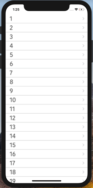
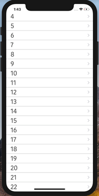
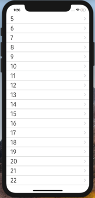
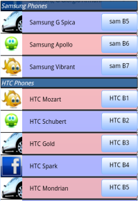
For example, If you scroll the segment data shown in the figure below, as the segment data scrolls up, the Samsung Phones docked header moves out of view and is replaced with the HTC Phones section header which is now docked.
The default value for this property is false.
Important: When the segment height is given as preferred, the property is not supported.
If set to false, the section header is not docked.
If set to true, the section header is docked.
Example
//Sample code to enable dockSectionHeaders property for a Segment widget

frmSegment.mySegment.dockSectionHeaders=true;
Platform Availability
- Available in the IDE
- Available on Android platforms only
editStyle Property
Specifies the editing style to be applied to the rows in the SegmentedUI.
Syntax
editStyle
Type
Number
Read/Write
Read + Write
Remarks
The default value for this property is SEGUI_EDITING_STYLE_NONE.
Following are the available options:
- SEGUI_EDITING_STYLE_ICON: An icon will be displayed on the left hand side of each row.
- SEGUI_EDITING_STYLE_SWIPE: A delete or insert button will be shown on the right hand side of each row when the user performs a SWIPE gesture on the row. Whether an insert button or delete button is to be shown is controlled by the editmode property that is set using the data property of the SegmentedUI.
- SEGUI_EDITING_STYLE_NONE: No special edit styles are applied.
This property is applicable only when the segment viewType is set to SEGUI_VIEW_TYPE_TABLE_VIEW.
To set the value through code, prefix the option with constants. such as constants..
For information regarding the Meta Info that can be set for the rows, see Methods associated with the segment.
If you want to enable Swipe to delete feature for a row in the SegmentedUI then set the editing style to constants.SEGUI.EDITING_STYLE_SWIPE (a delete confirmation appears when you swipe a row).
Example
//Sample code to define editStyle property for a Segment widget

frmSegment.mySegment.editStyle= constants.SEGUI_EDITING_STYLE_SWIPE;
The following image illustrates the Icon edit style:
Platform Availability
- iPhone
- iPad
enable Property
The enable property is used to control the actionability of the widgets. In a scenario where you want to display a widget but not invoke any action on the widget, configure the enable property to false to achieve it.
This is a constructor level property and applicable for all widgets in VoltMX Iris.
Syntax
nable
Type
Boolean
Read/Write
Read + Write
Remarks
The default value of this property is true.
When enable property is configured to true, the action associated with a widget can be invoked by the user in the application.
When enable property is configured to false, the action associated with a widget cannot be invoked by the user in the application.
Example
//This is a generic property and is applicable for many widgets.

/*The example provided is for the Button widget. Make the changes required in the example while using other widgets.*/

frmButton.myBtn.enable= true;
Platform Availability
- Android, iOS, Windows, SPA, and Desktop web
enableCache Property
The property enables you to improve the performance of Positional Dimension Animations.
Syntax
enableCache
Type
Boolean
Read/Write
Read + Write
Remarks
The default value for this property is true.
Note: When the property is used, application consumes more memory. The usage of the property enables tradeoff between performance and visual quality of the content. Use the property cautiously.
Example
Form1.widgetID.enableCache = true;
Platform Availability
- Available in the IDE.
- Windows
enableCloneControllerForRowTemplates Property
This property helps you to create multiple copies of the controller of a Segment row template.
When you set the value of this property as true, multiple copies of the row template controller is created. You can then use this.view to access a particular row and the row's data. When the value of this property is set as false, the multiple copies of the row template controller is not created.
Syntax
enableCloneControllerForRowTemplates
Type
Boolean
The default value of this property is false.
Read/Write
Read + Write
Example
/*Sample code to enable enableCloneControllerForRowTemplates property for a Segment widget.*/

frmSegment.mySegment.enableCloneControllerForRowTemplates = true;
Platform Availability
- Android
enableDictionary Property
Specifies if dictionary must be enabled for easy navigation.
Syntax
enableDictionary
Type
Boolean
Remarks
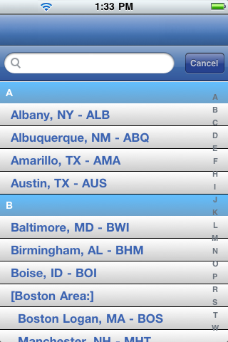
If the dictionary property is enabled, alphabets from A to Z appear on the screen and when you select any alphabet, all the corresponding results that start with the selected alphabet are displayed.
This property is applicable if screenLevelWidget property is set to true, viwType is set to SEGUI_VIEW_TYPE_TABLE_VIEW, and the section headers have been set.
The default value for this property is false.
If set to true, the dictionary is available.
If set to false, the dictionary is not available.
The following image illustrates the behavior of the Enable Dictionary property when set to true:
Example
 //Sample code to enable enableDictionary property for a Segment widget

frmSegment.mySegment.enableDictionary=true;
Platform Availability
- Available in the IDE
- iPhone
- iPad
enableHapticFeedback Property
Allows you to enable or disable haptic feedback on the Segment widget.
Syntax
enableHapticFeedback
Type
Boolean.
If the enableHapticFeedback property is not specified, haptic feedback is not enabled on the Segment widget.
Read/Write
Read + Write
Remarks
- The enableHapticFeedback property is supported for Segment widgets only when the onClick callback event is defined.
-
iOS
- The Haptic Feedback feature is available on iPhone 7 devices and later. These devices have Taptic Engine hardware and users can enable/disable Haptics from Device Settings-> Sounds & Haptics-> System Haptics.
-
Android
- Users can enable the Vibrate on touch feature from Settings-> Sound & notification-> Other sounds.
-
Windows
- Haptic Feedback is supported on Windows devices with OS build version 10.0.15063.0 or later.
Example
//Sample code to set the enableHapticFeedback property on a Segment widget.
frmSegment.mySegment.enableHapticFeedback = true;
Platform Availability
- Android
- iOS
- Windows
enableLazyLoad Property
This property helps you to enable the lazy loading capability for the rows of a Segment. When lazy loading is enabled for a segment, the data in the rows is loaded only when required. Lazy loading improves the performance of a segment as all the data is not loaded simultaneously.
Important: The lazy loading feature is only available for Segments present in a Responsive Web App that is built in the CSS Library mode (with the Enable JS Library Mode (Legacy) option disabled in the Project Settings). If the Enable JS Library Mode (Legacy) option is enabled for the app, the lazy loading feature does not work at run-time, and the loadingPlaceholderImage property does not appear.
When you set the value of this property as true, lazy loading is enabled for the segment, by default.
Note: Support for this property has been introduced in the VoltMX Iris V9 Service Pack 2 Fix Pack 7 release.
Syntax
enableLazyLoad
Type
Boolean
The default value of this property is false.
Read/Write
Read + Write
Example
/*Sample code to enable enableLazyLoad property for a Segment widget.*/

frmSegment.mySegment.enableLazyLoad = true;
Remarks
As lazy loading only loads selective segment rows, the row animations and the onRowDisplay event callbacks are only triggered for the segment rows that are loaded.
When lazy loading is enabled, a default loading image is displayed when users scroll through the segment. Developers can use the loadingPlaceholderImage property to display a desired image as the background (in place of the default background image).
Platform Availability
- Responsive Web
enableReordering Property
The property allows you enable or disable reordering the rows in a Segment.
Syntax
enableReordering
Type
Boolean
Read/Write
Read + Write
Remarks
To allow users to reorder (drag and drop) the rows in a segment, set the property to true. The reordering of the rows works only when the segment's view type is table view. To do so, set the viewType property as SEGUI_VIEW_TYPE_TABLEVIEW.
Example
Setting the enableReordering property on an existing widget
form1.Sgmnt1.enableReordering = true;
Platform Availability
- Available in the IDE
- Android
- iOS
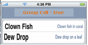
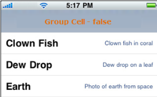
groupCells Property
Specifies if all the rows in the segment should grouped using a rounded corner background and border.
Syntax
groupCells
Type
Boolean
Remarks
The default value for this property is true.
If set to false, the cells will not have rounded border.
If set to true, the cells will have a rounded border.
Example
//Sample code to enable groupCells property for a Segment widget

frmSegment.mySegment.groupCells= true;
Platform Availability
- Available in the IDE
- Available on all platforms except Desktop Web and Server side Mobile Web platforms
height Property
It determines the height of the widget and measured along the y-axis.
The height property determines the height of the widget’s bounding box. The value may be set using DP (Device Independent Pixels), Percentage, or Pixels. For supported widgets, the height may be derived from either the widget or container’s contents by setting the height to “preferred”.
Syntax
height
Type
Number, String, and Constant
Read/Write
Read + Write
Remarks
Following are the available measurement options:
- %: Specifies the values in percentage relative to the parent dimensions.
- px: Specifies the values in terms of device hardware pixels.
- dp: Specifies the values in terms of device independent pixels.
- default: Specifies the default value of the widget.
- voltmx.flex.USE_PREFERED_SIZE: When this option is specified, the layout uses preferred height of the widget as height and preferred size of the widget is determined by the widget and may varies between platforms.
Example
//Sample code to set the height property for widgets by using DP, Percentage and Pixels.
frmHome.segment1.height="50dp";

frmHome.segment1. height="10%";

frmHome.segment1. height="10px";
Platform Availability
- Available in the IDE
- iOS
- Android
- Windows
- SPA
id Property
A unique identifier of Segment consisting of alpha numeric characters. Every Segment should have a unique id within a Form.
Syntax
id
Type
String
Read/Write
Read only
Example
//Defining the properties for a Segment with id:"segId".
var segBasic = {
    **id**: "segment",
    isVisible: true,
    widgetSkin: "widSkin",
    rowSkin: "rowSkn",
    rowFocusSkin: "rowFSkn",
    alternateRowSkin: "altSkin",
    sectionHeaderSkin: "secHSkin",
    widgetDataMap: {
        widgetId1: "dataid1",
        widgetId2: "dataId2",
        widgetId3: "dataId3",
        widgetId4: "secDataId1",
        widgetId5: "secDataId2"
    },
    rowTemplate: box1
};

var segLayout = {
    padding: [5, 5, 5, 5],
    margin: [5, 5, 5, 5]
};

var segPSP = {};

//Creating the Segment.
var segment = new voltmx.ui.SegmentedUI2(segBasic, segLayout, segPSP);

//Reading the id of the SegmentedUI.
voltmx.print("SegmentedUI Id ::" + segment.id);
Platform Availability
- Available in the IDE
- Available on all platforms
indicator Property
Specifies the indicator type as rowSelect, rowClick, or none.
Syntax
indicator
Type
Number
Remarks
Based on your selection, the behavior is exhibited:
The default value for this property is SEGUI_ROW_SELECT.
The available options are:
- SEGUI_ROW_SELECT: Specifies the disclosure indicator. The indicator appears as follows:

If the user selects the indicator, the related content appears in the next screen .
- SEGUI_ROW_CLICK: Specifies the disclosure button. The button appears as follows:

If the user selects the disclosure button, the detailed content appears.
- SEGUI_NONE: No indicator or button is displayed.
To set the value through code, prefix the option with constants. such as constants..
Example
//Sample code to set indicator property for a Segment widget

frmSegment.mySegment.indicator=constants.SEGUI_ROW_CLICK;
Platform Availability
- Available in the IDE
- iPhone
- iPad
info Property
A custom JSObject with the key value pairs that a developer can use to store the context with the widget.
Syntax
info
Type
JSObject
Read/Write
Read + Write
Remarks
This will help in avoiding the globals to most part of the programming.
This is a non-Constructor property. You cannot set this property through widget constructor. But you can read and write data to it.
Info property can hold any JSObject. After assigning the JSObject to info property, the JSObject should not be modified.
Example
var inf = {
    a: 'hello'
};
widget.info = inf; //works
widget.info.a = 'hello world';
//This will not update the widget info a property to Hello world.
//widget.info.a will have old value as hello.
//Sample code to set info property for a Segment widget

frmSegment.mySegment.info = {
    key: "segmentobjects"
};

//Reading the info of the Segment widget.
voltmx.print("SegmentedUI info ::" +frmSegment.mySegment.info);
Platform Availability
- Available in the IDE
- Available on all platforms
isMaster Property
Specifies whether the container is a master container.
Syntax
isMaster
Type
Boolean
Read/Write
Read Only after initialization.
Remarks
If the isMaster property is true, the current widget is a master container and all of the rules and limitations of master containers apply to it. For more information, please see Masters in the Overviews section of this guide, as well as Using Masters in the Iris User Guide.
Your app can set the isMaster property in this container's constructor. After that, this property is read-only.
Example
var isMasterContainer = segContainer1.isMaster;
Platform Availability
- Available in the IDE (except for form/popup)
- Available on all platforms
isVisible Property
This property controls the visibility of a widget on the form.
Syntax
isVisible
Type
Boolean
Read/Write
Read + Write
Remarks
The default value for this property is true.
If set to false, the widget is not displayed.
If set to true, the widget is displayed.
Example
//Sample code to set isVisible property for a Segment widget
frmSegment.mySegment.isVisible=true;
Note: You can set the visibility of a widget dynamically from code using the setVisibility method.
Platform Availability
- Available in the IDE (except for form/popup)
- Available on all platforms
left Property
This property determines the lower left corner edge of the widget and is measured from the left bounds of the parent container.
The left property determines the position of the left edge of the widget’s bounding box. The value may be set using DP (Device Independent Pixels), Percentage, or Pixels. In freeform layout, the distance is measured from the left edge of the parent container. In flow-vertical layout, the distance is measured from the left edge of the parent container. In flow-horizontal layout, the distance is measured from the right edge of the previous sibling widget in the hierarchy.
Syntax
left
Type
String
Read/Write
Read + Write
Remarks
If the layoutType is set as voltmx.flex.FLOW_HORIZONTAL, the left property is measured from right edge of the left sibling widget.
Example
//Sample code to set the left property for widgets by using DP, Percentage and Pixels.
frmHome.widgetID.left = "50dp";

frmHome.widgetID.left = "10%";

frmHome.widgetID.left = "10px";
Platform Availability
- Available in the IDE
- iOS, Android, Windows, SPA, and Desktop Web
loadingPlaceholderImage
Specifies the image to be used as a background to indicate that the rows are loading while the user scrolls through the segment at a fast pace.
Note: Support for this property has been introduced in the VoltMX Iris V9 Service Pack 2 Fix Pack 7 release.
Syntax
loadingPlaceholderImage
Type
String
Read/Write
Read + Write
Remarks
The following image formats are supported:
- .png
- .gif
- .svg
Example
//Sample code to assign Loading Placeholder Image property of a Segment widget
frmSegment.mySegment.loadingPlaceholderImage = "loader.gif";
Remarks
The lazy loading feature is only available for Segments present in a Responsive Web App that is built in the CSS Library mode (with the Enable JS Library Mode (Legacy) option disabled in the Project Settings). If the Enable JS Library Mode (Legacy) option is enabled for the app, the lazy loading feature does not work at run-time, and the loadingPlaceholderImage property does not appear.
Platform Availability
Available in the IDE
- Responsive Web
maxHeight Property
This property specifies the maximum height of the widget and is applicable only when the height property is not specified.
The maxHeight property determines the maximum height of the widget’s bounding box. The value may be set using DP (Device Independent Pixels), Percentage, or Pixels. The maxHeight value overrides the preferred, or “autogrow” height, if the maxHeight is less than the derived content height of the widget.
Syntax
maxHeight
Type
Number
Read/Write
Read + Write
Example
//Sample code to set the maxHeight property for widgets by using DP, Percentage and Pixels.
frmHome.widgetID.maxHeight = "50dp";

frmHome.widgetID.maxHeight = "10%";

frmHome.widgetID.maxHeight = "10px";
Platform Availability
- Available in the IDE
- iOS, Android, Windows, SPA, and Desktop Web
maxWidth Property
This property specifies the maximum width of the widget and is applicable only when the width property is not specified.
The Width property determines the maximum width of the widget’s bounding box. The value may be set using DP (Device Independent Pixels), Percentage, or Pixels. The maxWidth value overrides the preferred, or “autogrow” width, if the maxWidth is less than the derived content width of the widget.
Syntax
maxWidth
Type
Number
Read/Write
Read + Write
Example
//Sample code to set the maxWidth property for widgets by using DP, Percentage and Pixels.
frmHome.widgetID.maxWidth = "50dp";

frmHome.widgetID.maxWidth = "10%";

frmHome.widgetID.maxWidth = "10px";
Platform Availability
- Available in the IDE
- iOS, Android, Windows, SPA, and Desktop Web
metaInfo Property
Allows to capture row level attributes.
Syntax
metaInfo
Type
JS Object
Read/Write
Read + Write
Remarks
| Key | Type | Comments |
| clickable | JavaScript: Boolean | Specifies if the row is clickable and supported by all platforms. |
| editMode ( in JS) | JavaScript: Number Possible values constants.SEGUI_EDIT_MODE_INSERT ( displays a "+" icon on the left handside of the row) constants.SEGUI_EDIT_MODE_DELETE ( displays a "-" icon on the left handside of the row) | eidtMode is only applicable if the editStyle has been set to either constants.SEGUI_EDITING_STYLE_ICON or constants.SEGUI_EDITING_STYLE_SWIPE If the editMode property is not specified for a row then it is not enabled for editing (even though an editStyle has been set). constants.SEGUI_EDIT_MODE_INSERT is not applicable for constants.SEGUI_EDITING_STYLE_SWIPE |
| editModeCustomConfig | JavaScript: Object ### Example: metaInfo: {editModeCustomConfig :[{title:"custom edit", backgroundColor:"0xff000000", callback: Callback object},{title:"custom edit1", backgroundColor:"0xffff0000", callback: Callback object1},…]} | The editModeCustomConfig property defines a single action to present when the user swipes horizontally on a row. When user performs a horizontal swipe in a row, by default, the Delete button is displayed. To delete the row by clicking on this button, in the associated callback, you need to write the segment.removeAt function. This configuration lets you define one or more custom actions to display for a given row. Each instance of this configuration represents a single action to perform and includes the text, formatting information, and behavior for the corresponding button. Set the editMode as constants.SEGUI_EDIT_MODE_DELETE to get the canned swipe as delete behavior by configuring a new property. Parameters: title - Specify a title for the button. backgroundColor - Optional. By default, red color is set. callback - Optional. Callback signature is:function mycallbcak (widgetHandle, section, row) |
| enableScrolling | Boolean ### Example: metaInfo:{"enableScrolling":false} | Allows you enable or disable the vertical scrolling of a page added as a row inside the Segment Widget. By default, the property is set to true. Note: The enableScrolling parameter is applicable only when the viewType property is set to SEGUI_VIEW_TYPE_PAGEVIEW. Sample Code: var seg = new voltmx.ui.SegmentedUI2({"data": [{ "metaInfo":{"enableScrolling":true}}],"viewType": constants.SEGUI_VIEW_TYPE_PAGEVIEW //which is required}); |
| skin | JavaScript: Object | ID of the skin that needs to be applied to the entire row. |
Example
Form3.seg1.data = {
    metaInfo: {
        editModeCustomConfig: [{
            title: "custom edit",
            backgroundColor: "0xff000000",
            callback: "Callback_object"
        }, {
            clickable: true
        }]
    }
};
Platform Availability
- Available in the IDE
- Available on all platforms
minHeight Property
This property specifies the minimum height of the widget and is applicable only when the height property is not specified.
The minHeight property determines the minimum height of the widget’s bounding box. The value may be set using DP (Device Independent Pixels), Percentage, or Pixels. The minHeight value overrides the preferred, or “autogrow” height, if the minHeight is larger than the derived content height of the widget.
Syntax
minHeight
Type
Number
Read/Write
Read + Write
Example
//Sample code to set the minHeight property for widgets by using DP, Percentage and Pixels.
frmHome.widgetID.minHeight = "50dp";

frmHome.widgetID.minHeight = "10%";

frmHome.widgetID.minHeight = "10px";
Platform Availability
- Available in the IDE
- iOS, Android, Windows, SPA, and Desktop Web
minWidth Property
This property specifies the minimum width of the widget and is applicable only when the width property is not specified.
The minWidth property determines the minimum width of the widget’s bounding box. The value may be set using DP (Device Independent Pixels), Percentage, or Pixels. The minWidth value overrides the preferred, or “autogrow” width, if the minWidth is larger than the derived content width of the widget.
Syntax
minWidth
Type
Number
Read/Write
Read only
Example
//Sample code to set the minWidth property for widgets by using DP, Percentage and Pixels.
frmHome.widgetID.minWidth = "50dp";

frmHome.widgetID.minWidth = "10%";

frmHome.widgetID.minWidth = "10px";
Platform Availability
- Available in the IDE
- iOS, Android, Windows, SPA, and Desktop Web
needPageIndicator Property
A Page Indicator is a succession of docs centered below the SegmentedUI widget.
Syntax
needPageIndicator
Type
Boolean
Read/Write
Read + Write
Remarks
Each dot corresponds to a row segment with the white dot indicating the currently viewed page.
Specifies if the page indicator must be displayed when a segment is dispalayed using pageView. This property is available only when the viewType is selected as pageView.
The default value for this property is true.
If set to false, the page indicator is not displayed.
If set to true, the page indicator is displayed.
Example
//Sample code to set needPageIndicator property for a Segment widget
frmSegment.mySegment.needPageIndicator=true;
Platform Availability
- Available in the IDE
- Available on all platforms
orientation Property
Specifies how you can stack the widgets within the SegmentedUI. You can set the orientation of the SegmentedUI as horizontal or vertical.
Syntax
orientation
Type
Number
Read/Write
Read only
Remarks
The default value for this property is BOX_LAYOUT_HORIZONTAL.
The available options are:
- BOX_LAYOUT_HORIZONTAL: Enables you to stack the content within the SegmentedUI horizontally.
- BOX_LAYOUT_VERTICAL: Enables you to stack the content within the SegmentedUI vertically.
To set the value through code, prefix the option with constants. such as constants..
Example
//Sample code to set orientation property for a Segment widget as BOX_LAYOUT_HORIZONTAL.
frmSegment.mySegment.orientation=constants.BOX_LAYOUT_HORIZONTAL;
Platform Availability
- Available in the IDE
- Available on all platforms.
opacity Property
Specifies the opacity of the widget. The value of this property must be in the range 0.0 (transparent) to 1.0 (opaque). Any values outside this range are fixed to the nearest minimum or maximum value.
Specifies the opacity of the widget. Valid opacity values range from 0.0 (transparent), to 1.0 (opaque). Values set to less than zero will default to zero. Values more than 1.0 will default to 1. Interaction events set on a transparent widget will still be fired. To disable the events, also set the “isVisible” property to “false”.
Syntax
opacity
Type
Number
Read/Write
Read + Write
Remarks
Note: This property has more priority compared to the values coming from the configured skin.
Example
//Sample code to make the widget transparent by using the opacity property.
frmHome.widgetID.opacity = 0;

//Sample code to make the widget opaque by using the opacity property.
frmHome.widgetID.opacity = 1;
Platform Availability
- Not available in the IDE.
- iOS, Android, Windows, SPA, and Desktop Web
parent Property
Helps you access the parent of the widget. If the widget is not part of the widget hierarchy, the parent property returns null.
Syntax
parent
Read/Write
Read only
Remarks
Note: The property works for all the widgets inside a FlexForm, FlexContainer or FlexScrollContainer.
Example
function func() {

    voltmx.print("The parent of the widget" + JSON.stringify(Form1.widgetID.parent));

}
Platform Availability
- Not available in the IDE
- iOS, Android, Windows, SPA, and Desktop Web
pageOnDotImage Property
Specifies the image to indicate that the page is currently being viewed.
Syntax
pageOnDotImage
Type
String / image Object
Read/Write
Read + Write
Remarks
This property is available only when the viewType is selected as pageview. By default a white dot indicates the currently viewed page.
You can create an image Object by using voltmx.image Namespace functions.
-
iOS - The image size should be 7x7 px for non-retina devices, and 14x14 px for retina devices.
-
On iOS 14 (and later) devices, the page control displays an opaque version of the image provided for the pageOnDotImage, without the colors. Support to apply colors to page dots has been provided by the iOS native platform and can be implemented in Volt MX Iris by using the pageOnTintColor property in the preShow event.The default color for the pageOnTintColor is an opaque white dot.
Note: Support for the pageOnTintColor Property is available from the following releases:
Volt MX Iris V9 ServicePack2 Fixpack 54
When the Segment is rendered, the size of the dots is decided by the size of the image provided for the pageOnDotImage property. The width and height of the page dot is the same as the resolution of the image passed as the input. If you do not provide an image, the default dot is displayed. To display a dot with a custom size, the image for the dot must be set in the widget properties.
Example
Using a string to define a local image resource:
//Sample code to assign pageOnDotImage property of a Segment widget with dot.png.
frmSegment.mySegment.pageOnDotImage="dot.png";
Using an image object (voltmx.image) to specify the pageOnDotImage image
var imgObjRef = voltmx.image.createImage("local.png");
var segment = new voltmx.ui.SegmentedUI2(segBasic, segLayout, segPSP);
segment.pageOnDotImage=imgObjRef;
if (this.view.seg.viewType == constants.SEGUI_VIEW_TYPE_PAGEVIEW) {
this.view.seg.pageOnTintColor = "ffb812";
}
Platform Availability
- Available in the IDE
- iOS
- Android
- Windows
pageOffDotImage Property
Specifies the image to indicate that the page is currently not being viewed.
Syntax
pageOffDotImage
Type
String / image Object
Read/Write
Read + Write
Remarks
This property is available only when the viewType is selected as pageview. By default a black/grey dot indicates the currently viewed page.
You can create an image Object by using volt mx.image Namespace functions.
-
iOS - The image size should be 7x7 px for non-retina devices, and 14x14 px for retina devices.
-
On iOS 14 (and later) devices, the page control displays an opaque version of the image provided for the pageOffDotImage, without the colors. Support to apply colors to page dots has been provided by the iOS native platform and can be implemented in Volt MX Iris by using the pageOffTintColor property in the preShow event. The default color for the pageOffTintColor is a translucent white (or gray) dot.
Note: Support for the pageOffTintColor property is available from the following releases:
Volt MX Iris V9 ServicePack2 Fixpack 54
When the Segment is rendered, the size of the dots is decided by the size of the image provided for the pageOffDotImage property. The width and height of the page dot is the same as the resolution of the image passed as the input. If you do not provide an image, the default dot is displayed. To display a dot with a custom size, the image for the dot must be set in the widget properties.
Example
Using a string to define a local image resource:
//Sample code to assign pageOnDotImage property of a Segment widget with off.png.
frmSegment.mySegment.pageOffDotImage="off.png";
Using an image object (voltmx.image) to set pageOffDotImage:
var imgObjRef = voltmx.image.createImage("local.png");
var segment = new voltmx.ui.SegmentedUI2(segBasic, segLayout, segPSP);
segment.pageOffDotImage=imgObjRef;
if (this.view.seg.viewType == constants.SEGUI_VIEW_TYPE_PAGEVIEW) {
this.view.seg.pageOffTintColor = "bababa";
}
Platform Availability
- Available in the IDE
- iOS
- Android
- Windows
pageSkin Property
Specifies the skin for page indicator. This property is applicable only when the viewType is set as SEGUI_VIEW_TYPE_PAGEVIEW.
Syntax
pageSkin
Type
String
Read/Write
Read + Write
Remarks
Use the pageSkin property to customize the color of the Segment Indicator for a segment with Page View. By default, the page indicator is displayed with a black background color.
To change the default black background color page indicator, use the below code snippet in form preshow. You can change the black background color to any desired color by creating skin manually for any widget and assigning that skin to the segment page indicator as shown below.
In case you want to change the color of the dots on the Segment page indicator, use images on pageOnDotImage and pageOffDotImage in segment widget as per your requirement.
Example
frmSegment.mySegment.pageSkin="skinName";
Platform Availability
- iOS
pressedSkin Property
Specifies the skin to indicate that the row of the segment is pressed or clicked.
Syntax
pressedSkin
Type
String
Read/Write
Read + Write
Remarks
If you do not specify the pressedSkin, the rowFocusSkin is applied.
Example
//Sample code to assign value to the pressedSkin property for a Segment widget. frmSegment.mySegment.pressedSkin="pressedSkn";
Platform Availability
- Available in the IDE
- This property is available on Android only
progressIndicatorColor Property
Specifies the color of the progress indicator as white or grey.
Syntax
progressIndicatorColor
Type
Number
Remarks
The default for this property is PROGRESS_INDICATOR_COLOR_WHITE.
The available options are:
- PROGRESS_INDICATOR_COLOR_WHITE: The progress indicator is white in color
- PROGRESS_INDICATOR_COLOR_GREY: The progress indicator is grey in color
To set the value through code, prefix the option with constants. such as constants..
Example
/*Sample code to define the properties for a Segment with
progressIndicatorColor:constants.PROGRESS_INDICATOR_COLOR_GREY.*/
frmSegment.mySegment.progressIndicatorColor=constants.PROGRESS_INDICATOR_COLOR_GREY;
Platform Availability
- Available in the IDE
- iPhone
- iPad
pullToRefreshI18NKey Property
Specifies the i18N key for "pull to refresh" title.
Syntax
pullToRefreshI18NKey
Type
String
Read/Write
Read + Write
Remarks
The platforms get the value from the existing application locale specific i18N resource bundle. If the key is not found in the resource bundle, then platforms use the default (english locale) title text.
This property is supported when the viewType is set as SEGUI_VIEW_TYPE_TABLEVIEW and the property screenLevelWidget is set to true.
Example
Form1.mySegment.pullToRefreshI18NKey= "Pull To Refresh";
Platform Availability
- Available in the IDE
- Available on all platforms except Desktop WebF and Server side Mobile Web platforms
pullToRefreshSkin Property
Specifies the skin to be applied to the pull to refresh title.
Syntax
pullToRefreshSkin
Type
String
Read/Write
Read + Write
Remarks
This property does not support image as background.
This property is supported when the viewType is set as SEGUI_VIEW_TYPE_TABLEVIEW and the property screenLevelWidget is set to true.
Following are the skin definition properties:
- font_weight
- font_style
- font_size
- font_color
- font_name
- background_color
- bg_type
- background_style
Note: The "release to refresh" title picks the skin of "pull to refresh" or "release to refresh" respectively.
Example
Form3.seg1.pullToRefreshSkin="segPullSkin";
/*Here segPullSkin is a skin created as a
Pull refresh skin under Skins Tab->segment*/
Platform Availability
- Available in the IDE
- Available on all platforms except Desktop Web and Server side Mobile Web platforms
pushToRefreshI18NKey Property
Specifies the i18N key for "push to refresh" title.
Syntax
pushToRefreshI18NKey
Type
String
Read/Write
Read + Write
Remarks
The platforms get the value from the existing application locale specific i18N resource bundle. If the key is not found in the resource bundle, then platforms use the default (english locale) title text.
This property is supported when the viewType is set as SEGUI_VIEW_TYPE_TABLEVIEW and the property screenLevelWidget is set to true.
Example
Form1.mySegment.pushToRefreshI18NKey= "Push To Refresh";
Platform Availability
- Available in the IDE
- Available on all platforms except Desktop Web and Server side Mobile Web platforms
pushToRefreshSkin Property
Specifies the skin to be applied to the push to refresh title.
Syntax
pushToRefreshSkin
Type
String
Read/Write
Read + Write
Remarks
This property does not support image as background.
This property is supported when the viewType is set as SEGUI_VIEW_TYPE_TABLEVIEW and the property screenLevelWidget is set to true.
Following are the skin definition properties:
- font_weight
- font_style
- font_size
- font_color
- font_name
- background_color
- bg_type
- background_style
Note: The "release to refresh" title picks the skin of "pull to refresh" or "release to refresh" respectively.
Example
Form3.seg1.pushToRefreshSkin="segPushSkin";
/*Here segPullSkin is a skin created as a
Push refresh skin under Skins Tab->segment*/
Platform Availability
- Available in the IDE
- Available on all platforms except Desktop Web and Server side Mobile Web platforms
releaseToPullRefreshI18NKey Property
Specifies the i18N key for "release to refresh" title that appears for pull to refresh.
Syntax
releaseToPullRefreshI18NKey
Type
String
Read/Write
Read + Write
Remarks
The platforms get the value from the existing application locale specific i18N resource bundle. If the key is not found in the resource bundle, then platforms use the default (english locale) title text.
This property is supported when the viewType is set as SEGUI_VIEW_TYPE_TABLEVIEW and the property screenLevelWidget is set to true.
Example
Form1.mySegment.releaseToPullRefreshI18NKey = "Release To Refresh";
Platform Availability
- Available in the IDE
- Available on all platforms except Desktop Web and Server side Mobile Web platforms
releaseToPushRefreshI18NKey Property
Specifies the i18N key for "release to refresh" title that appears for push for refresh.
Syntax
releaseToPushRefreshI18NKey
Type
String
Read/Write
Read + Write
Remarks
The platforms get the value from the existing application locale specific i18N resource bundle. If the key is not found in the resource bundle, then platforms use the default (english locale) title text.
This property is supported when the viewType is set as SEGUI_VIEW_TYPE_TABLEVIEW and screenLevelWidget is set to true.
Example
Form1.mySegment.releaseToPushRefreshI18NKey = "Release To Refresh";
Platform Availability
- Available in the IDE
- Available on all platforms except Desktop Web and Server side Mobile Web platforms
retainContentAlignment Property
This property is used to retain the content alignment property value, as it was defined.
Note: Locale-level configurations take priority when invalid values are given to this property, or if it is not defined.
The mirroring widget layout properties should be defined as follows.
function getIsFlexPositionalShouldMirror(widgetRetainFlexPositionPropertiesValue) {
    return (isI18nLayoutConfigEnabled &&
    localeLayoutConfig[defaultLocale]
    ["mirrorFlexPositionalProperties"] == true &&
    !widgetRetainFlexPositionPropertiesValue);
}
The following table illustrates how widgets consider Local flag and Widget flag values.
| Properties | Local Flag Value | Widget Flag Value | Action |
|---|---|---|---|
| Mirror/retain FlexPositionProperties | true | true | Use the designed layout from widget for all locales. Widget layout overrides everything else. |
| Mirror/retain FlexPositionProperties | true | false | Use Mirror FlexPositionProperties since locale-level Mirror is true. |
| Mirror/retain FlexPositionProperties | true | not specified | Use Mirror FlexPositionProperties since locale-level Mirror is true. |
| Mirror/retain FlexPositionProperties | false | true | Use the designed layout from widget for all locales. Widget layout overrides everything else. |
| Mirror/retain FlexPositionProperties | false | false | Use the Design/Model-specific default layout. |
| Mirror/retain FlexPositionProperties | false | not specified | Use the Design/Model-specific default layout. |
| Mirror/retain FlexPositionProperties | not specified | true | Use the designed layout from widget for all locales. Widget layout overrides everything else. |
| Mirror/retain FlexPositionProperties | not specified | false | Use the Design/Model-specific default layout. |
| Mirror/retain FlexPositionProperties | not specified | not specified | Use the Design/Model-specific default layout. |
Syntax
retainContentAlignment
Type
Boolean
Read/Write
No (only during widget-construction time)
Example
//This is a generic property that is applicable for various widgets.
//Here, we have shown how to use the retainContentAlignment property for Button widget.
/*You need to make a corresponding use of the
retainContentAlignment property for other applicable widgets.*/
var btn = new voltmx.ui.Button({
    "focusSkin": "defBtnFocus",
    "height": "50dp",
    "id": "myButton",
    "isVisible": true,
    "left": "0dp",
    "skin": "defBtnNormal",
    "text": "text always from top left",
    "top": "0dp",
    "width": "260dp",
    "zIndex": 1
}, {
    "contentAlignment": constants.CONTENT_ALIGN_TOP_LEFT,
    "displayText": true,
    "padding": [0, 0, 0, 0],
    "paddingInPixel": false,
    "retainFlexPositionProperties": false,
    "retainContentAlignment": true
}, {});
Platform Availability
- Available in IDE
- Windows, iOS, Android, and SPA
retainFlexPositionProperties Property
This property is used to retain flex positional property values as they were defined. The flex positional properties are left, right, and padding.
Note: Locale-level configurations take priority when invalid values are given to this property, or if it is not defined.
The mirroring widget layout properties should be defined as follows.
function getIsFlexPositionalShouldMirror(widgetRetainFlexPositionPropertiesValue) {
    return (isI18nLayoutConfigEnabled &&
    localeLayoutConfig[defaultLocale]
    ["mirrorFlexPositionalProperties"] == true &&
    !widgetRetainFlexPositionPropertiesValue);
}
The following table illustrates how widgets consider Local flag and Widget flag values.
| Properties | Local Flag Value | Widget Flag Value | Action |
|---|---|---|---|
| Mirror/retain FlexPositionProperties | true | true | Use the designed layout from widget for all locales. Widget layout overrides everything else. |
| Mirror/retain FlexPositionProperties | true | false | Use Mirror FlexPositionProperties since locale-level Mirror is true. |
| Mirror/retain FlexPositionProperties | true | not specified | Use Mirror FlexPositionProperties since locale-level Mirror is true. |
| Mirror/retain FlexPositionProperties | false | true | Use the designed layout from widget for all locales. Widget layout overrides everything else. |
| Mirror/retain FlexPositionProperties | false | false | Use the Design/Model-specific default layout. |
| Mirror/retain FlexPositionProperties | false | not specified | Use the Design/Model-specific default layout. |
| Mirror/retain FlexPositionProperties | not specified | true | Use the designed layout from widget for all locales. Widget layout overrides everything else. |
| Mirror/retain FlexPositionProperties | not specified | false | Use the Design/Model-specific default layout. |
| Mirror/retain FlexPositionProperties | not specified | not specified | Use the Design/Model-specific default layout. |
Syntax
retainFlexPositionProperties
Type
Boolean
Read/Write
No (only during widget-construction time)
Example
//This is a generic property that is applicable for various widgets.
//Here, we have shown how to use the retainFlexPositionProperties property for Button widget.
/*You need to make a corresponding use of the
retainFlexPositionProperties property for other applicable widgets.*/
var btn = new voltmx.ui.Button({
    "focusSkin": "defBtnFocus",
    "height": "50dp",
    "id": "myButton",
    "isVisible": true,
    "left": "0dp",
    "skin": "defBtnNormal",
    "text": "always left",
    "top": "0dp",
    "width": "260dp",
    "zIndex": 1
}, {
    "contentAlignment": constants.CONTENT_ALIGN_CENTER,
    "displayText": true,
    "padding": [0, 0, 0, 0],
    "paddingInPixel": false,
    "retainFlexPositionProperties": true,
    "retainContentAlignment": false
}, {});
Platform Availability
- Available in IDE
- Windows, iOS, Android, and SPA
retainFlowHorizontalAlignment Property
This property is used to convert Flow Horizontal Left to Flow Horizontal Right.
Note: Locale-level configurations take priority when invalid values are given to this property, or if it is not defined.
The mirroring widget layout properties should be defined as follows.
function getIsFlexPositionalShouldMirror(widgetRetainFlexPositionPropertiesValue) {
    return (isI18nLayoutConfigEnabled &&
    localeLayoutConfig[defaultLocale]
    ["mirrorFlexPositionalProperties"] == true &&
    !widgetRetainFlexPositionPropertiesValue);
}
The following table illustrates how widgets consider Local flag and Widget flag values.
| Properties | Local Flag Value | Widget Flag Value | Action |
|---|---|---|---|
| Mirror/retain FlexPositionProperties | true | true | Use the designed layout from widget for all locales. Widget layout overrides everything else. |
| Mirror/retain FlexPositionProperties | true | false | Use Mirror FlexPositionProperties since locale-level Mirror is true. |
| Mirror/retain FlexPositionProperties | true | not specified | Use Mirror FlexPositionProperties since locale-level Mirror is true. |
| Mirror/retain FlexPositionProperties | false | true | Use the designed layout from widget for all locales. Widget layout overrides everything else. |
| Mirror/retain FlexPositionProperties | false | false | Use the Design/Model-specific default layout. |
| Mirror/retain FlexPositionProperties | false | not specified | Use the Design/Model-specific default layout. |
| Mirror/retain FlexPositionProperties | not specified | true | Use the designed layout from widget for all locales. Widget layout overrides everything else. |
| Mirror/retain FlexPositionProperties | not specified | false | Use the Design/Model-specific default layout. |
| Mirror/retain FlexPositionProperties | not specified | not specified | Use the Design/Model-specific default layout. |
Syntax
retainFlowHorizontalAlignment
Type
Boolean
Read/Write
No (only during widget-construction time)
Example
//This is a generic property that is applicable for various widgets.
//Here, we have shown how to use the retainFlowHorizontalAlignment property for Button widget.
/*You need to make a corresponding use of the
retainFlowHorizontalAlignment property for other applicable widgets. */
var btn = new voltmx.ui.Button({
 "focusSkin": "defBtnFocus",
 "height": "50dp",
 "id": "myButton",
 "isVisible": true,
 "left": "0dp",
 "skin": "defBtnNormal",
 "text": "always left",
 "top": "0dp",
 "width": "260dp",
 "zIndex": 1
}, {
 "contentAlignment": constants.CONTENT_ALIGN_CENTER,
 "displayText": true,
 "padding": [0, 0, 0, 0],
 "paddingInPixel": false,
 "retainFlexPositionProperties": true,
 "retainContentAlignment": false,
 "retainFlowHorizontalAlignment ": false
}, {});
Platform Availability
- Available in IDE
- Windows, iOS, Android, and SPA
retainScrolledPage Property
This property helps you to maintain the same page when the Segment widget with the viewType property set asSEGUI_VIEW_TYPE_PAGEVIEW is reloaded.
Syntax
retainScrolledPage
Type
Boolean
The default value for this property is false.
If set to true, the scrolled page is retained when the Segment widget is reloaded.
If set to false, the scrolled page is not retained, when the Segment widget is reloaded.
Read/Write
Read + Write
Example
//Sample code to enable retainScrolledPage property for a Segment widget.
frmSegment.mySegment.retainScrolledPage=true;
Platform Availability
- iOS
retainSelection Property
Specifies if the segment should retain the selection made even when the user navigates out of the form and revisits the form.
Syntax
retainSelection
Type
Boolean
Read/Write
Read + Write
Remarks
The default value for this property is false.
If set to true, the selection is retained when the user navigates to different form.
If set to false, the selection is not retailed.
The retainSelection property works only when segment viewType is TableView.
Example
//Sample code to enable retainSelection property for a Segment widget.
frmSegment.mySegment.retainSelection=true;
Platform Availability
- Available in the IDE
- iPad
- iPhone
- Android
- SPA
right Property
This property determines the lower right corner of the widget and is measured from the right bounds of the parent container.
The right property determines the position of the right edge of the widget’s bounding box. The value may be set using DP (Device Independent Pixels), Percentage, or Pixels. In freeform layout, the distance is measured from the left edge of the parent container. In flow-vertical layout, value is ignored. In flow-horizontal layout, the value is ignored.
The right property is used only if the width property is not provided.
Syntax
right
Type
String
Read/Write
Read + Write
Remarks
If the layout Type is set as voltmx.flex.FLOW_HORIZONTAL, the right property is measured from left edge of the right sibling widget. The horizontal space between two widgets is measured from right of the left sibling widget and left of the right sibling widget.
Example
//Sample code to set the right property for widgets by using DP, Percentage and Pixels.
frmHome.widgetID.right = "50dp";

frmHome.widgetID.right = "10%";

frmHome.widgetID.right = "10px";
Platform Availability
- Available in the IDE
- iOS, Android, Windows, SPA, and Desktop Web
rowFocusSkin Property
Specifies the skin that must be applied when user selects the row.
Syntax
rowFocusSkin
Type
String
Read/Write
Read + Write
Example
//Sample code to set the rowFocusSkin property for a Segment widget as rowFSkn.
frmSegment.mySegment.rowFocusSkin="rowFSkn";
Platform Availability
- Available in the IDE
- Available on all platforms
rowHeight Property
This property specifies the height of the row of a SegmentedUI.
Syntax
rowHeight
Type
Number
Read/Write
Read + Write
Remarks
Following are the options:
- %: Specifies the values in percentage relative to the parent dimensions.
- px: Specifies the values in terms of device hardware pixels.
- dp: Specifies the values in terms of device independent pixels.
- default: Specifies the default value of the widget.
- voltmx.flex.USE_PREFERED_SIZE: When this option is specified, the layout uses preferred height of the widget as height. The preferred size of the widget is determined by the widget and may varies between platforms.
Example
Setting the rowHeight property on an existing widget
//Using DP units
frmHome.seg1.rowHeight="50dp";

//Using Percentage
frmHome.seg1.rowHeight="10%";

//Using Pixels
frmHome.seg1.rowHeight="10px";
Platform Availability
- Available in the IDE
- iOS
- SPA
rowSkin Property
Specifies the skin that must be applied for each row.
Syntax
rowSkin
Type
String
Read/Write
Read + Write
Example
//Sample code to set the rowSkin property for a Segment widget as rowSkn.
frmSegment.mySegment.rowSkin="rowSkn";
Platform Availability
- Available in the IDE
- Available on all platforms
rowTemplate Property
Indicates the common template to be used for each row while creating the row and filling the data.
Syntax
rowTemplate
Type
voltmx.ui.FlexContainer
Read/Write
Read + Write
Remarks
This can be overridden at the row level when setting the data using the template key.
On iOS platform, when a FlexContainer is used as a template for SegmentedUI, the layout properties are not applicable.
Note: If you are switching between the templates of the segment, ensure that the widgetDataMap property is defined after the segment template is set. The mapping of the widgets needs to be refreshed after setting the template on a segment.
Example
/*In this example, TempFlexContainer is the immediate child FlexContainer of a Segment Row Template.*/
frmSegment.mySegment.rowTemplate = TempFlexContainer;
Platform Availability
- Available in the IDE
- Available on all platforms
rowWidth Property
This property specifies the width of the row of a SegmentedUI.
Syntax
rowWidth
Type
Number
Read/Write
Read + Write
Remarks
Following are the options:
- %: Specifies the values in percentage relative to the parent dimensions.
- px: Specifies the values in terms of device hardware pixels.
- dp: Specifies the values in terms of device independent pixels.
- default: Specifies the default value of the widget.
- voltmx.flex.USE_PREFERED_SIZE: When this option is specified, the layout uses preferred height of the widget as height. The preferred size of the widget is determined by the widget and may varies between platforms.
Example
Setting the rowWidth property on an existing widget
//Using DP units
frmHome.seg1.rowWidth ="50dp";

//Using Percentage
frmHome.seg1.rowWidth ="10%";

//Using Pixels
frmHome.seg1.rowWidth ="10px";
Platform Availability
- Available in the IDE
- iOS
- SPA
scrollsToTop Property
This property enables you to scroll the Segment to top on tapping a device’s status bar.
Syntax
scrollsToTop
Type
Boolean
Read/Write
Read + Write
Remarks
This property is supported only when the viewType is set as SEGUI_VIEW _TYPE_TABLEVIEW or SEGUI_VIEW _TYPE_PAGEVIEW.
The default value for this property is false.
If this property is true for more than one widget, then this property is not applied to any of the widgets.
Example
//Sample code to enable the scrollsToTop property for a Segment widget. frmSegment.mySegment.scrollsToTop = true;
Platform Availability
- iPhone
- iPad
searchBy Property
Indicates the identifier of the widget placed inside the row of the SegmentedUI.
Syntax
searchBy
Type
String
Read/Write
Read + Write
Remarks
Search will be performed against the content present inside the widget.
This property is applicable only when screenLevelWidget of SegmentedUI is set to true preserve">var var viewType is set to SEGUI_VIEW_TYPE_TABLE_VIEW.
Example
 /*Sample code to enable the searchBy property for a Segment widget with searchBy:"widgetId1".*/
frmSegment.mySegment.searchBy="widgetId1";
Platform Availability
- Available in the IDE
- iPhone
- iPad
searchCriteria Property
Specifies the search criteria to be applied when searching has been enabled on the SegmentedUI.
Syntax
searchCriteria
Type
Number
Read/Write
Read + Write
Remarks
This property is applicable only when screenLevelWidget of SegmentedUI is set to true, viewType is set to SEGUI_VIEW_TYPE_TABLE_VIEW, and searchBy property has been set.
SEGUI_SEARCH_CRITERIA_STARTSWITH
The available options are:
- SEGUI_SEARCH_CRITERIA_STARTSWITH: The search is performed on the strings that start with the input string.
- SEGUI_SEARCH_CRITERIA_ENDSWITH: The search is performed on the strings that end with the input string.
- SEGUI_SEARCH_CRITERIA_CONTAINS: The search is performed on the strings that contain the input string.
To set the value through code, prefix the option with constants. such as constants..
The following image illustrates the search with startsWith criteria:
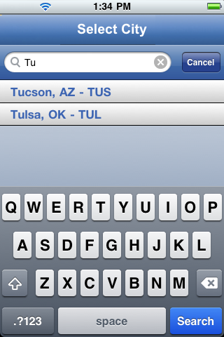
Example
 /*Sample code to enable the searchCriteria property for a Segment widget with
searchCriteria:constants.SEGUI_SEARCH_CRITERIA_ENDSWITH */
frmSegment.mySegment.searchCriteria=constants.SEGUI_SEARCH_CRITERIA_ENDSWITH;
Platform Availability
- Available in the IDE
- iPhone
- iPad
sectionHeaderSkin Property
Specifies the skin to be applied to the Section Header.
Syntax
sectionHeaderSkin
Type
String
Read/Write
Read + Write
Example
//Sample code to define the sectionHeaderSkin property for Segment.
frmSegment.mySegment.sectionHeaderSkin ="secHSkin";
Platform Availability
Available in the IDE
Available on all platforms
sectionHeaderTemplate Property
Specifies the common template to be used for each section while creating the section header and filling the data.
Syntax
sectionHeaderTemplate
Type
voltmx.ui.FlexContainer
Read/Write
Read + Write
Remarks
This is optional parameter and if not provided the default template provided by each platform will be used. It can also be provided at each section level when setting the data. Please refer data property for examples.
When a Section Header is provided along with the rows/items, the Section Header is "clamped" to the top of the scrollable area (on the Form) as one scrolls through a long list of items (for example, if you have a long list of contacts that all begin with the letter "A", the "A" header will be fixed at the top until you scroll down past the last "A" item). This behavior can be clearly seen iPhone's Contacts application.
This behavior of Section Headers is available on iOS and Android platform and is enabled when the screenLevelWidget has been set to true.
Example
frmSegment.mySegment.sectionHeaderTemplate = template1
Platform Availability
- Available in the IDE
- Available on all platforms
selectedRowIndex Property
Indicates the currently selected row in single select or multi select modes in the SegmentedUI.
Syntax
selectedRowIndex
Type
Array
Read/Write
Read + Write
Remarks
The index is with respect to the order in which data is set with data property.
Programmatically setting the selectedRow Index will not make any visible differences in the row, however it will bring the row at the index into the view able area on the screen.
Setting this value before the parent form is shown may result in the value not being changed. To avoid this you can set this value in the onDidFinishDataLoading callback for the SegmentUI widget.
Setting this value it to null/nil clears the selection state and also sets the selectedRowIndices to null in cases where segui selection behavior is SEGUI_SINGLE_SELECT or SEGUI_DEFAULT_BEHAVIOR or SEGUI_MULTI_SELECT_BEHAVIOR.
The selectedRowIndex is not updated when clicked on any child widget of a Row. For example, a Button or an HBox.
selectedRowIndex Array format:
[sectionIndex1, [rowIndex1],

For example,
[1,3] indicates 4th row in 2nd section.
[1,4] indicates 5th row in 2nd section.
selectedRowIndex is not updated when a row is swiped in PAGE_VIEW or COVERFLOW_VIEW. It is updated only when clicked on a row.
If data contains the sections then the selectedIndex indicates the selected row index within the section.
Example
//Sample code to set the selectedRowIndex property for a Segment [1,4].
frmSegment.mySegment.selectedRowIndex= [1,4];

//Reading the selectedRowIndex of the Segment widget.
voltmx.print("SegmentedUI selectedRowIndex ::" + frmSegment.mySegment.selectedRowIndex);
Platform Availability
Available on all platforms
selectedRowIndices Property
Specifies an array of indexes which indicates the selected rows.
Syntax
selectedRowIndices
Type
Array
Read/Write
Read + Write
Remarks
Setting this value before the parent form is shown may result in the value not being changed. To avoid this you can set this value in the onDidFinishDataLoading callback for the SegmentUI widget.
In case of MULTI_SELECT there can be more than one selected index and the array represents the same.
In case of SINGLE_SELECT and DEFAULT_BEHAVIOR the array contains only one element indicating the selectedIndex.
Setting it to null/nil clears the selection state and also sets the selectedIndices to null/nil.
The selectedRowIndices is not updated when clicked on any child widget of a Row. For example, a Button or an HBox.
When this property is read from the SegmentedUI the list structure depends on the usage of sections.
selectedRowIndices Array format:
[
 [sectionIndex1, [rowIndex1, rowIndex2, ...],
 [sectionIndex3, [rowIndex4, rowIndex5, ...],
 .....
]
For example:
- [ [0, [2] ] ] indicates 3rd row is selected in the first selection.
-
[ [0, [1, 4] ] ] indicates 2nd and 5th rows are selected in the first section.
-
[ [0, [0, 3] ], [2, [1, 3, 4] ] ] indicates the 1st, 4th rows, of 1st section and also 2nd , 4th and 5th rows in 3rd section.
Note: selectedRowIndices is not updated when a row is swiped in PAGE_VIEW or COVERFLOW_VIEW. It is updated only when clicked on a row.
Behavior when data is modified in the segment
Example
//Sample code to set the selectedRowIndices property for a Segment as [4,5].
frmSegment.mySegment.selectedRowIndices= [4, 5];

//Reading the selectedRowIndices of the Segment widget.
voltmx.print("SegmentedUI selectedRowIndices ::" + frmSegment.mySegment.selectedRowIndices);
Platform Availability
Available on all platforms.
selectedRowItems Property
Returns the data of the selected rows in the segmentedUI.
Syntax
selectedRowItems
Type
Array of objects
Read/Write
Read only
Remarks
Use the property name as selectedItem for backward compatibility.
Setting this value before the parent form is shown may result in the value not being changed. To avoid this you can set this value in the onDidFinishDataLoading callback for the SegmentUI widget.
Example
 var row_items=Form3.seg1.selectedRowItems;
  voltmx.print("The selected row items are"+JSON.stringify(row_items));
Platform Availability
Available on all platforms
selectionBehavior Property
Specifies if the segment can support single or multiple selection.
Syntax
selectionBehavior
Type
Number
Read/Write
Read + Write
Remarks
The default value for this property is SEGUI_DEFAULT_BEHAVIOR.
The available options are:
-
SEGUI_DEFAULT_BEHAVIOR: Indicates that the segment does not support either single or multiple selection. This option allows you to define an onRowClick event for the segment.
-
SEGUI_SINGLE_SELECT_BEHAVIOR: Indicates that you can make one selection when you have many choices in the segment (the behavior is similar to a RadioButtonGroup).
- SEGUI_MULTI_SELECT_BEHAVIOR: Indicates that you can make more than one selection when you have many choices in the segment (the behavior is similar to a CheckBoxGroup).
Note: To set the value through code, prefix the option with constants. such as constants..
Example
/*Sample code to set the selectionBehavior property for a Segment as constants.SEGUI_MULTI_SELECT_BEHAVIOR.*/
frmSegment.mySegment.selectionBehavior= constants.SEGUI_MULTI_SELECT_BEHAVIOR;
Platform Availability
- Available in the IDE
- Available on all platforms
selectionBehaviorConfig Property
This property is enabled if you select either singleselect or multiselect.
Syntax
selectionBehaviorConfig
Type
JSObject
Read/Write
Read + Write
Remarks
It specifies the Image widget ID which is used to indicate to the user that the row is selected or deselected. Following are the key value configurations:
imageIdentifier - Identifier of the Image widget that is placed in template box and this will be used to indicate the selection state by toggling selectedStateImage and unselectedStateImage.
Only after you specify the imageIdentifier, the selectStateImage preserve">var var unselectedStateImage properties will be available.
selectedStateImage
Specifies the image to be displayed when the user selects the row.
unselectedStateImage
Specifies the image to be displayed when the user deselects the row.
Note: The image size should be equal for both selectedStateImage and unselectedStateImage otherwise the UI gets distorted.
Example
//Sample code to set the selectionBehaviorConfig property for a Segment widget.
frmSegment.mySegment.selectionBehaviorConfig = {
 imageIdentifier: img,
 selectedStateImage: "sel.png",
 unselectedStateImage: "unSel.png"
};
Platform Availability
- Available in the IDE
- Available on all platforms
separatorColor Property
Specifies the color of the separator between row of segmentedUI.
Syntax
separatorColor
Type
String
Read/Write
Read + Write
Remarks
The color property follows hex format (#RRGGBBAA) which includes even transparency portion. For example, if the seperator color is green and transparency is 50% then value is 00ff0032. Similarly if the transparency is 100% then the value is 00ff0064.
Example
//Sample code to set the seperatorColor property for a Segment widget.
frmSegment.mySegment.seperatorColor="#FF0000";
Platform Availability
- Available in the IDE
- Available on all platforms
separatorRequired Property
Specifies if the segment should display the separator between the rows of the SegmentedUI.
Syntax
separatorRequired
Type
Boolean
Remarks
The default value for this property is false.
If set to true, the separator is displayed.
If set to false, the separator is not displayed.
Example
//Sample code to enable the seperatorRequired property for a Segment widget.
frmSegment.mySegment.separatorRequired=true;
Platform Availability
- Available in the IDE
- Available on all platforms
separatorThickness Property
Specifies the thickness of the separator in pixels.
Syntax
separatorThickness
Type
Number
Read/Write
Read + Write
Remarks
The default value for this property is 1 px.
For iOS platform, this property is applicable only when you set the groupCells property as true.
From iOS7 onwards this property is not applicable even when you set the groupCells property as true.
Example
//Sample code to set the separatorThickness property for a Segment widget.

frmSegment.mySegment.separatorThickness= 20;
Platform Availability
- Available in the IDE
- Available on all platforms except iPhone and iPad
showProgressIndicator Property
Specifies if the progress indicator must be displayed.
Syntax
showProgressIndicator
Type
Boolean
Remarks
The default value for this property is true (the progress indicator is displayed on the widget).
If you do not want the progress indicator to be displayed, set the value to none.
Example
//Sample code to enable the showProgressIndicator property for a Segment widget.
frmSegment.mySegment.showProgressIndicator=true;
Platform Availability
- Available in the IDE
- iPhone
- iPad
showScrollbars Property
Specifies if the scrollbars must be visible all the time.
Syntax
showScrollbars
Type
Boolean
Remarks
The default value for this property depends on the individual native behavior.
If set to true, the scrollbars are displayed.
If set to false, the scrollbars are not displayed.
Example
//Sample code to enable the showScrollbars property for a Segment widget.
frmSegment.mySegment.showScrollbar=true;
Platform Availability
- Available in the IDE
- iOS, Windows, SPA, and Desktop Web
supportSectionHeaderIndex Property
When this property is enabled, VoltMX Iris allows indexing of section headers of Segment widget. You can bring the section headers to the visible region by setting the selectedRowIndex Property.
Syntax
supportSectionHeaderIndex
Type
Boolean
Remarks
You can use this property in the following scenarios:
- To bring the rows of a section to the visible region For example,, to bring the 0th row of a section in the visible region, set this property as true. Then, set selectedRowIndex to [sectionIndex, 0].
- To bring a section header to the visible region For example,, to bring the section with sectionIndex as ‘0’, set this property as true. Then, set selectedRowIndex to [0, -1].
If set through code, enable this property in the preShow/postShow of the form.
Example
Form1.segment1.supportSectionHeaderIndex = true;
Platform Availability
- Available in the IDE
- Android
- iOS
- Windows
- SPA
stopRerenderOnSetDataAt Property
This property is used to enable only the modified contents of a Segment row to be updated while using the setDataAt method.
Consider a scenario where there are two widgets in a Segment row, such as a Label and a Button widget. By using a tab key, if the focus was set on the Button widget and the text of the Label widget was modified using the setDataAt method, the whole row gets modified. After the row has been modified, the Button widget in the row is no longer in focus. The focus goes to the top-right corner of the page. When you enable the stopRerenderOnSetDataAt property, only the modified contents of the row are updated in the Segment widget.
Syntax
stopRerenderOnSetDataAt
Type
Boolean
Remarks
The default value of the stopRerenderOnSetDataAt property is false.
- When you specify the value of this property as true, only the properties in the row that are modified using setDataAt method is updated.
- When you specify the value of this property as false, the content of the entire row is modified.
Limitations
- The
stopRerenderOnSetDataAtproperty is not enabled, when the old and new data have different row templates. - The
stopRerenderOnSetDataAtproperty is not enabled, if the isVisible property of a widget is modified.
Example
/*Sample code to enable the stopRerenderOnSetDataAt property by using mySegment Segment widget in frmSegment Form.*/
frmSegment.mySegment.stopRerenderOnSetDataAt=true;
Platform Availability
- SPA and Desktop Web
top Property
This property determines the top edge of the widget and measured from the top bounds of the parent container.
The top property determines the position of the top edge of the widget’s bounding box. The value may be set using DP (Device Independent Pixels), Percentage, or Pixels. In freeform layout, the distance is measured from the top edge of the parent container. In flow-vertical layout, the distance is measured from the bottom edge of the previous sibling widget in the hierarchy. In flow-horizontal layout, the distance is measured from the left edge of the parent container.
Syntax
top
Type
String
Read/Write
Read + Write
Remarks
If the layoutType is set as voltmx.flex.FLOW_VERTICAL, the top property is measured from the bottom edge of the top sibling widget. The vertical space between two widgets is measured from bottom of the top sibling widget and top of the bottom sibling widget.
Example
//Sample code to set the top property for widgets by using DP, Percentage and Pixels.
frmHome.widgetID.top = "50dp";

frmHome.widgetID.top = "10%";

frmHome.widgetID.top = "10px";
Platform Availability
- Available in the IDE
- iOS, Android, Windows, SPA, and Desktop Web
transform Property
Contains an animation transformation that can be used to animate the widget.
Syntax
transform
Type
JSObject
Read/Write
Read + Write
Remarks
This property is set to the identify transform by default. Any transformations applied to the widget occur relative to the widget's anchor point. The transformation contained in this property must be created using the voltmx.ui.makeAffineTransform function.
Example
This example uses the button widget, but the principle remains the same for all widgets that have a transform property.
//Animation sample
var newTransform = voltmx.ui.makeAffineTransform();
newTransform.translate3D(223, 12, 56);

//translates by 223 xAxis,12 in yAxis,56 in zAxis
widget.transform = newTransform;
Platform Availability
- iOS, Android, Windows, and SPA
viewConfig Property
The viewConfig property is applicable on widgets when the viewType property has the following values:
- SEGUI_VIEW_TYPE_COVERFLOW (For Android and iOS)
- SEGUI_VIEW_TYPE_TABLEVIEW (For iOS only)
- SEGUI_VIEW_TYPE_CYLINDER (For iOS only)
- SEGUI_VIEW_TYPE_INVERTED_CYLINDER (For iOS only)
- SEGUI_VIEW_TYPE_INVERTED_ROTARY (For iOS only)
- SEGUI_VIEW_TYPE_LINEAR (For iOS only)
- SEGUI_VIEW_TYPE_ROTARY (For iOS only)
- SEGUI_VIEW_TYPE_STACK (For iOS only)
Syntax
viewConfig
Type
JSObject
Read/Write
Read + Write
Remarks
When the viewType is set as SEGUI_VIEW_TYPE_COVERFLOW, then you can set the viewConfig Property through canvas for Android.
You can set the following properties for Android:
projectionAngle [Number]: Specifies the angle in degrees between a row except at center and z-axis. When the projection angle is 0, all rows are aligned along z-axis one after the other. When previewed, only one rows appears at the center. When the projection angle is 90, all rows are aligned along x-axis side by side. If the value entered is negative, then the resultant angle is 90 + entered value. For example, if the projection angle is -30 then resultant projection angle, is 90 - 30 = 60 degrees. Projection angle accepts a range between -90 and +90 only.
rowItemRotationAngle[Number]: Specifies the angle in degrees of rotation of each row along its own y-axis. The parameter accepts a range between 0 and 360.
spaceBetweenRowItems [Number]: Specifies the space between each row. The parameter accepts the value in pixels.
rowItemWidth[Number]: Specifies the width in percentage relative to its parent width. The parameter accepts a range between 1 and 100.
isCircular[Boolean]: When set to true, isCircular parameter specifies the widget to scroll endlessly (repeating the first row after you reach the last row). When set to false, the widget stops scrolling after you reach the last row.
For iOS, isCircular is the only parameter that is applicable.
-
isCircular[Boolean]: When set to true, isCircular parameter specifies the widget to scroll endlessly (repeating the first row after you reach the last row). When set to false, the widget stops scrolling after you reach the last row.
isCircular property needs to be given in the following ways in iOS:
-
SEGUI_VIEW_TYPE_COVERFLOW
viewConfig:{coverflowConfig:{isCircular:true}} - SEGUI_VIEW_TYPE_CYLINDER
viewConfig:{cylinderConfig:{isCircular:true}} - SEGUI_VIEW_TYPE_INVERTED_CYLINDER
viewConfig:{invertedCylinderConfig:{isCircular:true}} - SEGUI_VIEW_TYPE_INVERTED_ROTARY
viewConfig:{invertedRotatoryConfig:{isCircular:true}} - SEGUI_VIEW_TYPE_LINEAR
viewConfig:{linearConfig:{isCircular:true}} - SEGUI_VIEW_TYPE_ROTARY
viewConfig:{rotatoryConfig:{isCircular:true}} - SEGUI_VIEW_TYPE_STACK
viewConfig:{stackConfig:{isCircular:true}}
When the viewType is set as SEGUI_VIEW_TYPE_TABLEVIEW(in iOS), viewConfig will have the following keys:
- tableViewConfig[JSObject]: This is a string key whose value is a map which accepts the configurations for customizing the index bar of the table view. Following are the keys and their respective values:
- indexColor [String]: Specifies the color of the index in hex format as a string. This option is available from iOS 6 and above.
- indexBackgroundColor [String]: Specifies the background color of the index in hex format as a string. This option is available from iOS 7 and above.
- indexTrackingBackgroundColor [String]: Specifies the tracking background color of the index in hex format as a string. This option is available from iOS 6 and above.
All the above keys are optional.
Example
/*This example uses the segment widget,
but the principle remains the same for all widgets that have a viewConfig property. In this sample code the viewType is SEGUI_VIEW_TYPE_COVERFLOW.*/
frmSegment.mySegment.viewConfig = {
 coverflowConfig: {
  isCircular: true
 }
};
Platform Availability
- Available in the IDE (only for Android)
- iOS and Android
viewType Property
You can use this property to select the view type of a segment.
Syntax
viewType
Type
Number
Read/Write
Read + Write
Note: On Android platform, this property cannot be changed dynamically.
Remarks
The default value for this property is SEGUI_VIEW_TYPE_TABLEVIEW.
Only the view type SEGUI_VIEW_TYPE_TABLEVIEW supports sections. All other views do not support sections but display rows of all sections continuously one below the other without any indication of sections.However, all section related APIs, sectionIndex, rowIndex work with all views of the segui without any code level changes when switching from one view to the other view.
The following are the available view types that you can select and their appearances on iPhone native client:
SEGUI_VIEW_TYPE_TABLEVIEW: The rows of the segment appear in a table as a list.
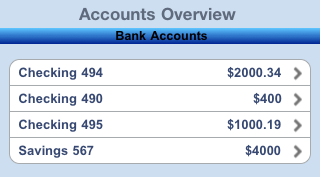
SEGUI_VIEW_TYPE_PAGEVIEW: The rows of the segment appear in pages and you need to scroll through the pages to view the rows.
Note: To avoid UI issues with segment, ensure that each page of segment with pageview has equal size and also the height of segment should fit into the screen viewport area.
The below option applicable to iPhone, iPad, and Android/Android Tablet platforms.
- SEGUI_VIEW_TYPE_COVERFLOW: Regular cover flow view. The cover flow view enables you to flip through the widgets placed in a segment and bring the associated widget into view. You can flip through the widgets placed in a segment as shown in the figure.
Following are the options applicable to iPhone and iPad only.
- SEGUI_VIEW_TYPE_CYLINDER: Displays the widgets placed in a segment as a cylinder. All the widgets placed in a segment form a horizontal cylinder (polygon) and the cylinder rotates based on the user's gesture. In the Cylinder view, the widgets appear as if the user is viewing at the cylinder from outside. The widgets gets skewed as you move along the axis of reference of the cylinder. You can rotate the widgets placed in a segment around the axis of reference as shown in the figure.
- SEGUI_VIEW_TYPE_INVERTED_CYLINDER: Displays the widgets placed in a segment as a cylinder. All the widgets of the segment form a horizontal cylinder (polygon) and the cylinder rotates based on user's gesture. In the Inverted Cylinder view, the widgets placed in a segment appear as if the user is viewing the cylinder from inside. The widgets in a segment gets skewed as you move the segment along the axis of reference. You can rotate the widgets placed in a segment around the axis of reference as shown in the figure.
- SEGUI_VIEW_TYPE_INVERTED_ROTARY: Displays the widgets placed in a segment that rotates around the axis of reference, where the current objects are projected inwards and the other widget appear closer to the user than the current widget. There won't be any widgets skewing or tilting like in the cover flow view.
- SEGUI_VIEW_TYPE_LINEAR: Displays the widgets placed in a segment in a linear view; which is very similar to the existing views, where you can scroll the widgets horizontally. You can scroll across the widgets by moving them forward or backward as shown in the figure.
- SEGUI_VIEW_TYPE_ROTARY: Displays the widgets placed in a segment that rotates around the axis of reference, where the current widget protrudes outwards and other widget appear slightly behind the current widget. There won't be any widget skewing or tilting like in the cover flow view.
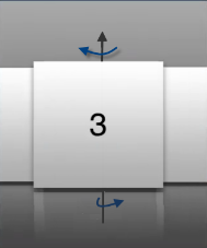
- SEGUI_VIEW_TYPE_STACK: Custom stack view where the widgets placed in a segment appear as a stack. The widgets can be moved inside and outside the stack based on the user's gesture as shown in the figure below.
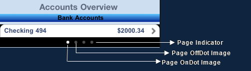
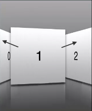
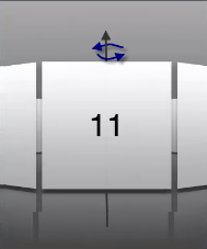
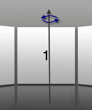
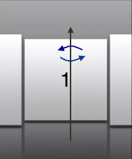
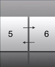
Example
/*Sample code to set the viewType property for a Segment widget to SEGUI_VIEW_TYPE_PAGEVIEW.*/
frmSegment.mySegment.viewType=constants.SEGUI_VIEW_TYPE_PAGEVIEW;
Platform Availability
- Available in the IDE
- Available on all platforms
widgetDataMap Property
Specifies the mapping information between the widget id's and the keys in the data.
Syntax
widgetDataMap
Type
JSObject
Read/Write
Read + Write
Remarks
It is developer responsibility to ensure that widgetDataMap to accommodate all the widget ids required including the widgets referred in dynamic templates.
{
 widgetID1: "dataId1",
 widgetId2: "dataId2",
 widgetId3: "dtaId3",
 widgetId4: "secDataId1"
 widgetId5: "secDataId2"
}
Note: Only after you specify the mapping information, you can use the Methods applicable for a segment.
Example
/*Sample code to set the properties for a Segment with widgetDataMap:
{widgetId1:"dataid1", widgetId2:"dataId2", widgetId3:"dataId3",
 widgetId4:"secDataId1", widgetId5:"secDataId2" }. */
frmSegment.mySegment.widgetDataMap= {
        widgetId1: "dataid1",
        widgetId2: "dataId2",
        widgetId3: "dataId3",
        widgetId4: "secDataId1",
        widgetId5: "secDataId2"
    };
Use Components without Contract in Segment Templates
You can use components without contract inside Segment templates. You can map the child widgets of the component to a key in the widgetDataMap property by using the dot operator.
The data property is then used to set the values that are to be displayed in the child widgets of the component. You can assign this set of values directly to the key or to the properties of the child widgets.
Note: Segment Templates do not provide support for component with contract.
In the following example, after the mapping is done, the data property assigns value to the Comp1lbl1 and Comp1Img1 keys. This value is then assigned to the child widgets- lbl1 and img1 of the segComp1 component.
/*In this example, segComp1 is the component with lbl1 and img1 as child widgets. Comp1lbl1 and Comp1Img1 are the keys.*/
mySegment.widgetDataMap = {
 " template1": " template1",
 "segComp1.lbl1": "Comp1lbl1",
 "segComp1.img1": "Comp1Img1"
};
//There are two methods to assign data to the widgets inside the component.
//Method One- assign directly by using the key
mySegment.data = [{
  "comp1lbl1": "Row One",
  "comp1img1": "icon1.png"
 },
 {
  "comp1lbl1": "Row Two",
  "comp1img1": "icon2.png"
 }
];
//Method Two- assign to the properties of the child widgets
mySegment.data = [{
  "comp1lbl1": {
   "text": "Row One",
   "skin": "lblskn1"
  },
  "comp1img1": {
   "src": "icon1.png",
   "left": "100dp"
  }
 },
 {
  "comp1lbl1": {
   "text": "Row Two",
   "skin": "lblskn1"
  },
  "comp1img1": {
   "src": "icon2.png",
   "left": "10dp"
  }
 }
];
Note: When components are rendered inside a Segment template, the events and gestures assigned to the child widgets of the components are retained.
Platform Availability
Available on all platforms.
widgetSkin Property
Specifies the skin to be applied to the entire SegmentedUI.
Syntax
widgetSkin
Type
String
Read/Write
Read + Write
Remarks
In widgetSkin property with Border style as rounded corner is supported only when you set the border property as SEGUI_BORDER_NONE.
Example
//Sample code to define the widgetSkin property for Segment.
frmSegment.mySegment.widgetSkin="widSkin";
Platform Availability
- Available in the IDE
- Available on all platforms
widgetSwipeMove Property
This property is used to enable and configure left or right swipe actions for a widget. The widgetSwipeMove Property can be used for all widgets . The most common use case is for implementing swipe action for individual rows in Segment.
Syntax
widgetSwipeMove
Type
String
Read/Write
Read + Write
Input Parameters
| Parameter Name | Type | Default Value | Description |
| translate | Boolean | true | This is an optional parameter. When the value of this parameter is set as true, the widget moves along with the swipe in the same direction. |
| Xboundaries | Array | Size of the current widget | This is an optional parameter and it defines the boundaries of the swipe in the X-axis. |
| swipeLeft/swipeRight | JS Object | This is an optional parameter and it is used to define the configuration of the widget while swiping to the left/ right. Each swipeLeft or swipeRightparameter is an array of configuration attributes containing translateRange , callback , translatePos , and translate. This JS Object defines the behavior of the widget during the swipe action. | |
| translateRange | Array | Size of the current widget | This is an optional parameter and it defines the sub-boundaries for the action when the swipe action ends. |
| translatePos | Array | Previous position of the widget | This is an optional parameter and it determines the final translation position to be applied to the widget when the widget swipe reaches the translateRange value. |
| callback | JS Object | null | This is an optional parameter and it defines the callback which needs to be triggered when the finger swipe reaches the sub boundary defined in translateRange. The attributes inside this parameter are described in the following table. |
The following table consists of the parameters of the callback parameter:
| Parameter Name | Type | Description |
| widgetHandle | This parameter consists of the widget handle or ID of the widget on which the swipe action has been performed. | |
| context | JS Object | This is applicable only for widgets inside the Segment with row templates. Each context parameter consists of rowIndex, sectionIndex and widgetref |
| rowIndex | Number | This parameter stores the row index of the Segment containing the swiped widget. |
| sectionIndex | Number | This parameter stores the section index of the Segment containing the swiped widget. |
| widgetref | widgetHandle | This parameter stores the handle of the Segment containing the swiped widget. |
Remarks
- For a Segment, the widgetSwipeMove Property is configured while setting the data of the Segment.
Note: It is not recommended to assign the widgetSwipeMove property on a top Flex container of the segment template widget.
Limitations
- When a translation animation is applied to the same widget that has widgetSwipeMove already configured, the action which has been performed last takes precedence. For example, if you have set a translation animation on a FlexContainer and then set the widgetSwipeMove property, the actions set in widgetSwipeMove take precedence over the translation animation.
- The state of the swipe transition of the widget is not retained.
-
In a Segment, the widgetSwipeMove Property must be configured for the rows so that they reset to the previous position.
-
If the widgetSwipeMove property is configured on a top level Flex container of a segment template, the onRowClick event will not be triggered. - Applicable on iOS, Android, and SPA.
- Android limitation: On Android devices, when the user lifts their finger, the transition occurs immediately.
Example
Following is a code snippet for a mail app. Here we have used a Segment for listing the mail and the widgetSwipeMove Property has been configured for the SwipeFlex FlexContainer.
//This is a generic property that is applicable for various widgets.
//Here, we have shown how to use the widetSwipeMove property for Button widget.
/*You need to make a corresponding use of the
widgetSwipeMove property for other applicable widgets.*/
//### Example of a swipe move configuration.
var swipeMoveConfig = {
 "translate": true,
 "Xboundaries": ["-60%", "60%"],
 "swipeLeft": [{
  "translateRange": ["-60%", "0%"],
  "callback": null,
  "translatePos": "-60%",
  "translate": true
 }, {
  "translateRange": ["0%", "60%"],
  "callback": null,
  "translatePos": "0%",
  "translate": true
 }],
 "swipeRight": [{
  "translateRange": ["-60%", "0%"],
  "callback": null,
  "translatePos": "0%",
  "translate": true
 }, {
  "translateRange": ["0%", "60%"],
  "callback": this.onCallback1,
  "translatePos": "60%",
  "translate": true
 }]
};

this.view.myButton.widgetSwipeMove=swipeMoveConfig;
Platform Availability
- Android, iOS, and SPA
width Property
This property determines the width of the widget and is measured along the x-axis.
The width property determines the width of the widget’s bounding box. The value may be set using DP (Device Independent Pixels), Percentage, or Pixels. For supported widgets, the width may be derived from either the widget or container’s contents by setting the width to “preferred”.
Syntax
width
Type
Number, String, and Constant
Read/Write
Read + Write
Remarks
Following are the options that can be used as units of width:
- %: Specifies the values in percentage relative to the parent dimensions.
- px: Specifies the values in terms of device hardware pixels.
- dp: Specifies the values in terms of device independent pixels.
- default: Specifies the default value of the widget.
- voltmx.flex.USE_PREFERED_SIZE: When this option is specified, the layout uses preferred width of the widget as width and preferred size of the widget is determined by the widget and may varies between platforms.
Example
//Sample code to set the width property for widgets by using DP, Percentage and Pixels.
frmHome.widgetID.width = "50dp";

frmHome.widgetID.width = "10%";

frmHome.widgetID.width = "10px";
Platform Availability
- Available in the IDE
- iOS, Android, Windows, SPA, and Desktop Web
zIndex Property
This property specifies the stack order of a widget. A widget with a higher zIndex is always in front of a widget with a lower zIndex.
The zIndex property is used to set the stack, or layer order of a widget. Widgets with higher values will appear “over”, or “on top of” widgets with lower values. Widgets layered over other widgets will override any interaction events tied to widgets beneath. Modifying the zIndex does not modify the order of the widgets in the VoltMX Iris hierarchy, inside of a flexContainer or form. The zIndex property accepts only positive values.
Syntax
zIndex
Type
Number
Read/Write
Read + Write
Remarks
The default value for this property is 1.
Note: Modifying the zIndex does not modify the order of the widgets inside the FlexContainer. If zIndex is same for group of overlapping widgets then widget order decides the order of overlapping. The last added widget is displayed on top.
From VoltMX Iris V9 SP2 FP7, developers can configure the Z Index value for a Responsive Web app as Auto or Custom. When the selected Z Index value is Auto, the default Z Index value of 1 is applied. When the selected Z Index value is Custom, developers can specify a desired numeric value.
Prior to the V9 SP2 FP7 release, the default value for the Z Index was 1. When developers imported any third-party libraries with the Z index set as Auto, content overflow was disabled as the value of Auto is less than 1.
Note: The Z Index value Auto is supported only when the Enable JS Library mode is configured as unchecked.
For existing components, the value of the Z Index is configured as 1 for the Native channel. For the Responsive Web channel, the Z Index will be set as Custom with 1 as the value.
For new components, the value of the Z Index is configured as 1 for the Native channel. For the Responsive Web channel, the Z Index will be set as Auto or 1 based on the project level settings.
Note: If ModalContainer property is set to true in any of the FlexContainer widget, the Z Index value of that container and all of its parent containers should be set to Custom.
voltmx.flex.ZINDEX_AUTO : Constant to configure the Z Index value as auto programmatically.
//Sample code to set the ZIndex value to Auto
 var flx = new voltmx.ui.FlexContainer({
  "id": "flx"
  "zIndex": voltmx.flex.ZINDEX_AUTO
});
//Sample code to set the ZIndex value to Auto
flx.zIndex = voltmx.flex.ZINDEX\_AUTO;
Example
//Sample code to set the zIndex property for widgets.
frmHome.widgetID.zIndex = 300;
Platform Availability
- Available in the IDE
- iOS, Android, Windows, SPA, and Desktop Web