Label
Label
Use a Label widget to display static text. A label typically identifies a nearby text box or other widget.
To learn how to use this widget programmatically, refer VoltMX Iris Widget guide.
Look Properties
Look properties define the appearance of the widget. The following are the major properties you can set:
- Whether the widget is visible.
- The platforms on which the widget is rendered.
- How the widget aligns with its parent widget and neighboring widgets.
- If the widget displays content, where the content appears.
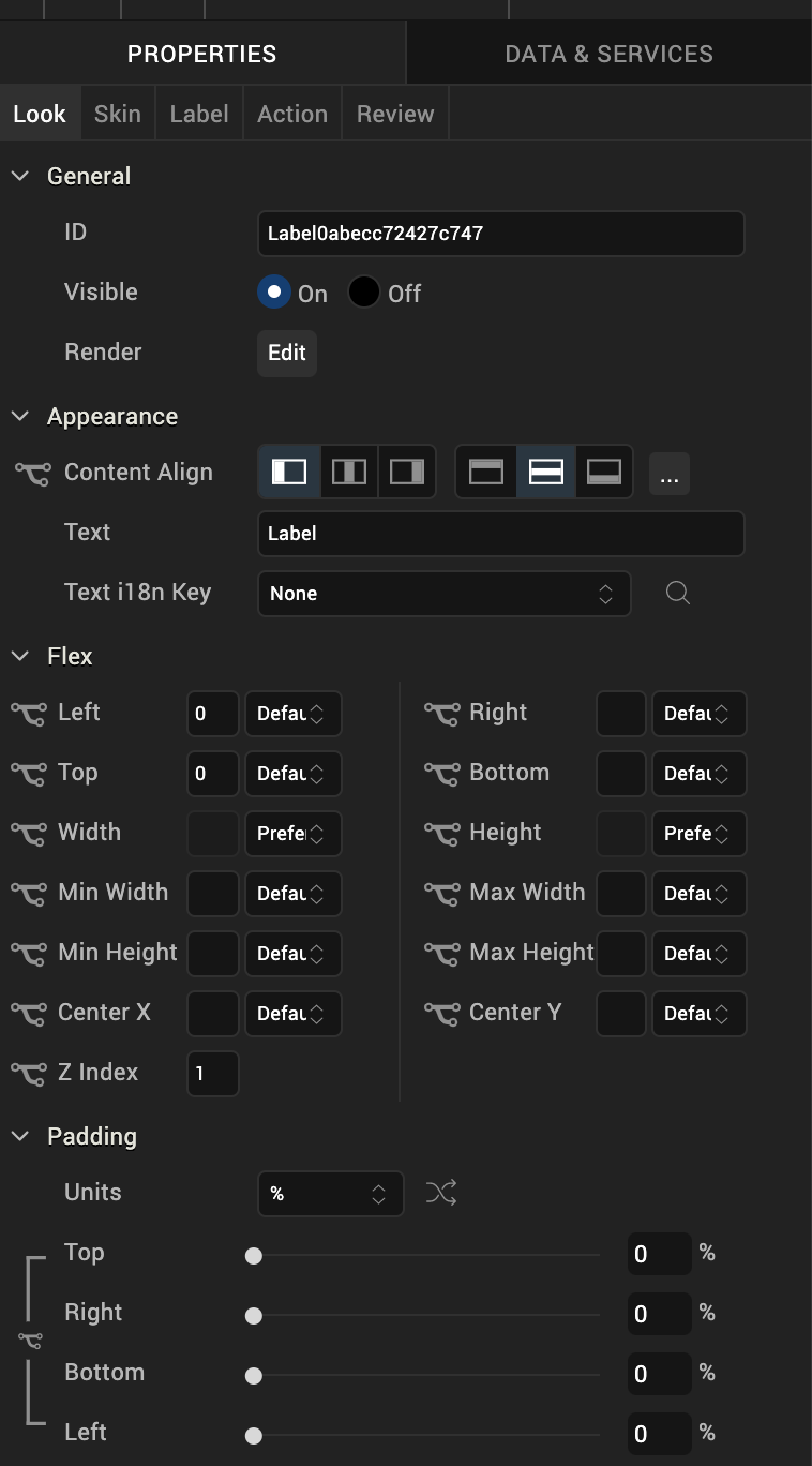
For descriptions of the properties available on the Look tab of the Properties pane, see Look.
Skin Properties
Skin properties define a skin for the widget, including background color, borders, and shadows. If the widget includes text, you can also specify the text font.
For a Label widget, you can apply a skin and its associated properties for the following states:
| Skin | Definition |
|---|---|
| Normal | The default skin of the widget. |
| Hover Skin | The look and feel of the widget when the cursor hovers over the widget. > Note: Hover skins are available only on the Windows (native) Tablet platform. |
For more information about applying skins, see Understanding Skins and Themes.
Label Properties
Label properties specify properties that are available on any platform supported by Volt MX Iris, and assign platform-specific properties.
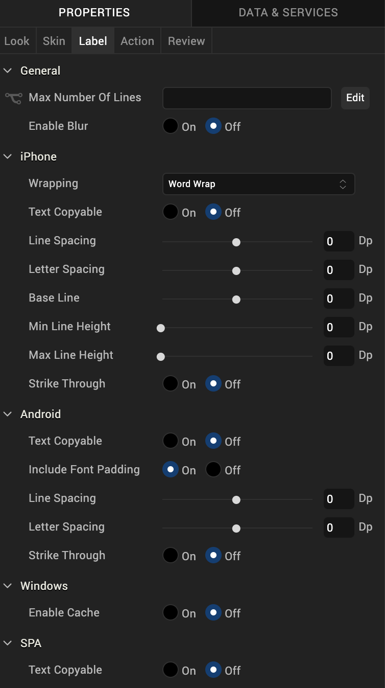
Wrapping
Specifies how the label wraps text, either Word Wrap or Character Wrap:
- Word Wrap (Default): Text wraps between words at the end of a line.
- Character Wrap: Text wraps between characters at the end of a line.
Note: This property is specific to the iOS platform.
Text Copyable
Specifies whether label text can be copied.
Tool Tip
For the Windows Tablet platform, specifies a message that displays when you hover the mouse pointer over the widget.
Actions
Actions define what happens when an event occurs. On an Image widget, you can run an action when the following event occurs:
- onTouchStart: The action is triggered when the user touches the touch surface. This event occurs asynchronously.
- onTouchMove: The action is triggered when the touch moves on the touch surface continuously until movement ends. This event occurs asynchronously.
- onTouchEnd: The action is triggered when the user touch is released from the touch surface. This event occurs asynchronously.
For more information, see Add Actions.
Placement Inside a Widget
The following table summarizes where an Image widget can be placed:
| Flex Form | Yes |
| VBox Form | Yes |
| FlexContainer | Yes |
| FlexScrollContainer | Yes |
| ScrollBox | Horizontal Orientation - Yes Vertical Orientation- Yes |
| Tab | Yes |
| Segment | Yes |
| Popup | Yes |
| Template | Header- NoFooter- No |
Widget Appearance on Platforms
The appearance of the Label widget on various platforms is as follows:
| Platform | Appearance |
|---|---|
| Android | 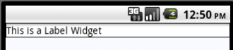 |
| iOS | 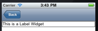 |
| SPA |  |
| Rev | Author | Edits |
| 8 | SHS | SHS |
| 7.2.1 | SHS | SHS |